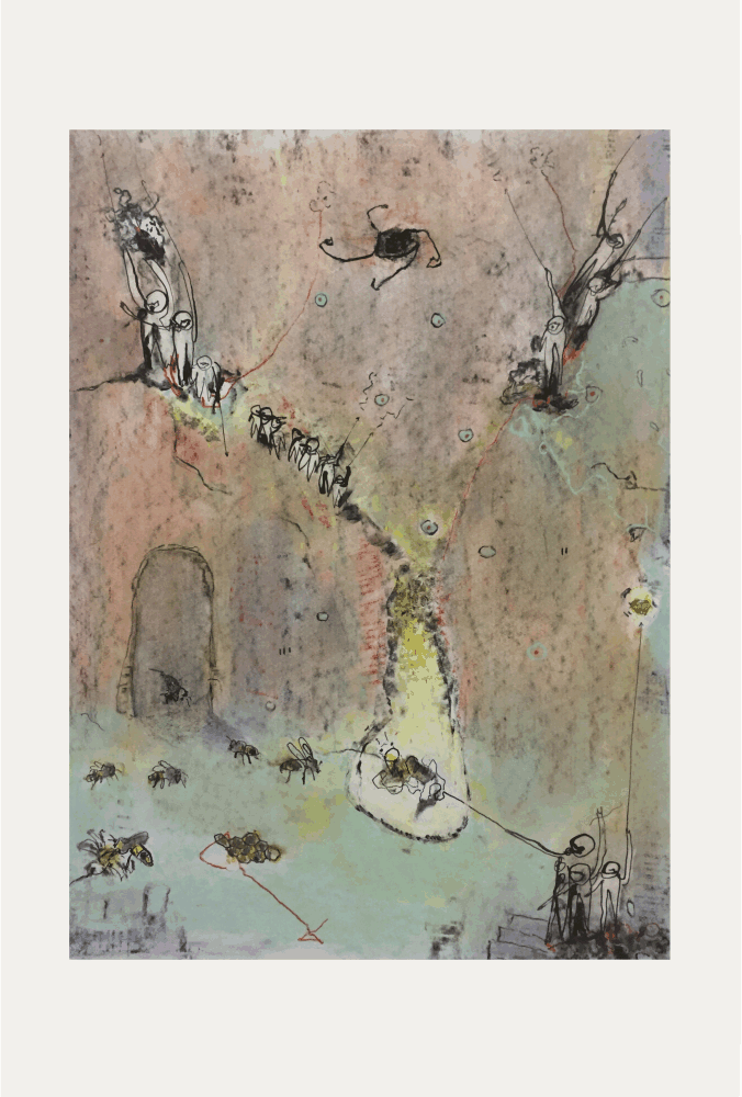
On November 4th, 1966, the city of Florence faced one of the worst floods recorded since the Renaissance. After days of severe and heavy rainfall, the Arno River flooded and submerged the Tuscan streets.
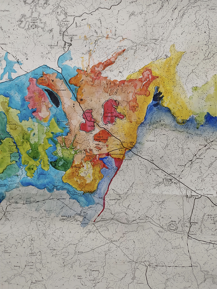
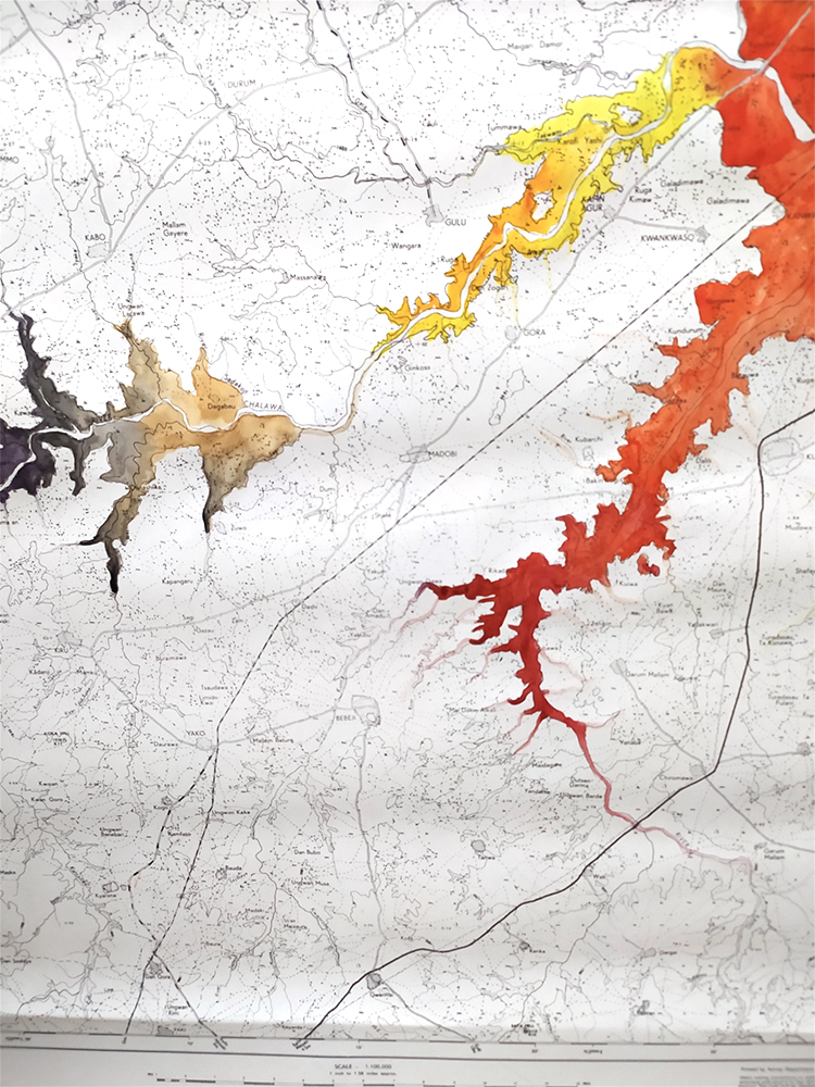
The river overflowed its banks and floodwaters swept through the streets and into thousands of shops, homes, churches, and museums. The river crested that day around noon. “There were about 225,000 gallons (852,000 liters) of water entering Florence every second with no place to go except into the city,” according to “Dark Water: Flood and Redemption in the City of Masterpieces” by Robert Clark. By that evening, the water levels had started to decrease; however, the devastation left behind was widespread. In addition to dozens of people losing their lives, a reported 20,000 people were left homeless and 10,000 cars were wrecked. Residents were without electricity, drinking water and phone service, and the streets were destroyed by the water and muck.
Il 4 novembre 1966, la città di Firenze fu colpita da una delle peggiori alluvioni mai registrate dal periodo del Rinascimento. Dopo giorni di forti e abbondanti piogge, il fiume Arno straripò e sommerse le strade toscane.
Le acque alluvionali oltrepassarono gli argini e travolsero le strade e con esse migliaia di negozi, case, chiese e musei. Quel giorno l’inondazione raggiunse il suo culmine verso mezzogiorno. “Ogni secondo entravano a Firenze circa 225.000 galloni (852.000 litri) d’acqua senza un altro posto in cui dirigersi se non in città”, scrive Robert Clark in “Dark Water: Flood and Redemption in the City of Masterpieces.” Verso sera il livello dell’acqua iniziò a scendere, ma la devastazione che l’alluvione lasciò dietro di sé fu molto estesa. Oltre alle decine di persone che persero la vita, si calcola che all’incirca 20.000 persone rimasero senza casa e 10.000 auto andarono distrutte. I cittadini rimasero senza elettricità, acqua potabile e telefono e le strade erano stravolte dall’acqua e dal fango.
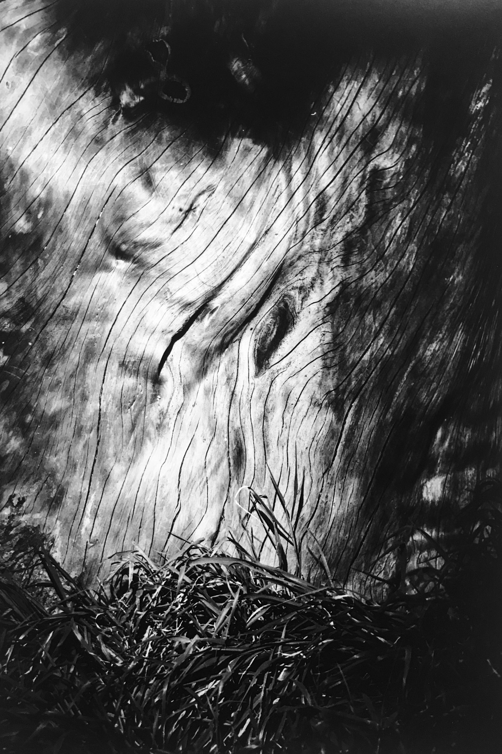
This city, known for its unparalled art, history, and beauty, had been ravaged by the flood. Water and mud had poured into Florence’s museums and ancient churches, destroying irreplaceable paintings, sculptures, murals, manuscripts and other precious artifacts in the very places they were housed. The mixture of the flood waters and the ruptured heating tanks in buildings around the city caused the fuel oil to spew into the water, creating a thick muddy mess. More than 1 million volumes were waterlogged, as were numerous important records at the Biblioteca Nazionale, a public library founded in the 18th century and the state archives.
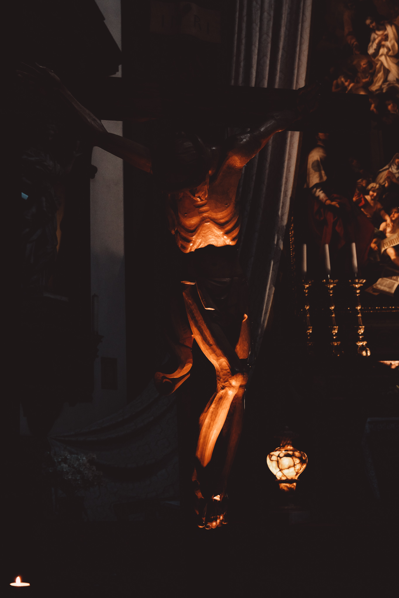
Floodwaters knocked off panels from the Florence Baptistery’s “Gates of Paradise,” – the 2,721 kilogram, 5-meter-tall gilt bronze doors designed by sculptor Lorenzo Ghiberti in the 15th century and considered a Renaissance masterpiece. At the Basilica di Santa Croce (a church and burial site of Michelangelo and Galileo, among others), a large wooden crucifix created in the 13th century by the master Italian artist Cimabue lost the majority of its original paint in the flood. Afterward, the ravaged artwork became a symbol of the toll the deluge took on Florence’s cultural heritage.
La città, famosa per la sua ineguagliabile arte, storia e bellezza, era stata devastata dall’alluvione. L’acqua e il fango si erano riversati nei musei e nelle chiese antiche di Firenze, distruggendo dipinti inimitabili, sculture, affreschi, manoscritti e altri preziosi manufatti proprio negli stessi luoghi in cui venivano custoditi. La miscela tra le acque alluvionali e il gasolio fuoriuscito a causa della rottura dei serbatoi di riscaldamento degli edifici della città creò una coltre di fango ancora più densa e distruttiva. Più di un milione di volumi vennero sommersi dall’acqua insieme a numerosi importanti documenti della Biblioteca Nazionale, istituzione pubblica che custodiva gli archivi di stato fondata nel XVIII secolo.
L’impatto dell’acqua arrivò addirittura a strappare via dal telaio sei dei dieci pannelli della “Porta del Paradiso” del Battistero di Firenze, la porta in bronzo dorato di 2.721 chilogrammi, alta 5 metri, progettata dallo scultore Lorenzo Ghiberti nel XV secolo e considerata un capolavoro del Rinascimento. Nella Basilica di Santa Croce (chiesa che ospita le spoglie di Michelangelo, Galileo e molte altre ilustri personalità), un grande crocifisso ligneo intagliato nel XIII secolo dal maestro italiano Cimabue perse la maggior parte della tinta originale a causa della catastrofe. Successivamente, tale opera d’arte devastata dal fango si è convertita in un simbolo del tributo che l’alluvione ha imposto al patrimonio culturale di Firenze.
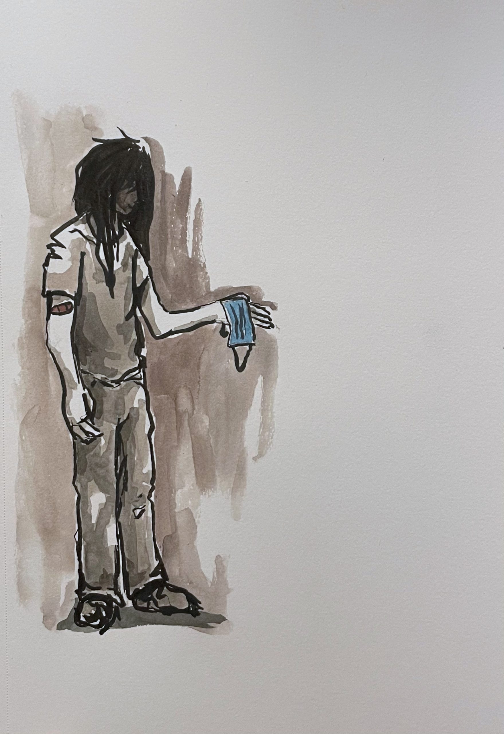
Upon learning about the flood, volunteers from across Italy and around the world arrived to help the city and rescue the rare books, artifacts, and art. The faithful group of volunteers we’re called “the Mud Angels.” These were young adults with no special training and were not organized, nor had they been recruited. They simply showed up. Young Europeans dropped what they were doing and boarded trains or drove south. Many had already been on the road, backpacking around Europe, and rearranged their plans to spend time to help in Tuscany. Study abroad students, specifically students from Florida State University, were a celebrated group of American volunteers who helped save many precious works of art and offered aid to the city.
Quando si diffuse la notizia della disastrosa alluvione, volontari da tutta Italia e da tutto il mondo arrivarono in soccorso della città per salvare libri rari, manufatti e opere d’arte. Questi zelanti volontari vennero ribattezzati gli “Angeli del fango”. Si trattava di giovani che, senza una particolare esperienza, poco organizzati e non previamente selezionati, si erano semplicemente messi a disposizione. I giovani europei lasciarono le proprie occupazioni, presero il primo treno e partirono verso Firenze. Molti di loro, che erano già stati, zaino in spalla, in giro per l’Europa, riorganizzarono i loro programmi per portare il proprio aiuto in Toscana. Gli studenti stranieri in Italia, in particolare quelli della Florida State University, vengono ancora ricordati come un celebre gruppo di volontari americani che contribuirono a salvare molte preziose opere d’arte e che offrirono il loro aiuto alla città.
The global efforts reached Hollywood as Franco Zeffirelli, the famous director and Florence native was working on a movie adaptation of “Taming of the Shrew” (starring Elizabeth Taylor and Richard Burton) in Rome at the time of the flood. He quickly returned to his hometown to make a documentary about the catastrophe. The film went on to reportedly earn $20 million in aid for the devastated city. Additionally, a group of American historians and other intellectuals started the Committee to Rescue Italian Art (CRIA) in order to raise funds to restore the damaged artwork and cultural artifacts.
The flood sparked significant change in the field of art preservation and helped developed new restoration techniques and standards in the years that followed. In the U.S., many national organizations subsequently were formed to help protect museums, historic sites, libraries and other cultural institutions in natural disasters and other emergencies.
Gli sforzi globali raggiunsero anche il mondo dello spettacolo: Franco Zeffirelli, il famoso regista originario di Firenze, mentre stava lavorando alla versione cinematografica della “Bisbetica domata” (con Elizabeth Taylor e Richard Burton) a Roma, al momento dell’alluvione, tornò subito nella sua città natale per girare un documentario sulla catastrofe. Si stima che il documentario abbia fruttato 20 milioni di dollari di aiuti a favore della città devastata. Inoltre, un gruppo di storici americani e di altri intellettuali ha dato vita al Committee to Rescue Italian Art (CRIA) (Comitato per il salvataggio dell’arte italiana) per raccogliere fondi per il restauro delle opere d’arte e degli artefatti culturali danneggiati. Jacqueline Kennedy fu presidentessa onoraria del gruppo, che faceva parte di un movimento di aiuto internazionale.
L’alluvione ha innescato un cambiamento significativo nel campo della conservazione dell’arte e ha contribuito a sviluppare nuove tecniche e standard di restauro negli anni successivi. Negli Stati Uniti sono nate molte organizzazioni statali per aiutare a proteggere musei, siti storici, biblioteche e altre istituzioni culturali in caso di disastri naturali e altre emergenze.
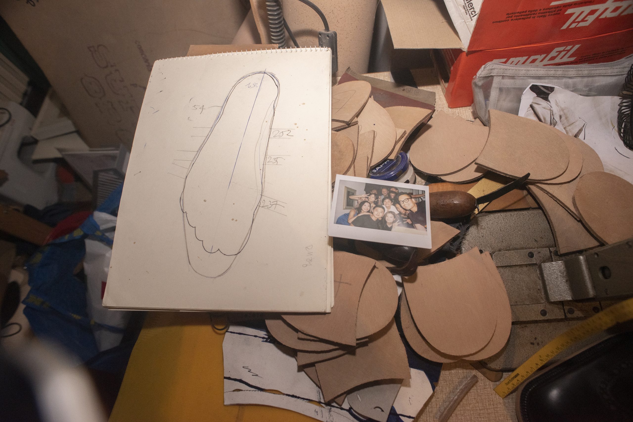
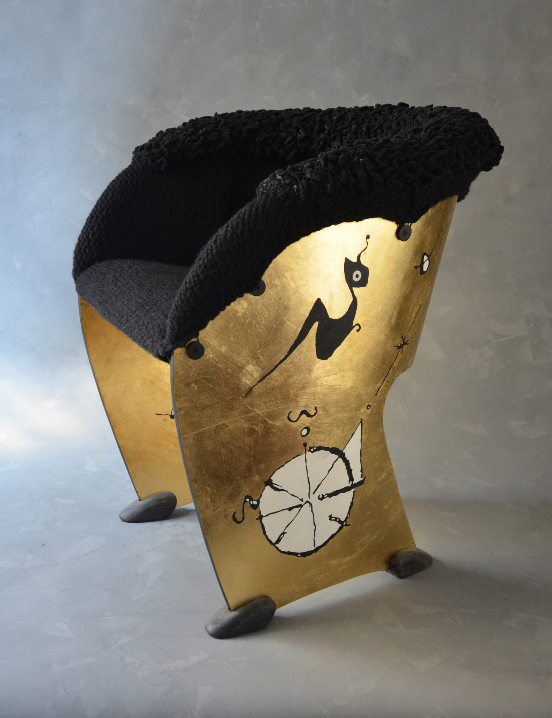
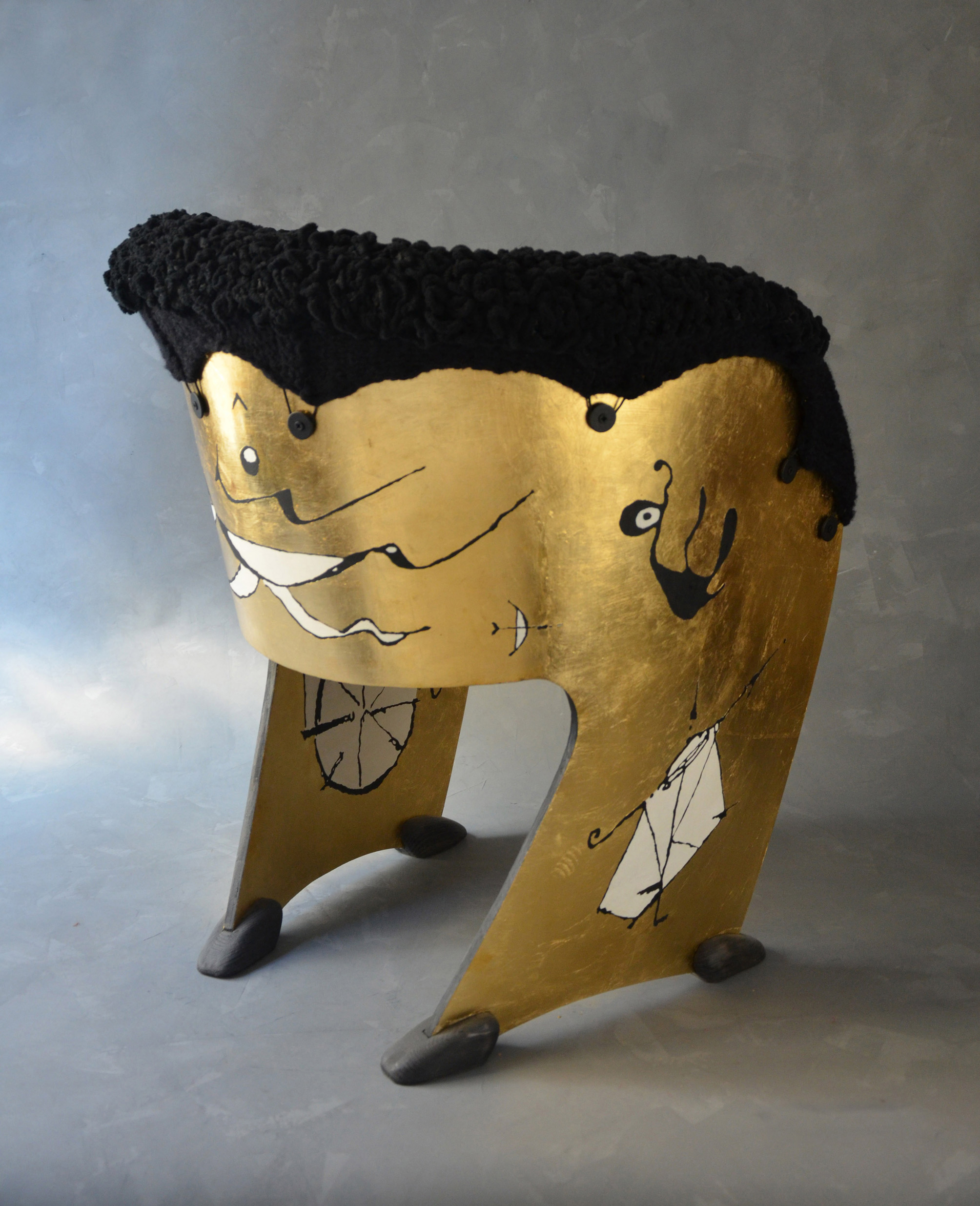
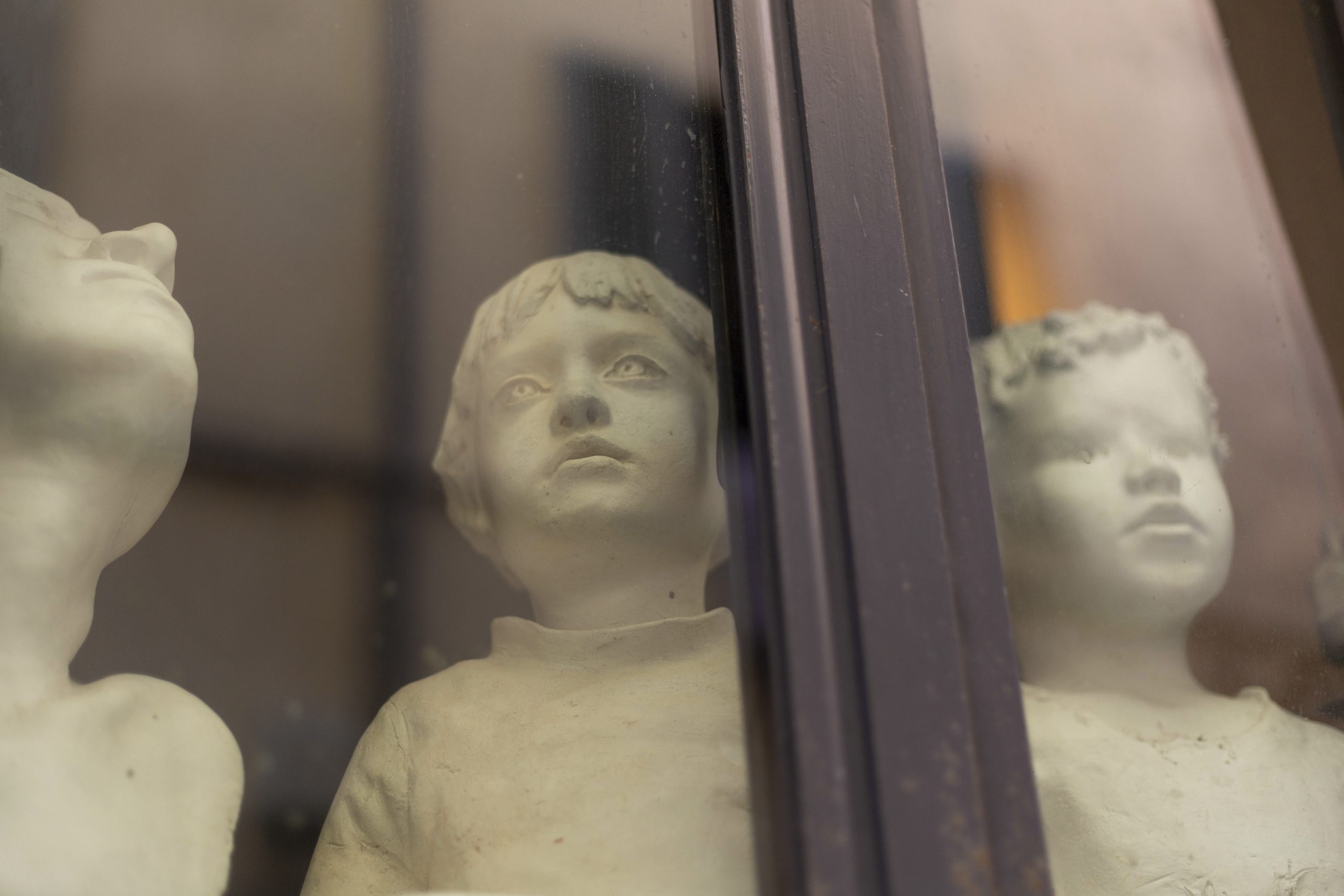
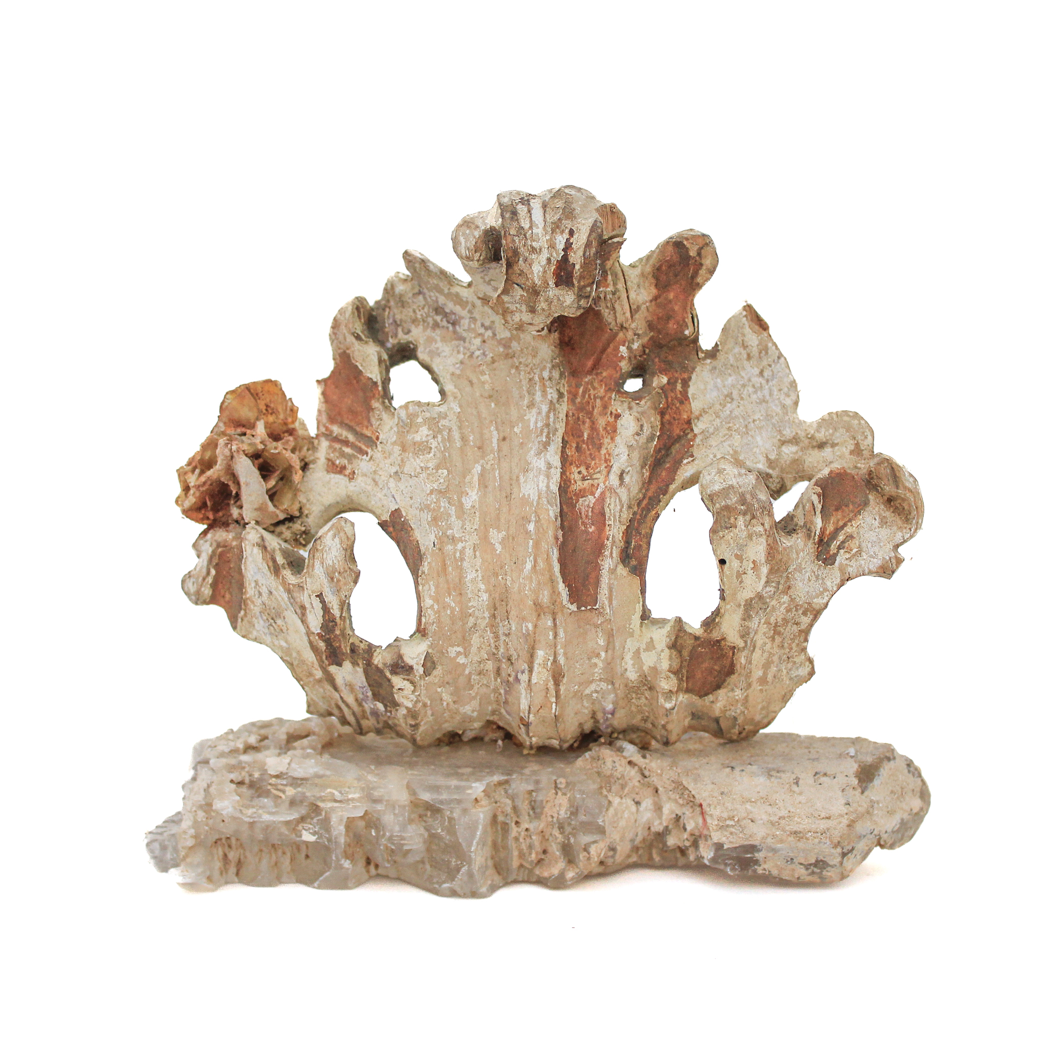
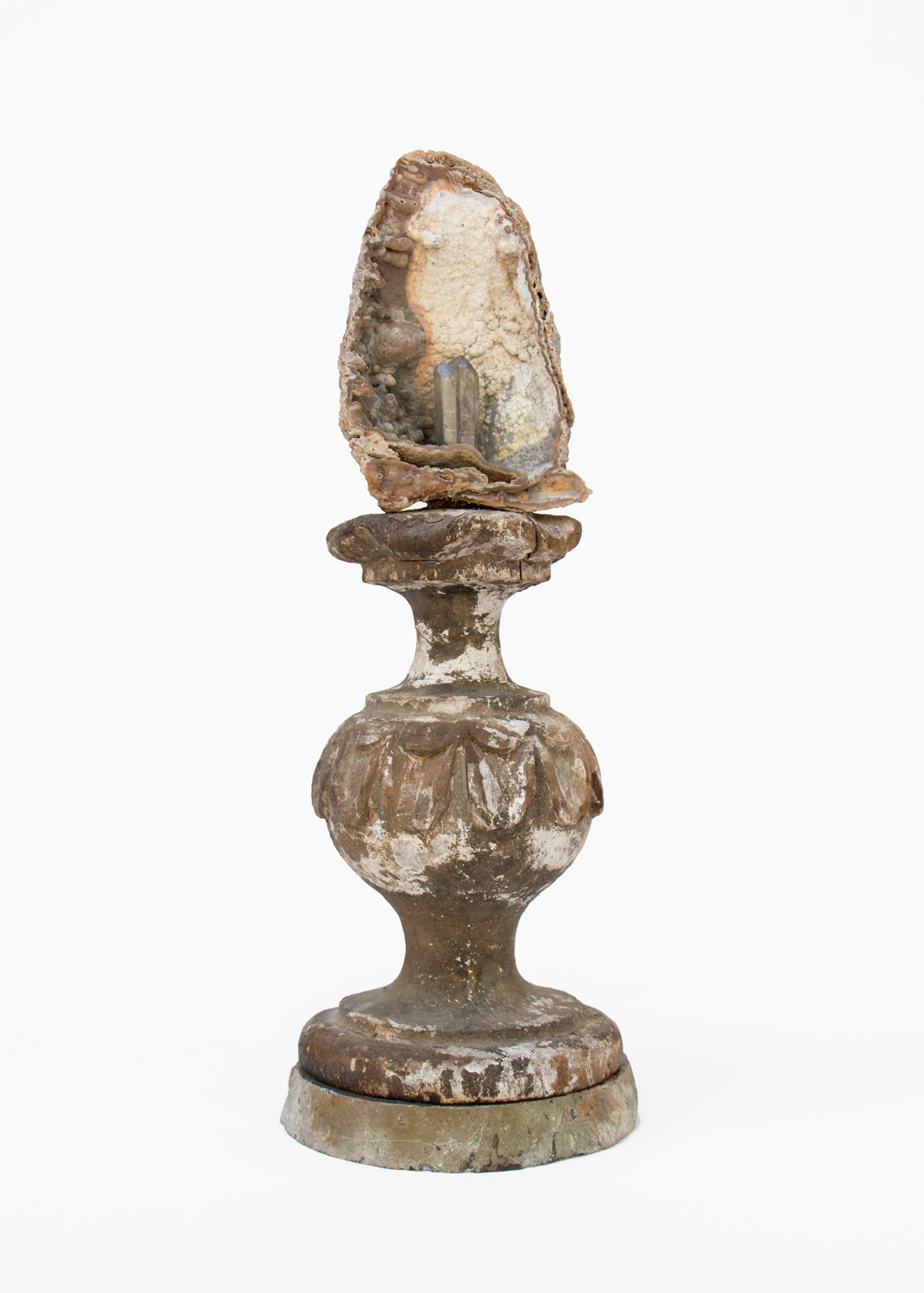
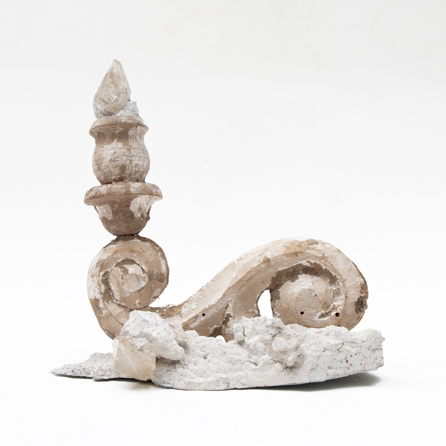
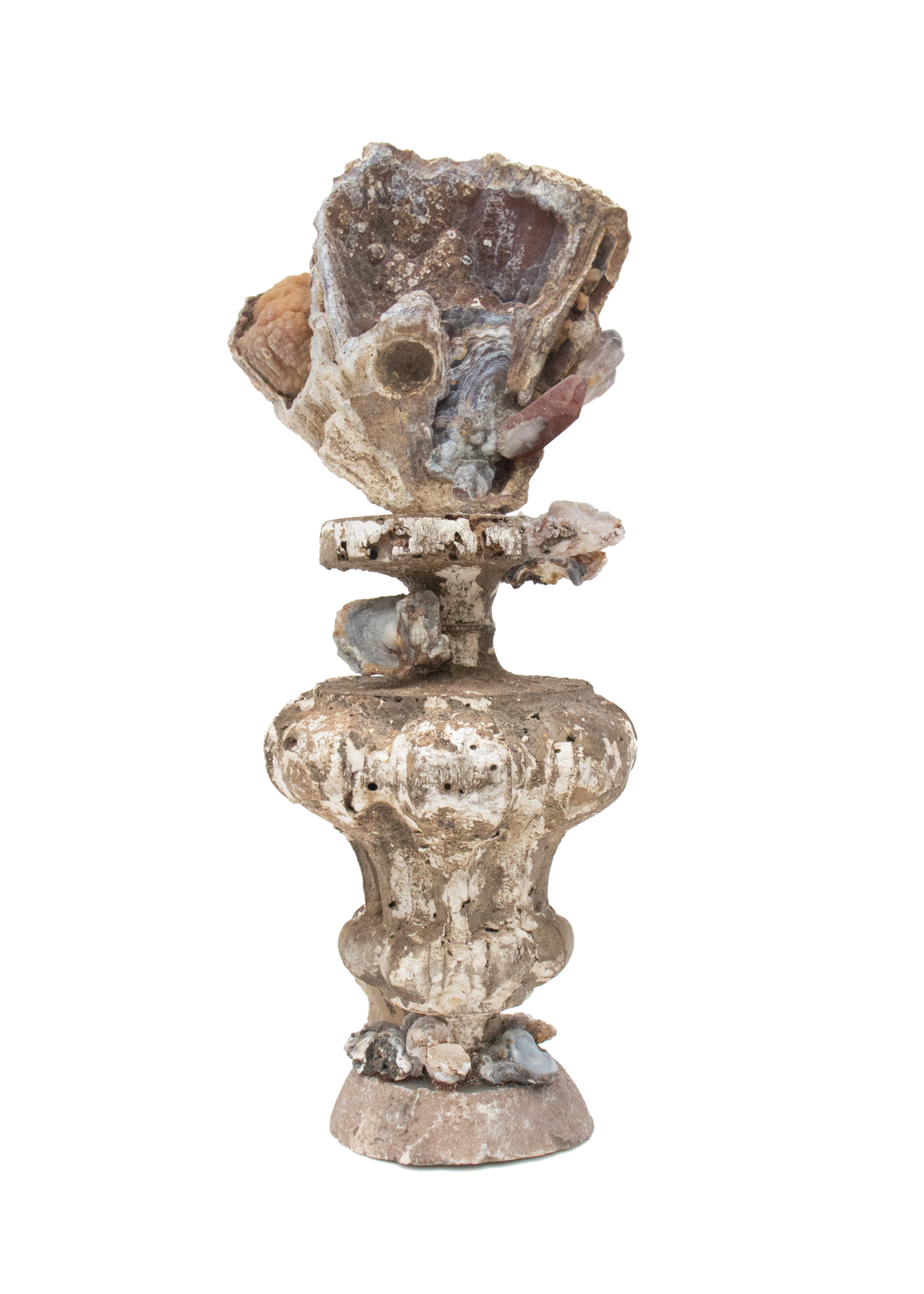
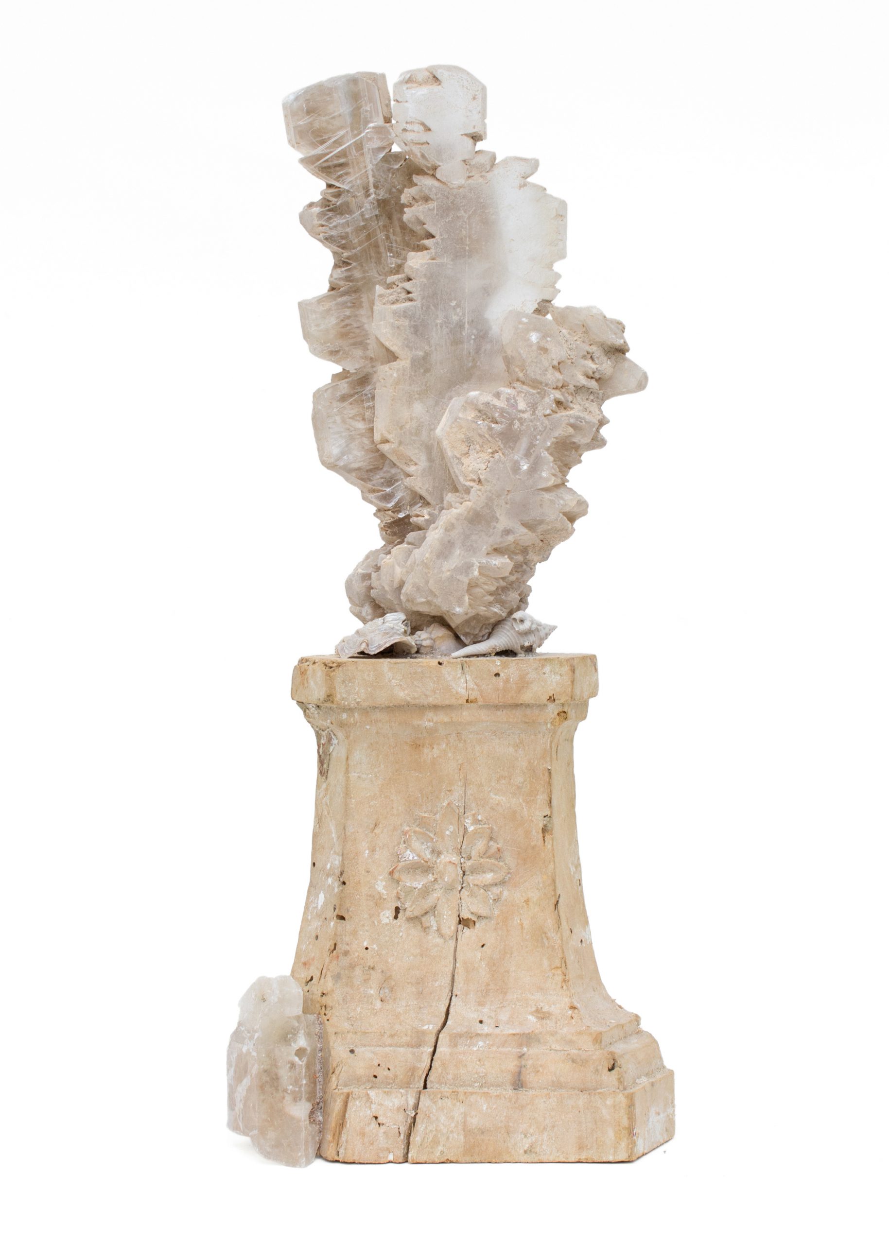
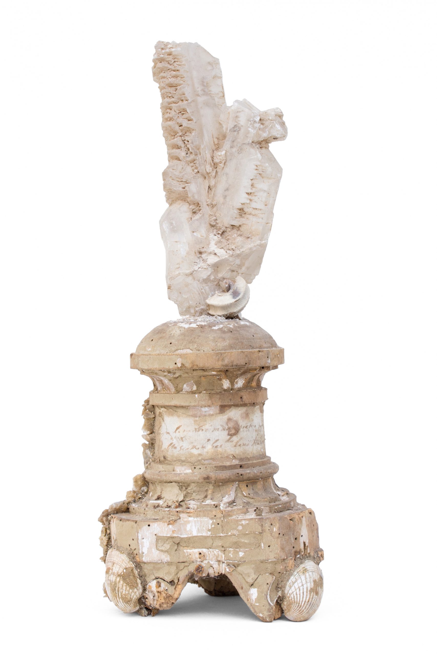
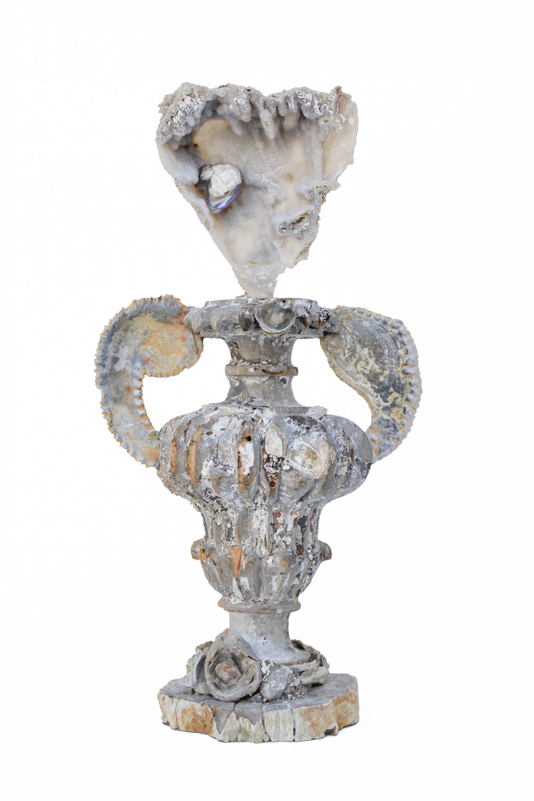
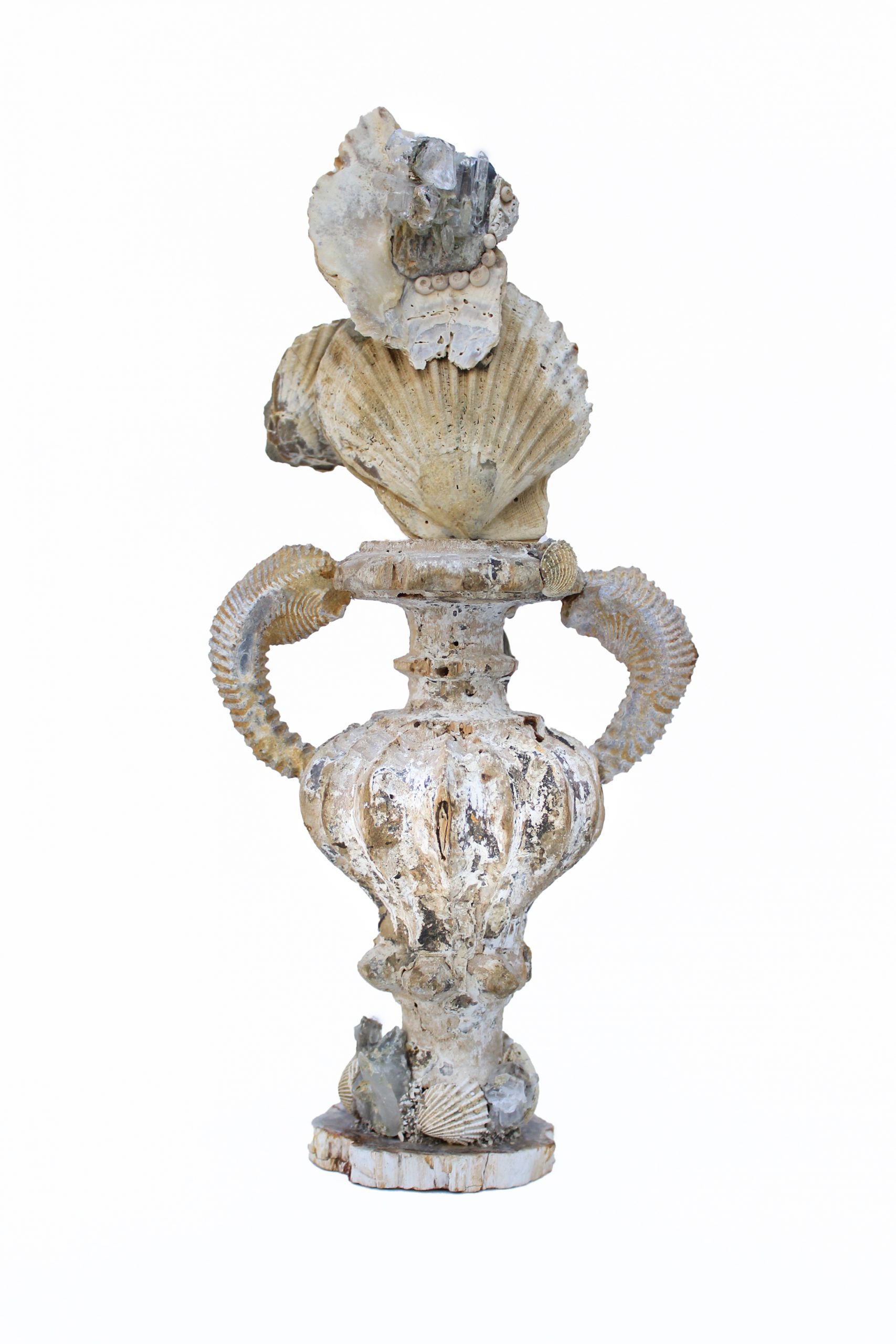
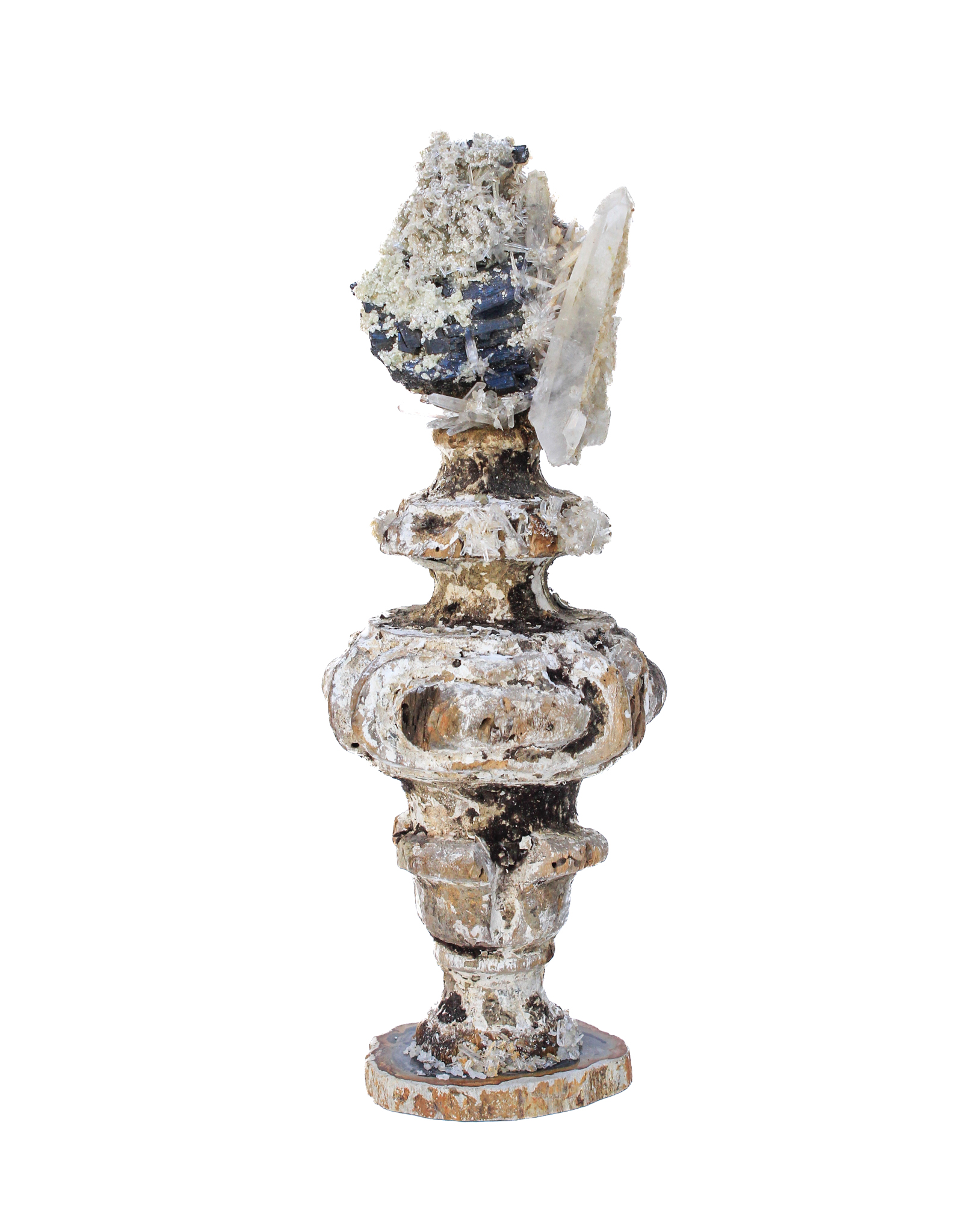
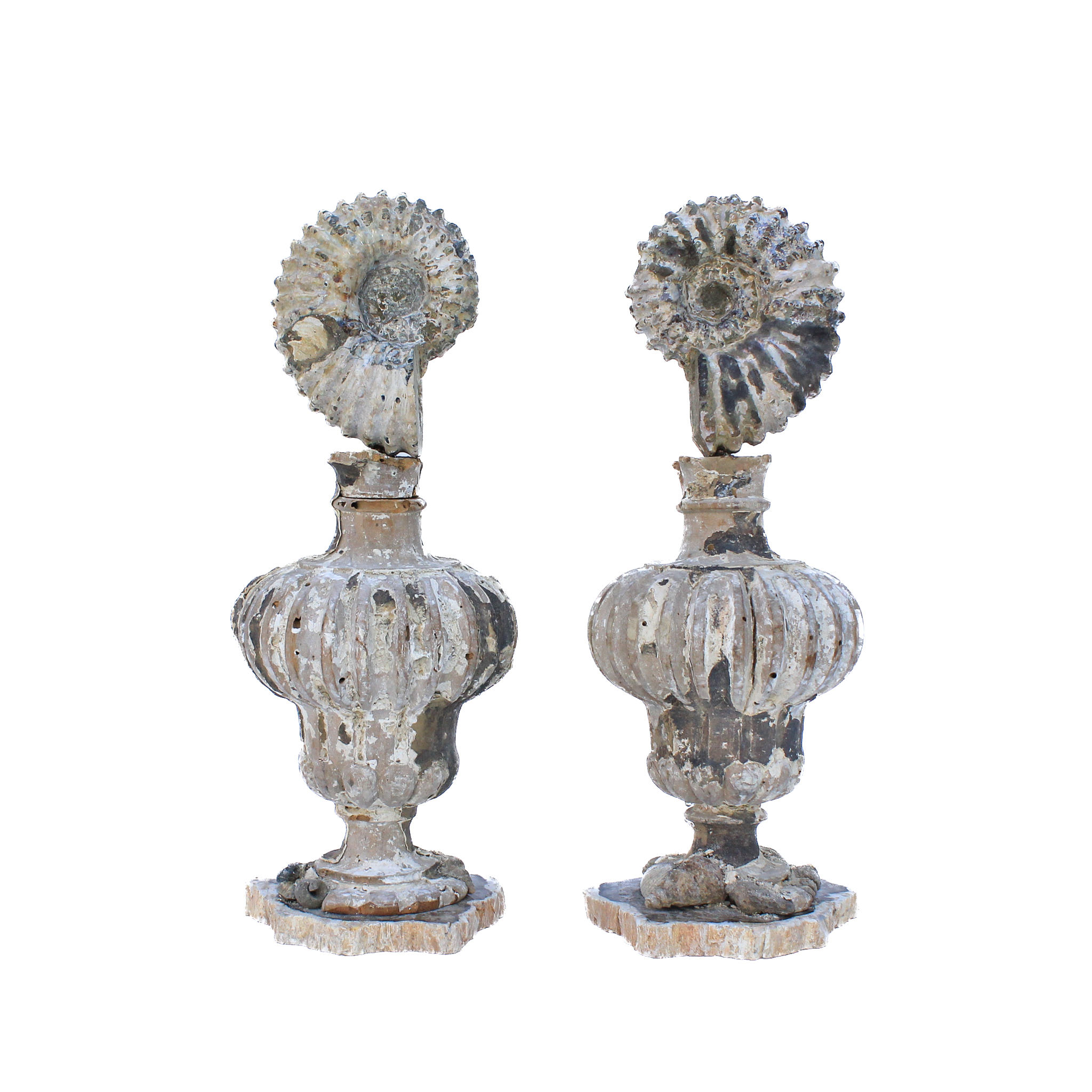
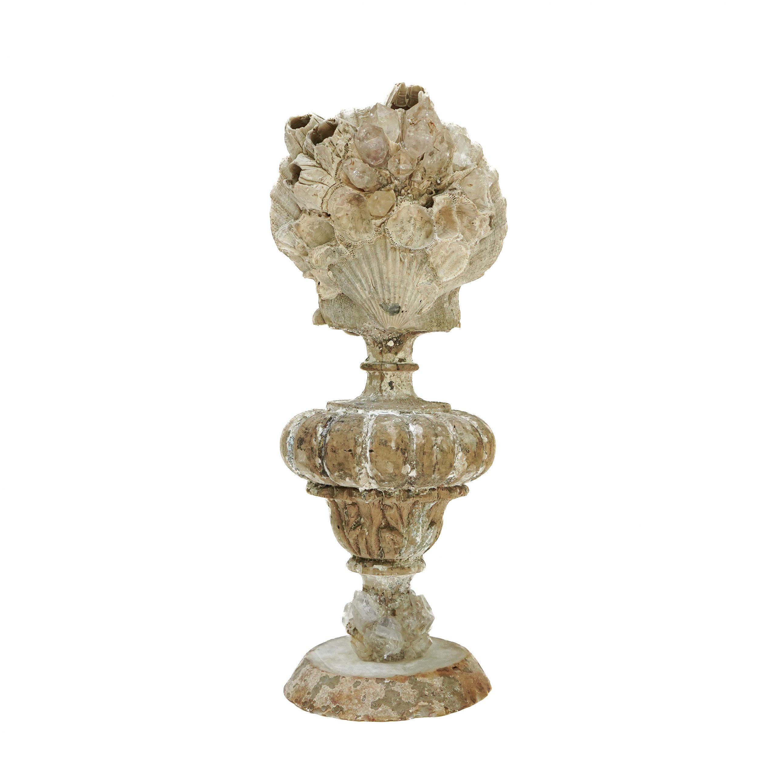
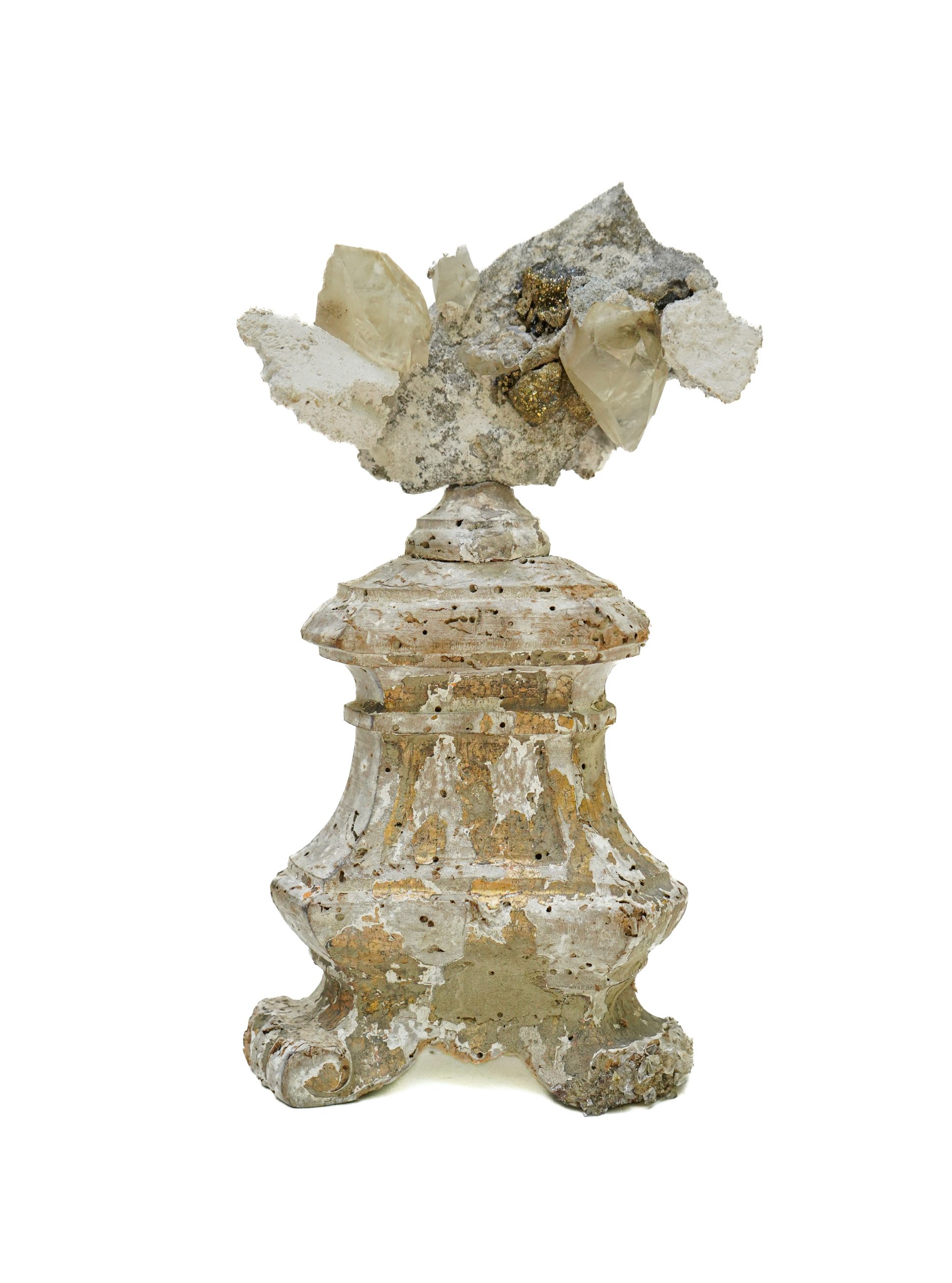
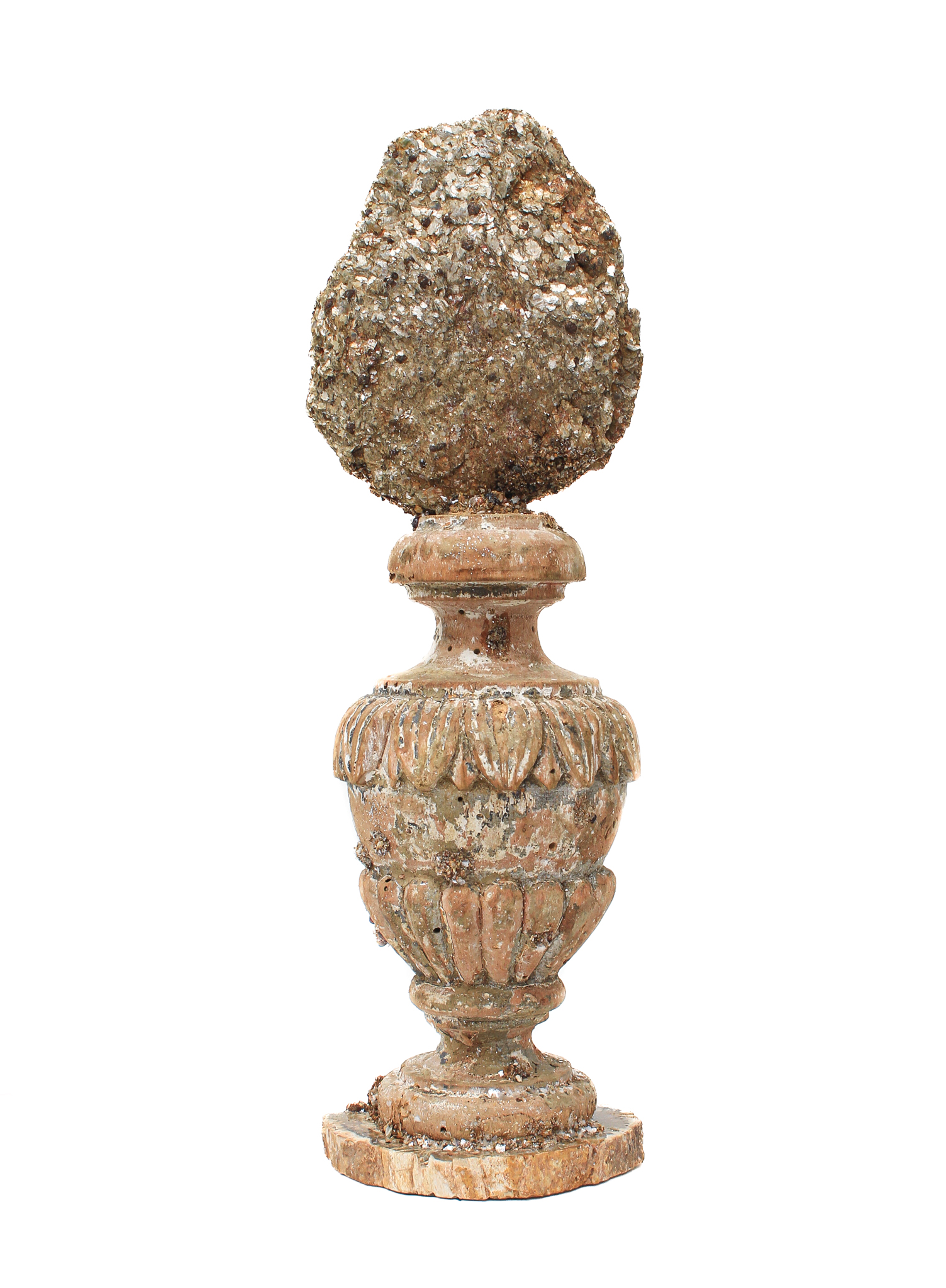
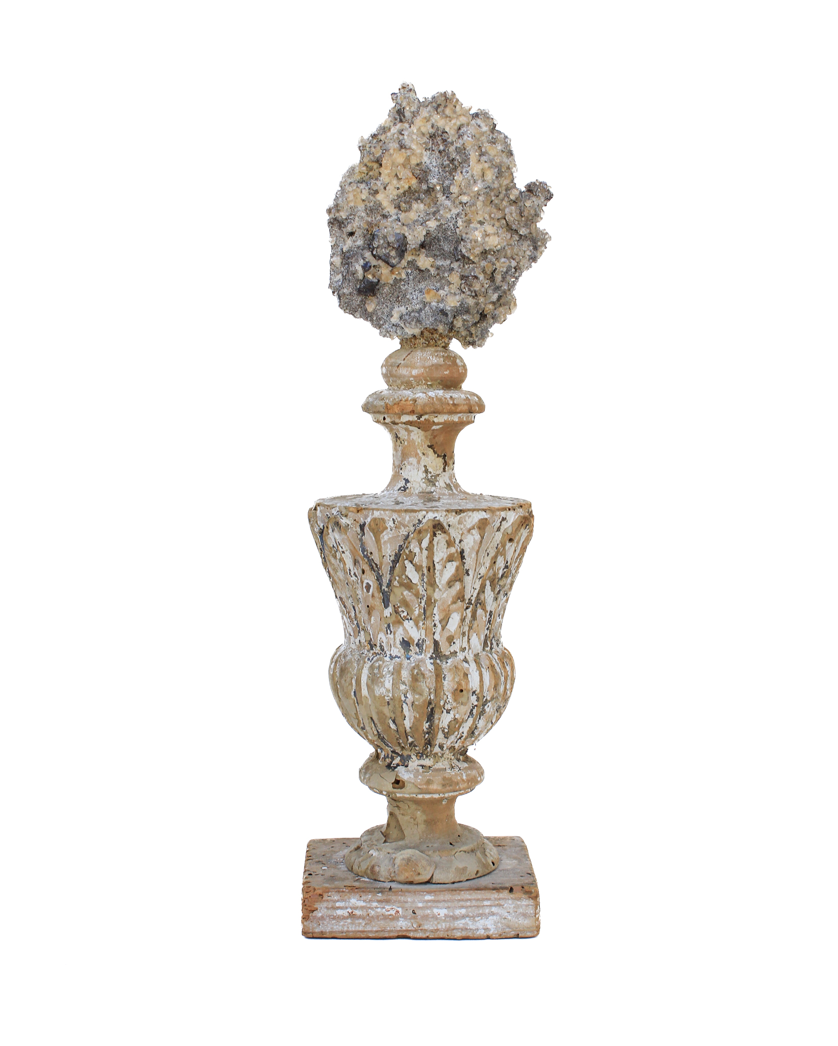
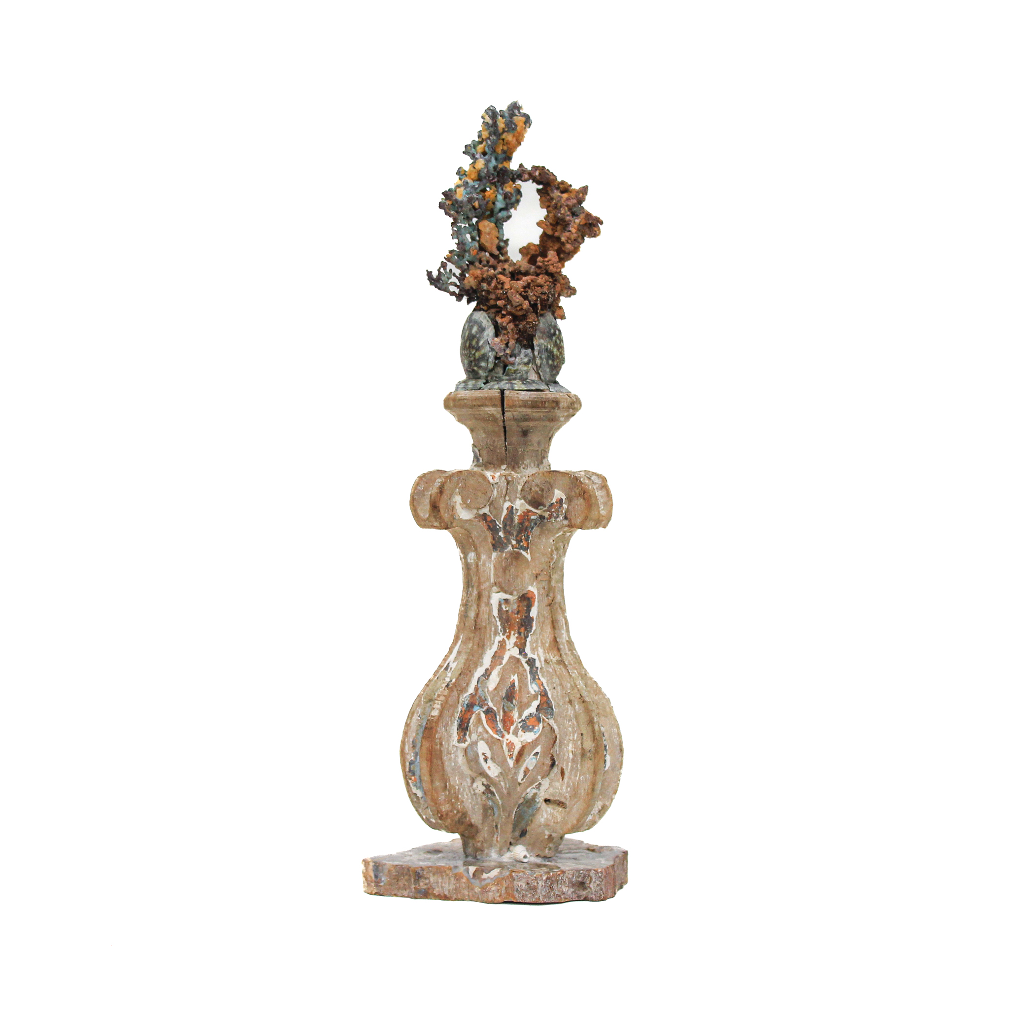
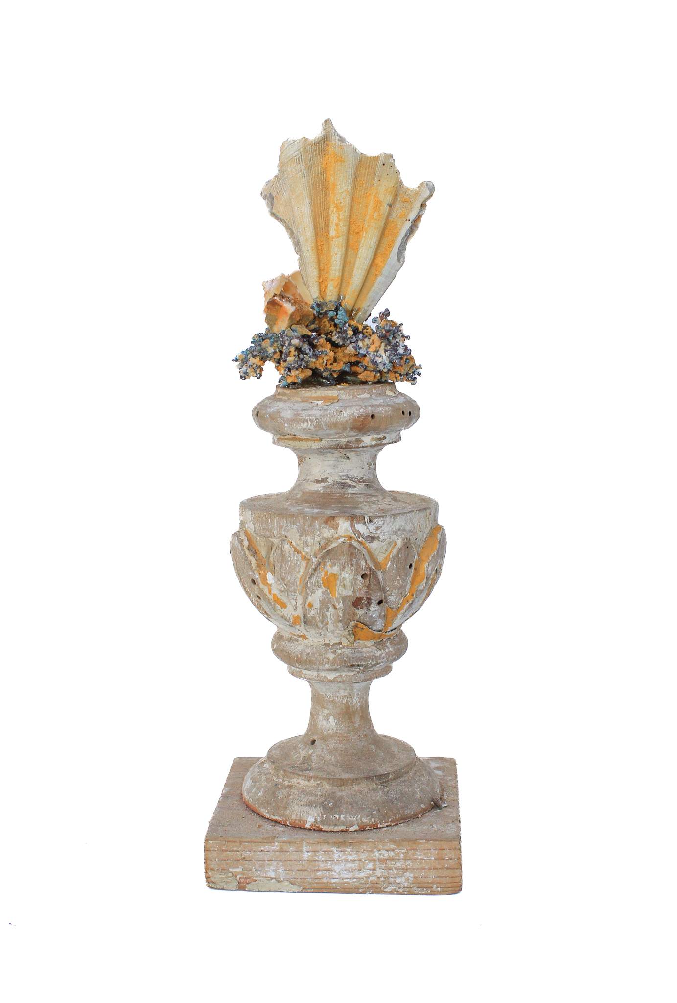
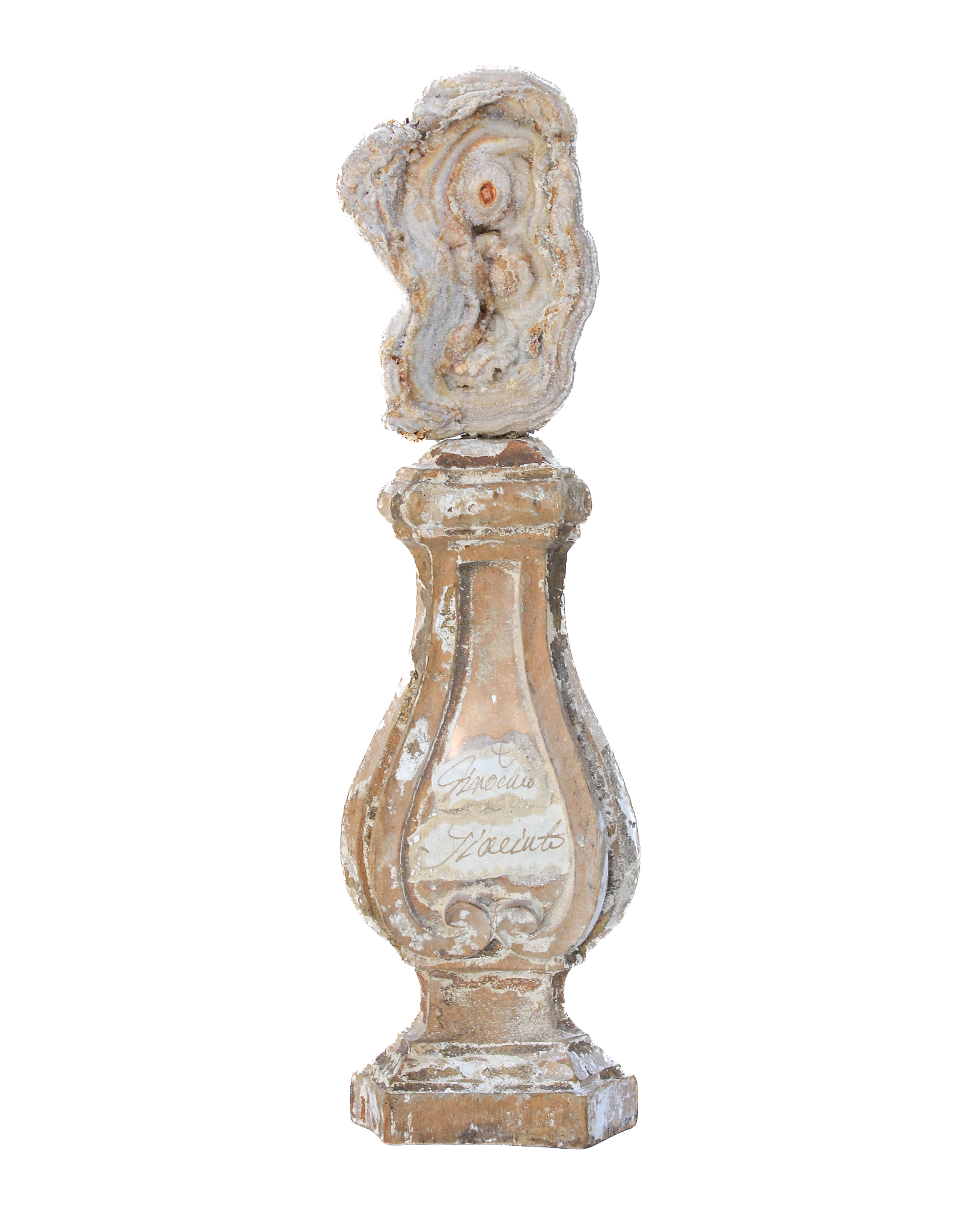
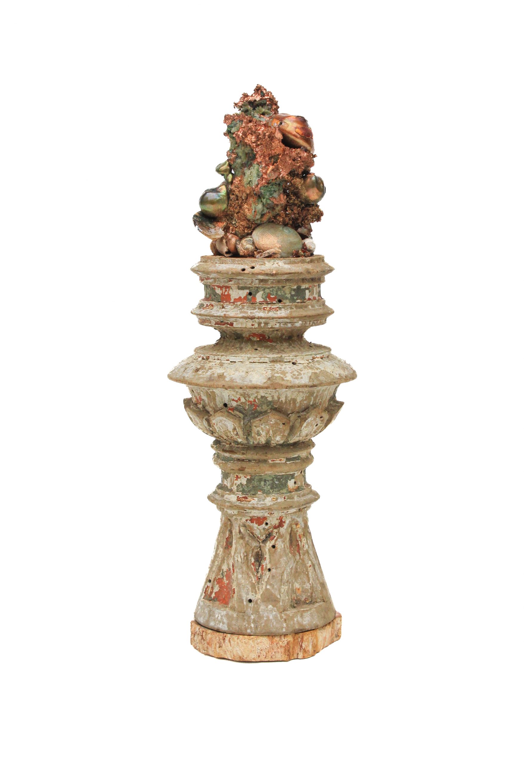
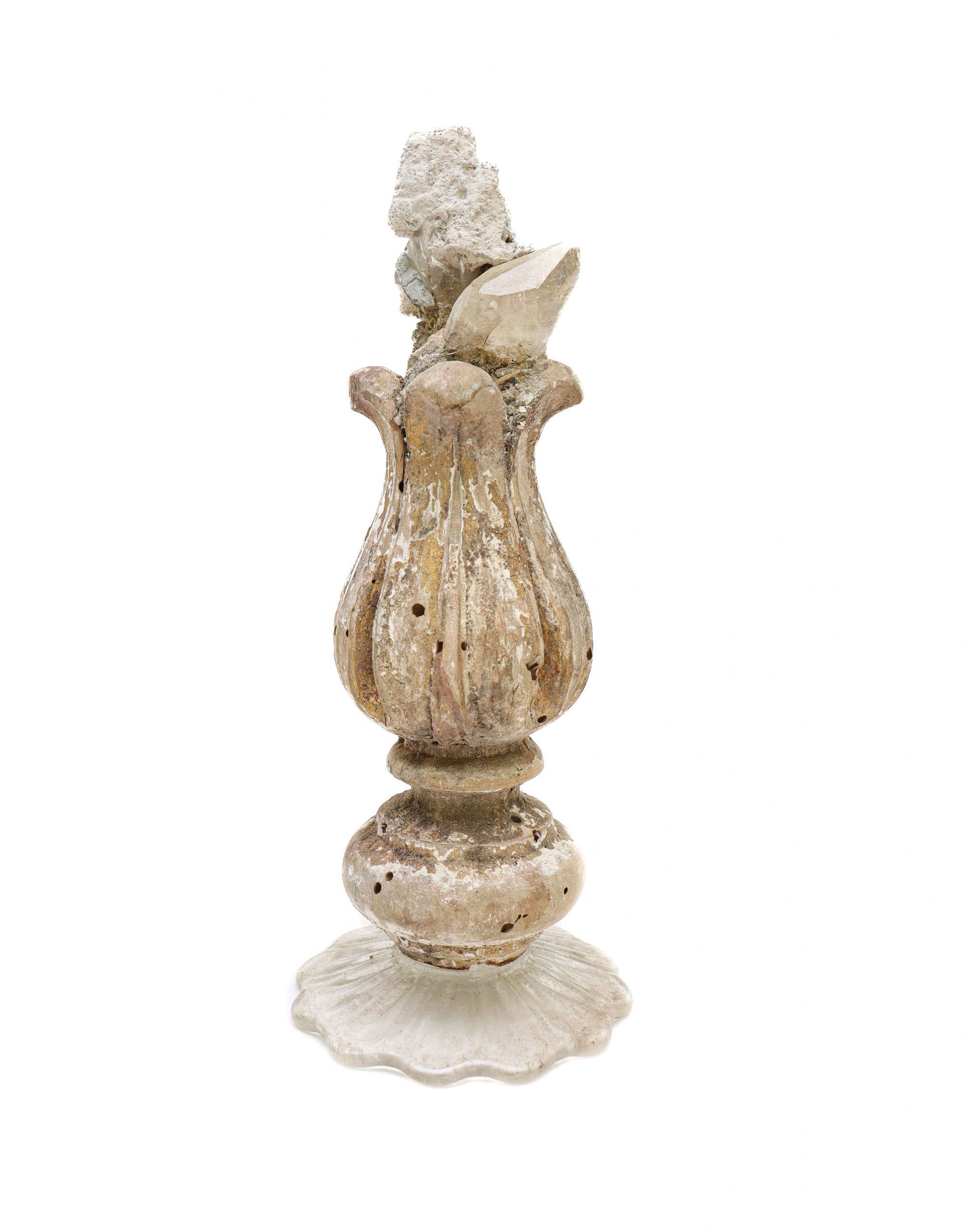
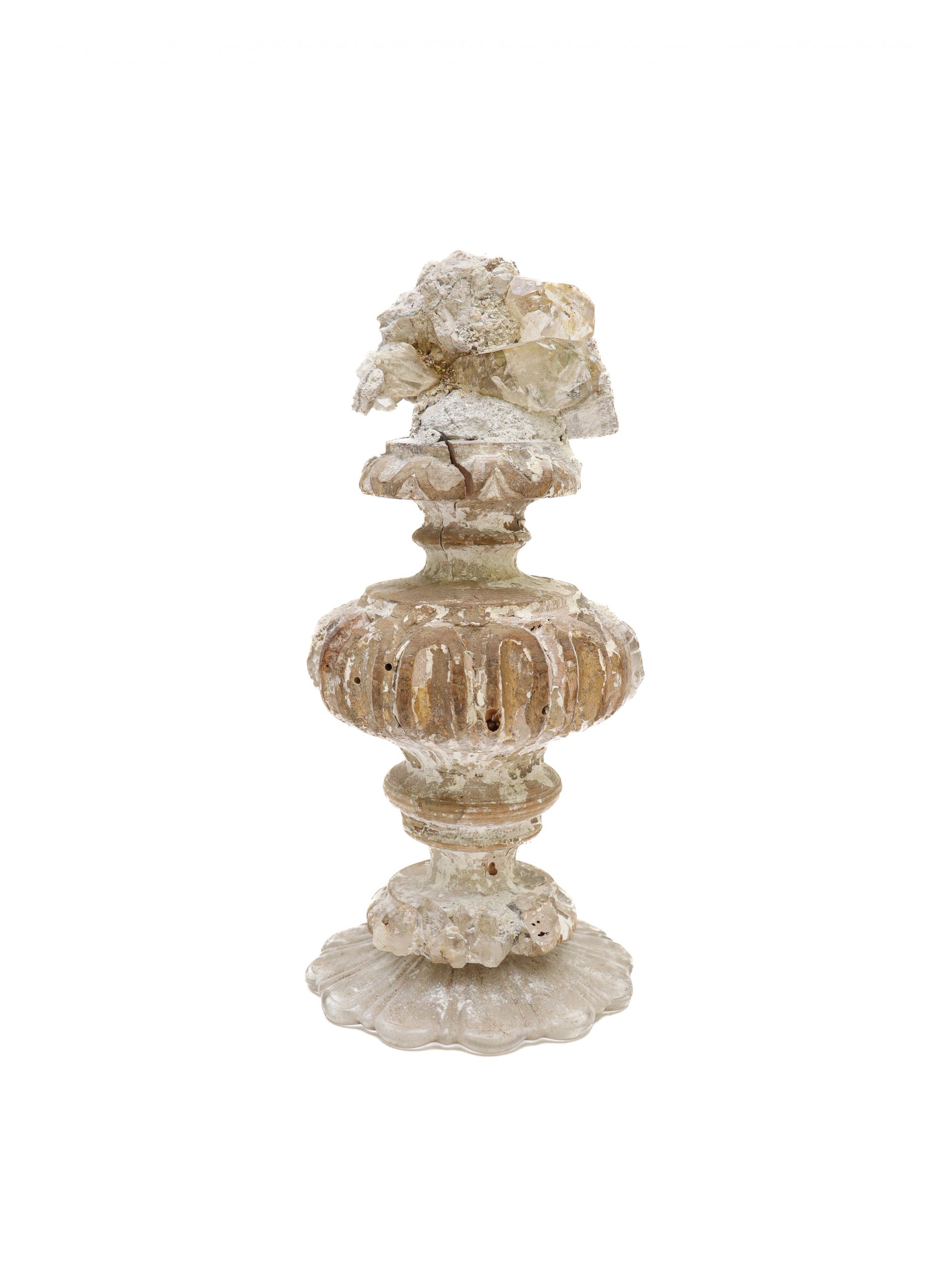
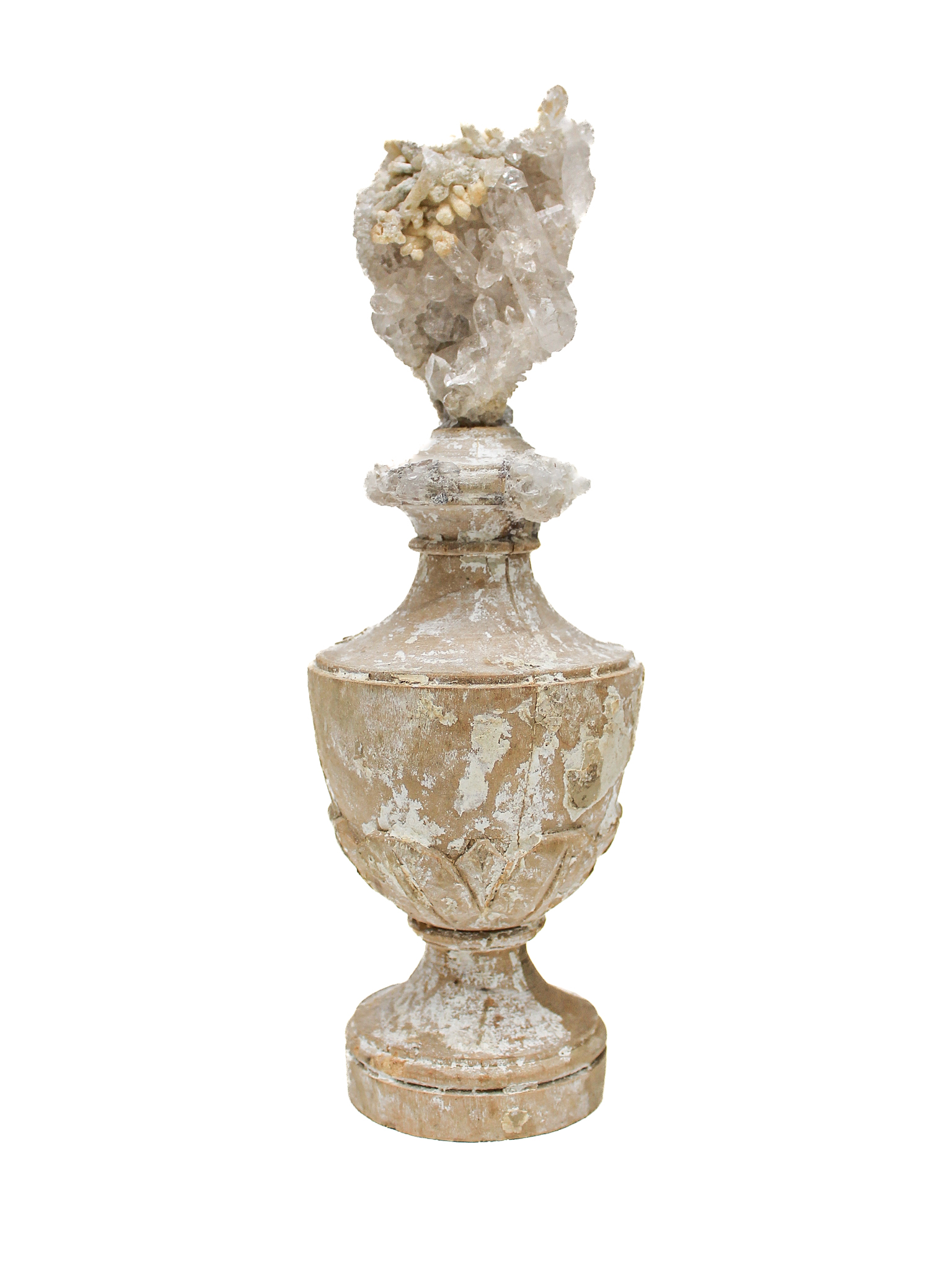
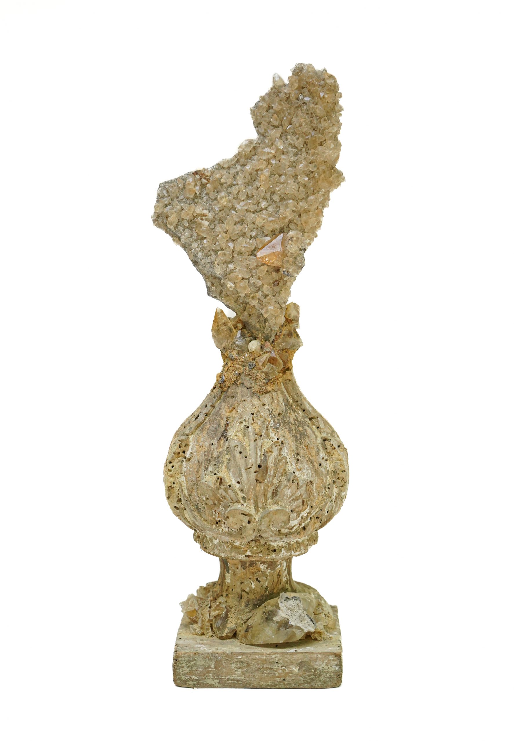
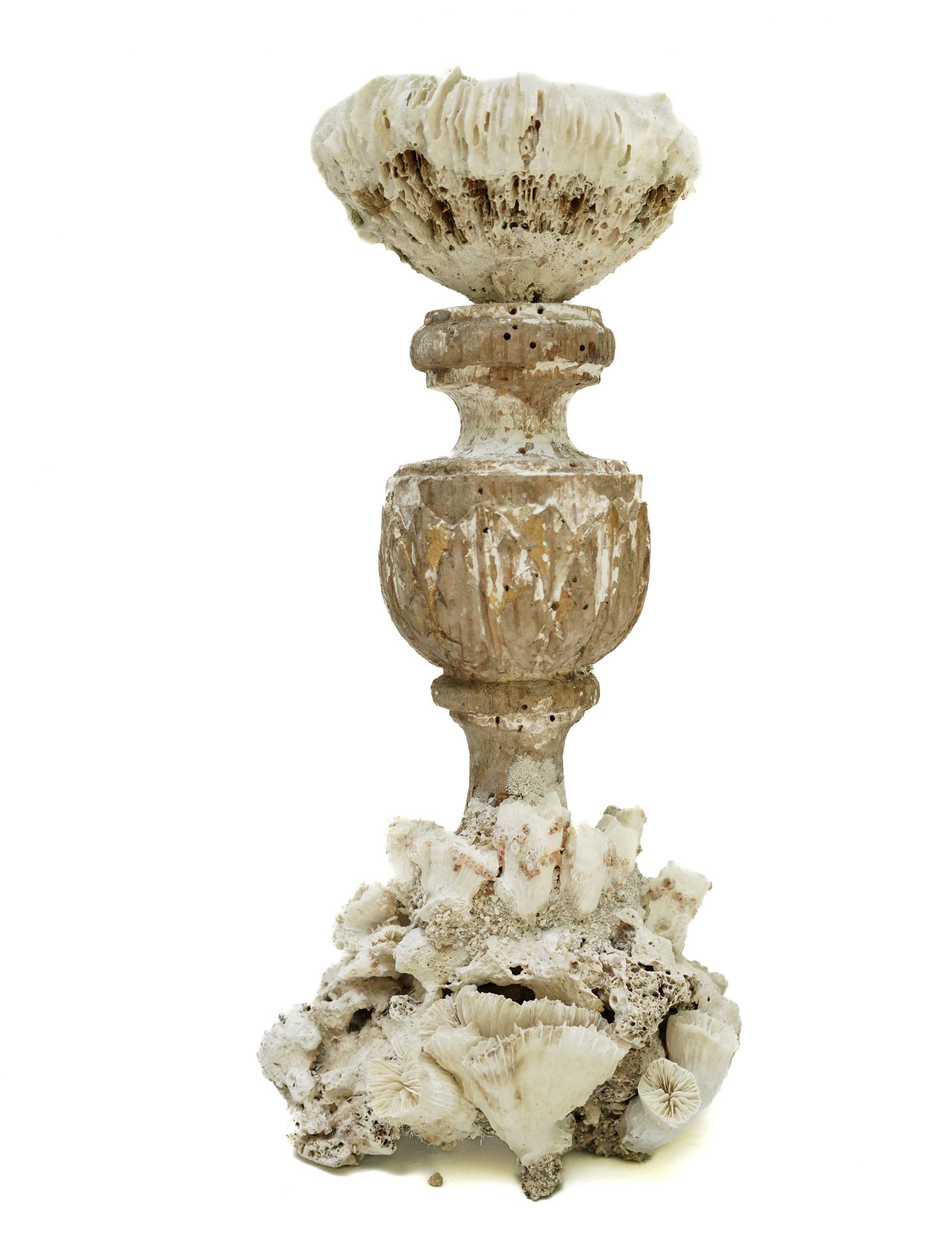
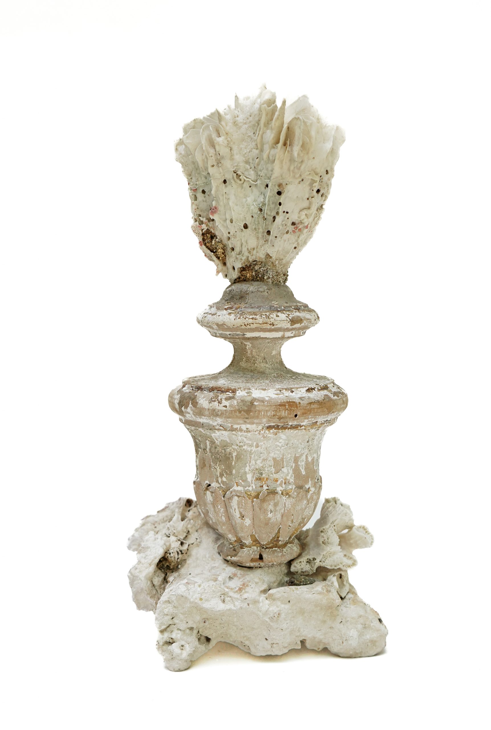
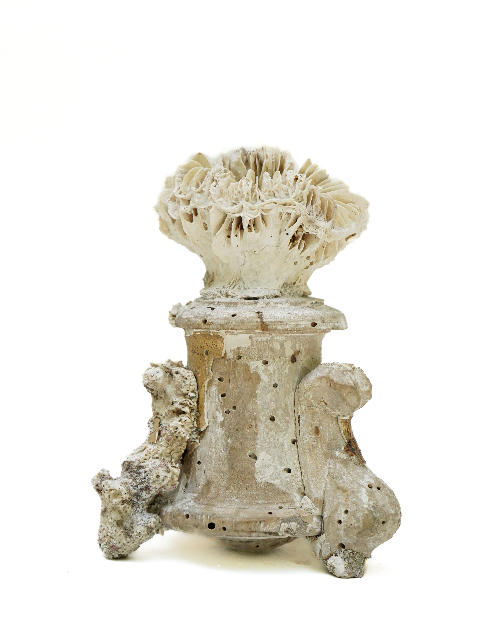
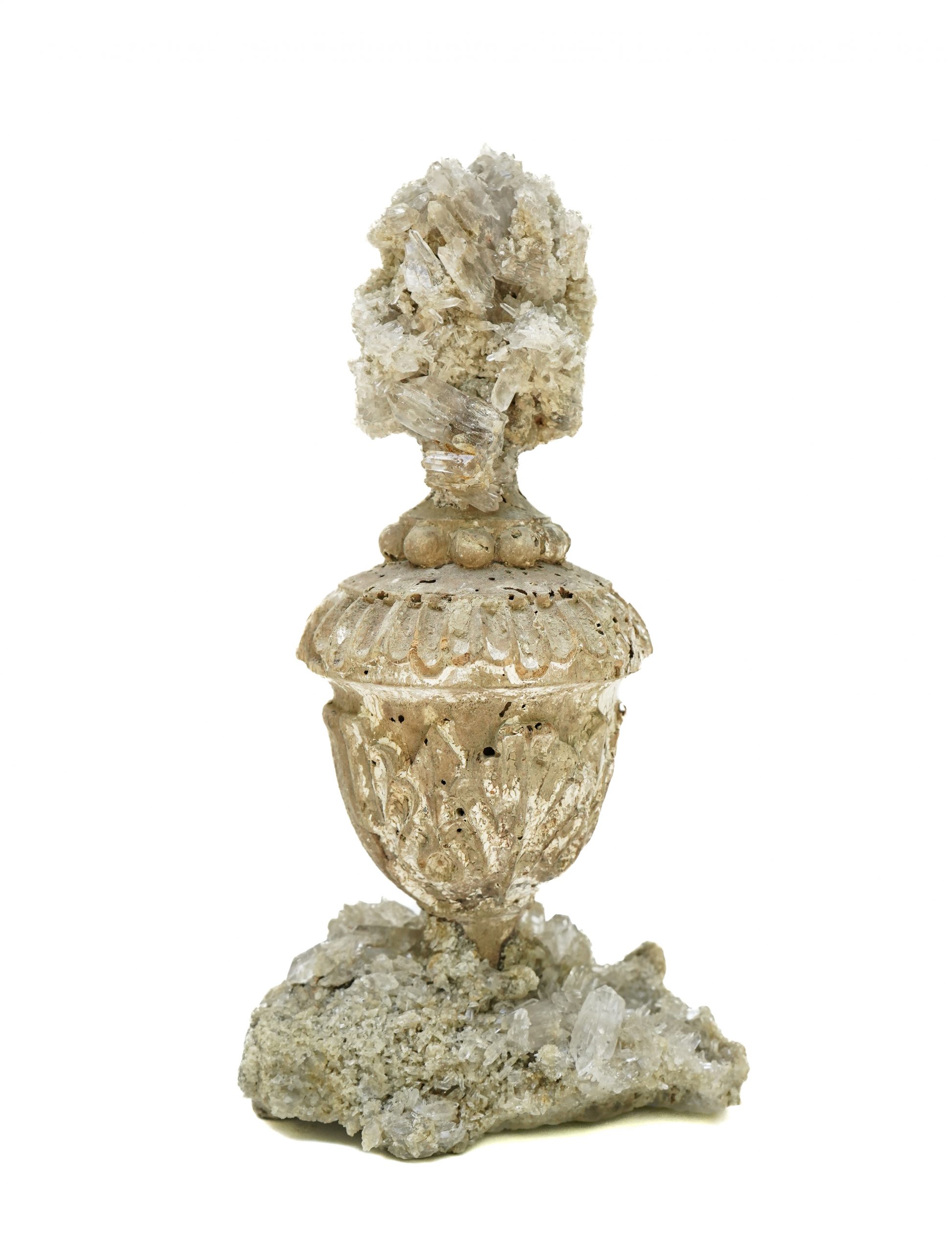
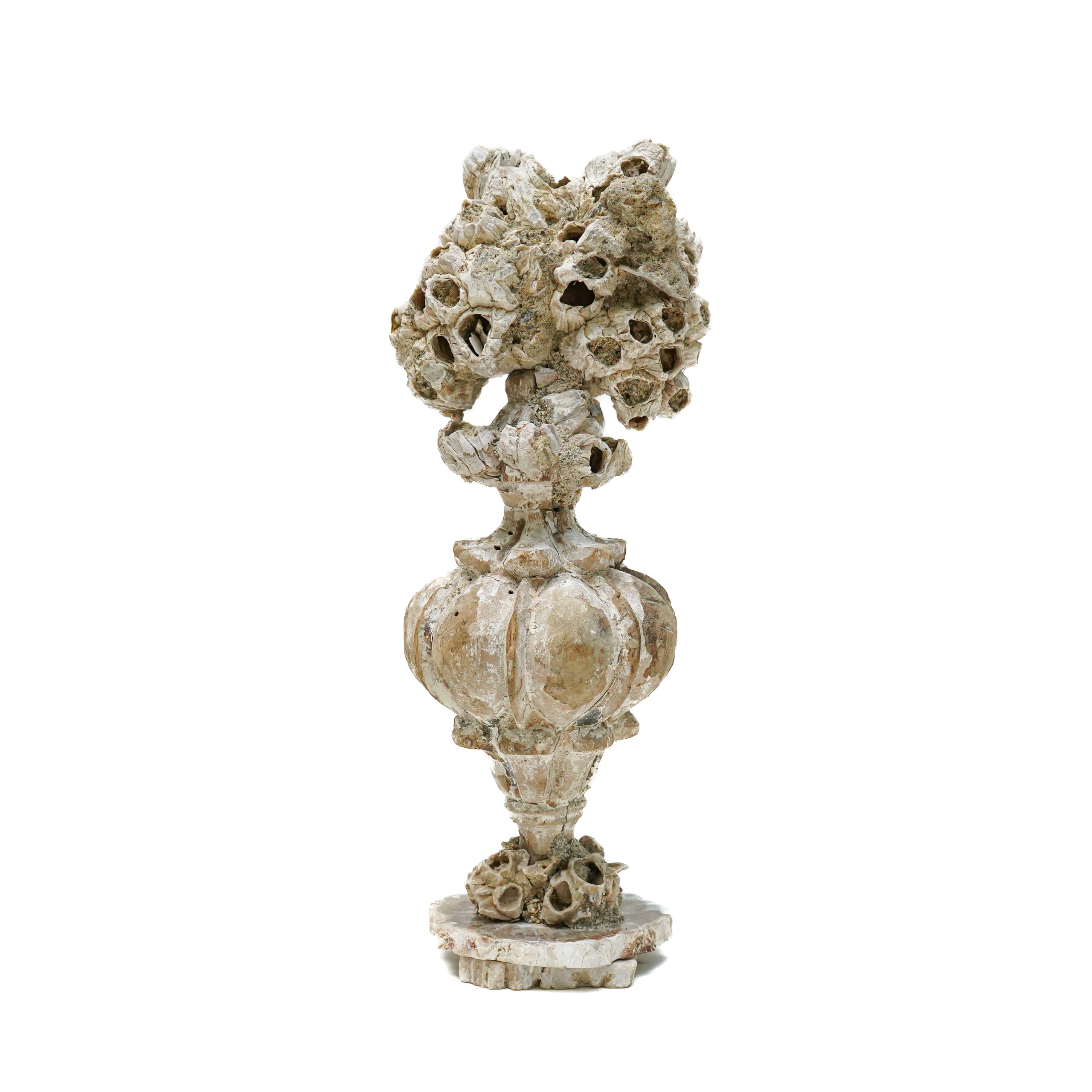
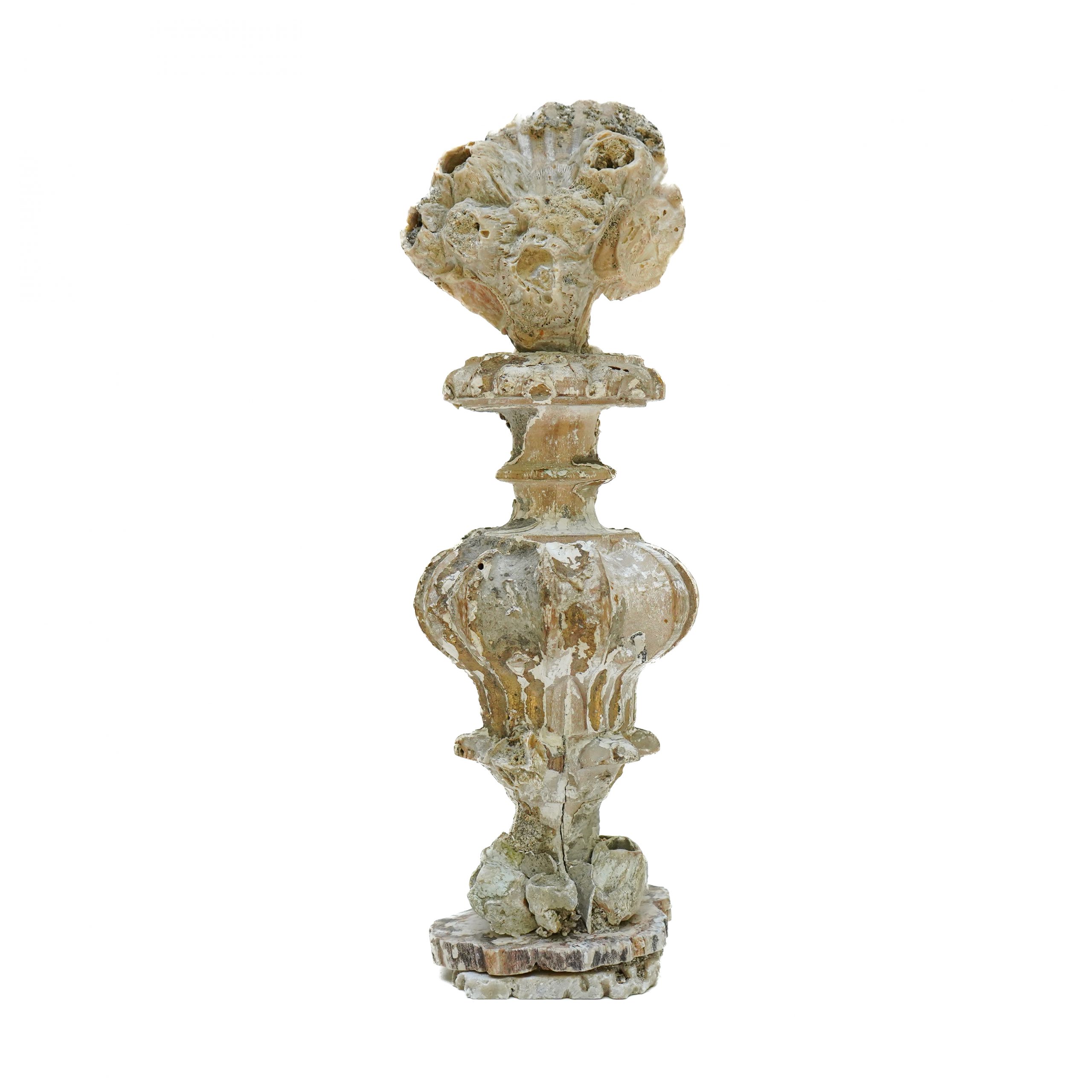
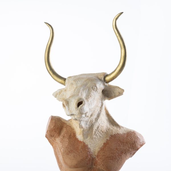
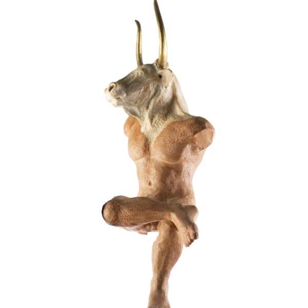
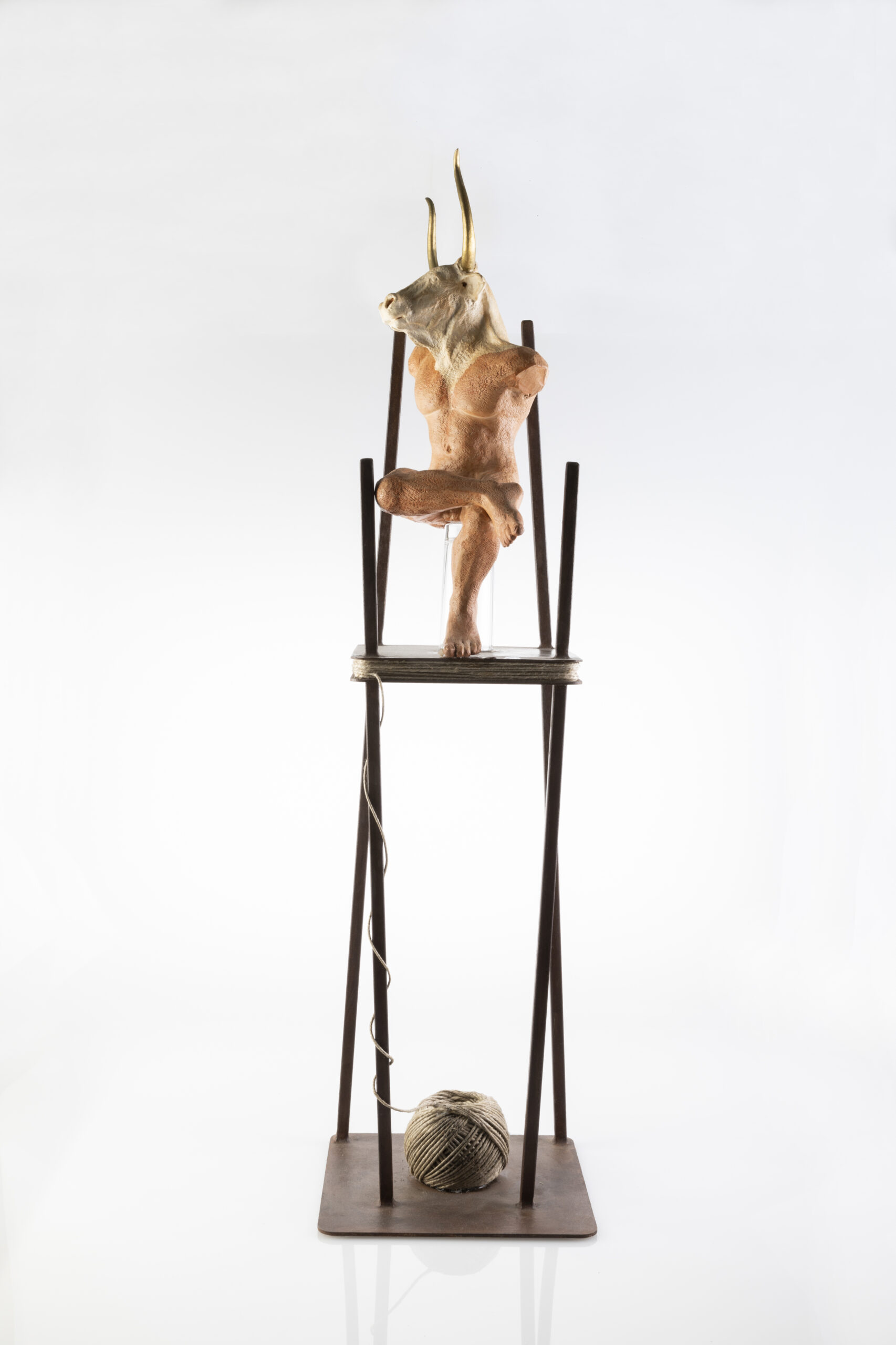
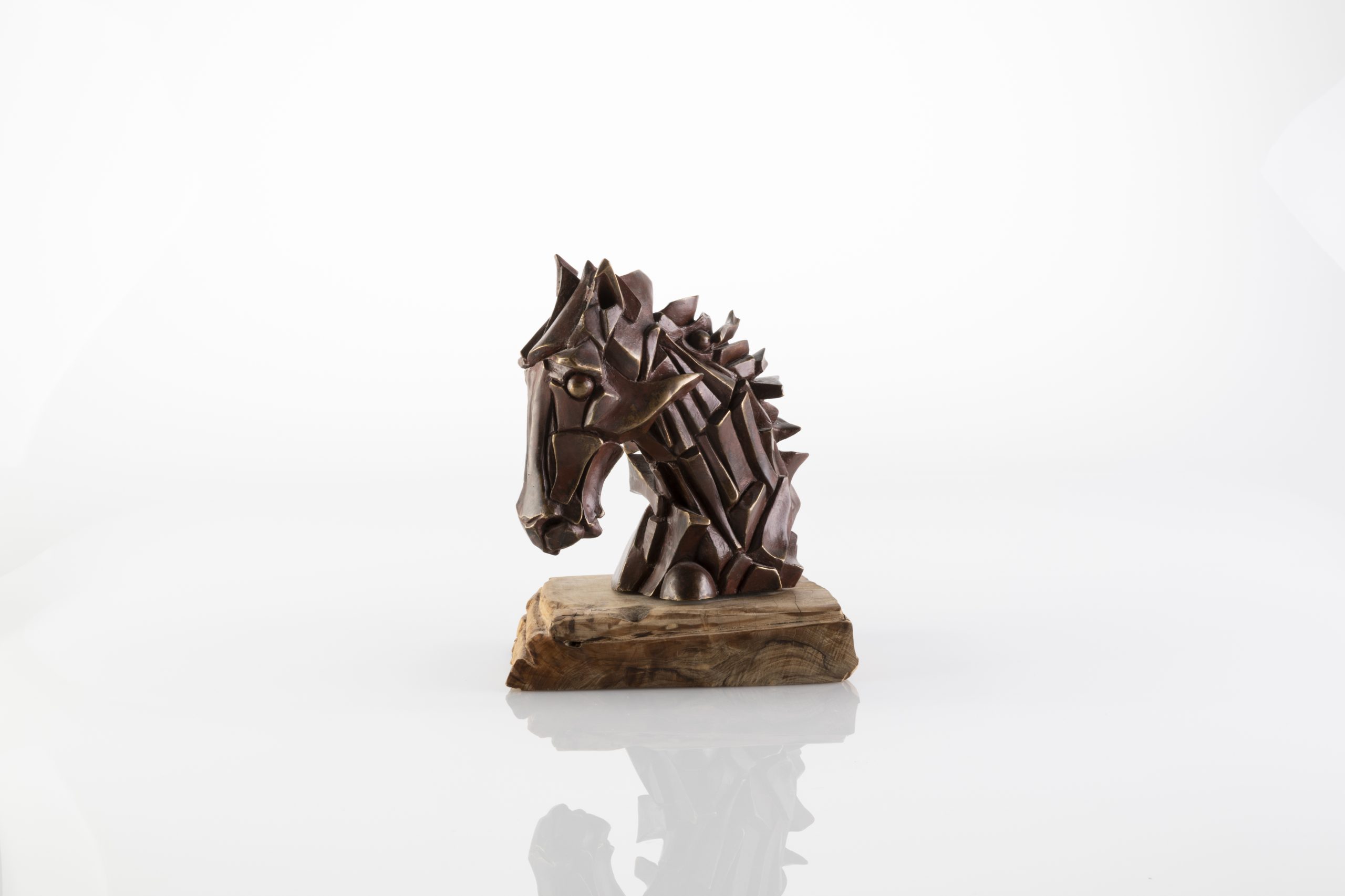
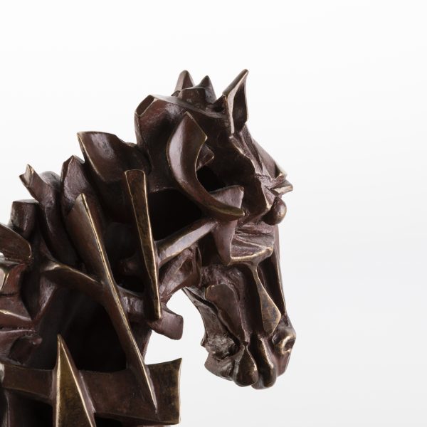
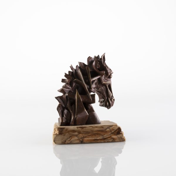
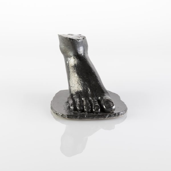
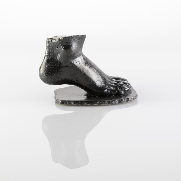
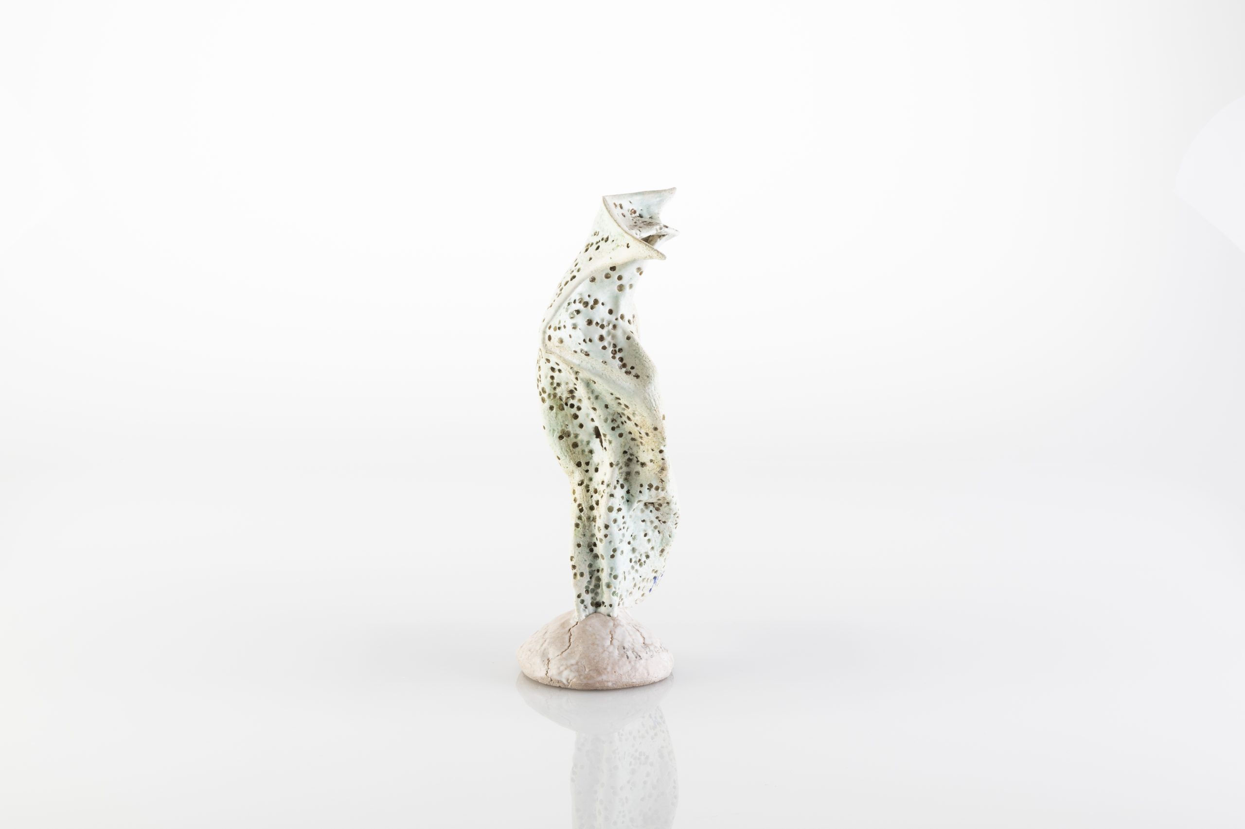
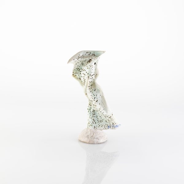
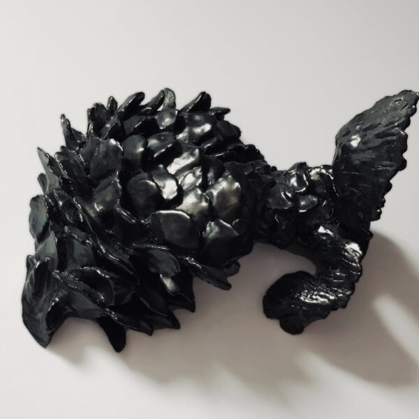
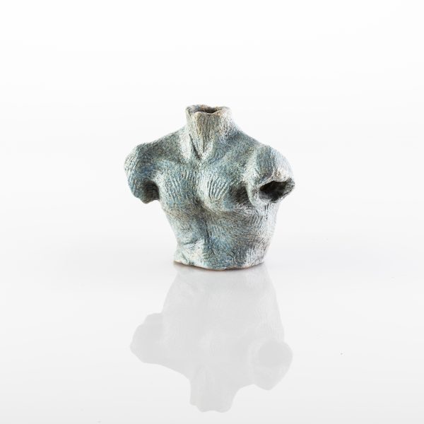
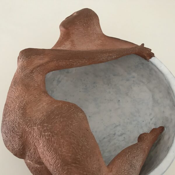
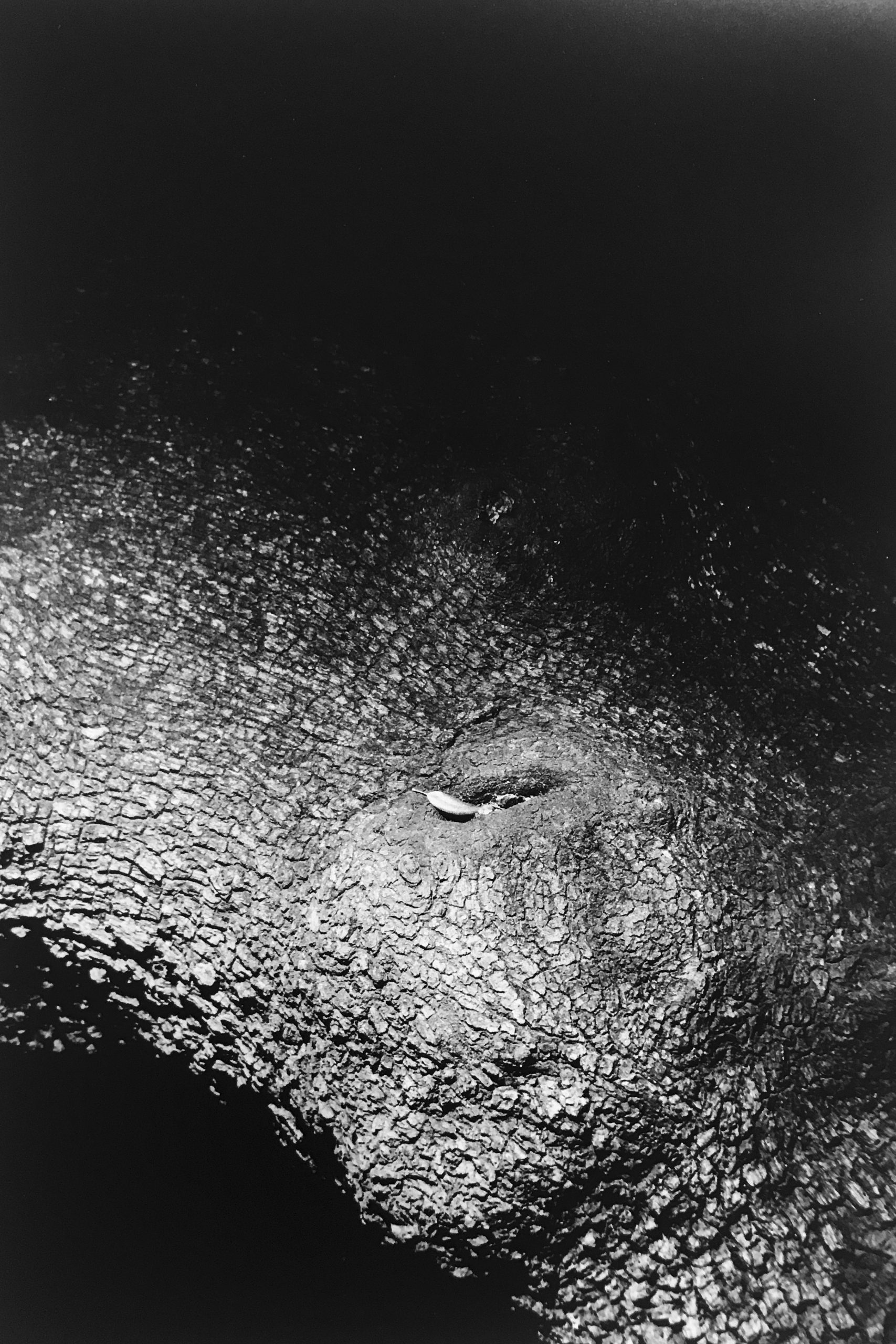
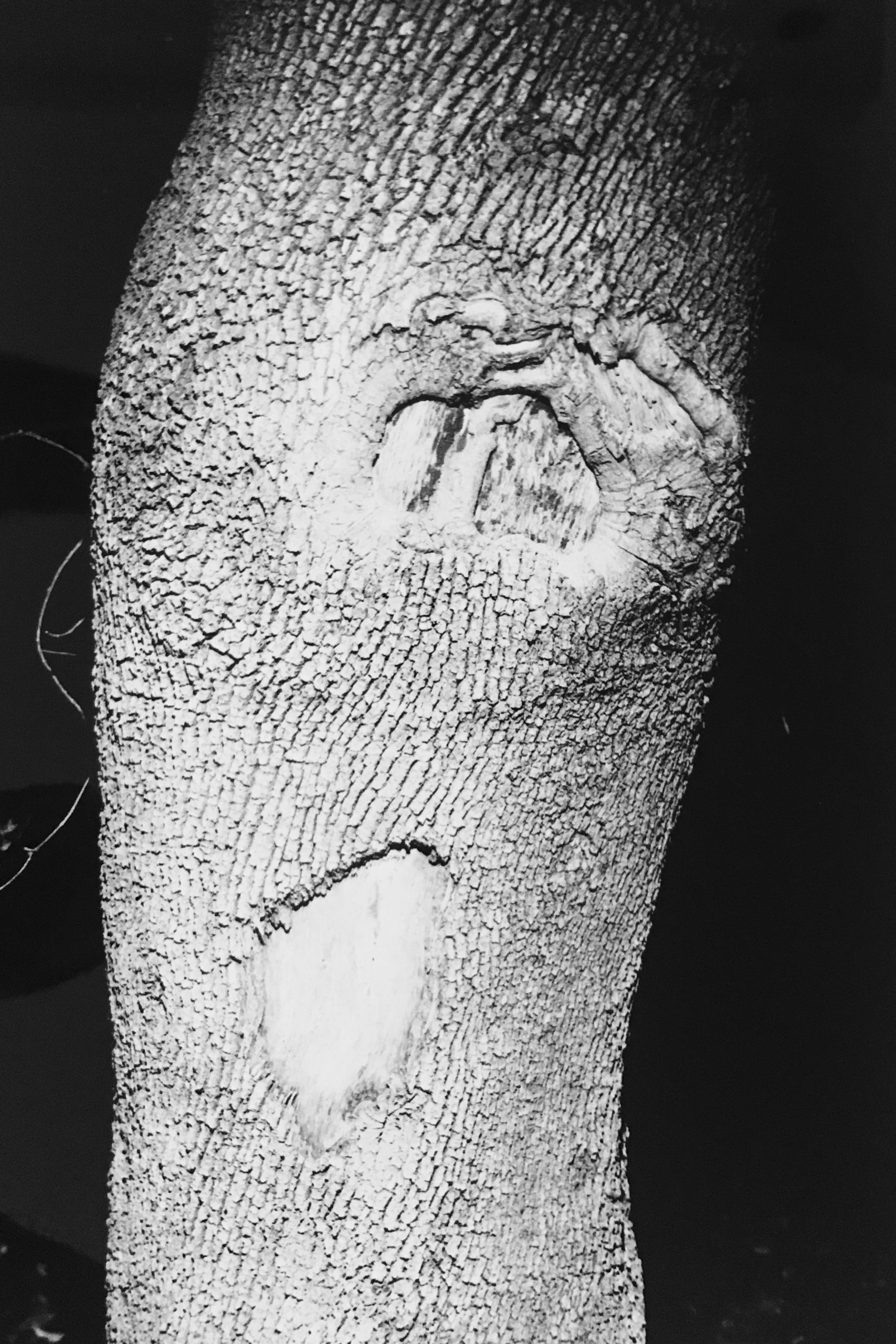
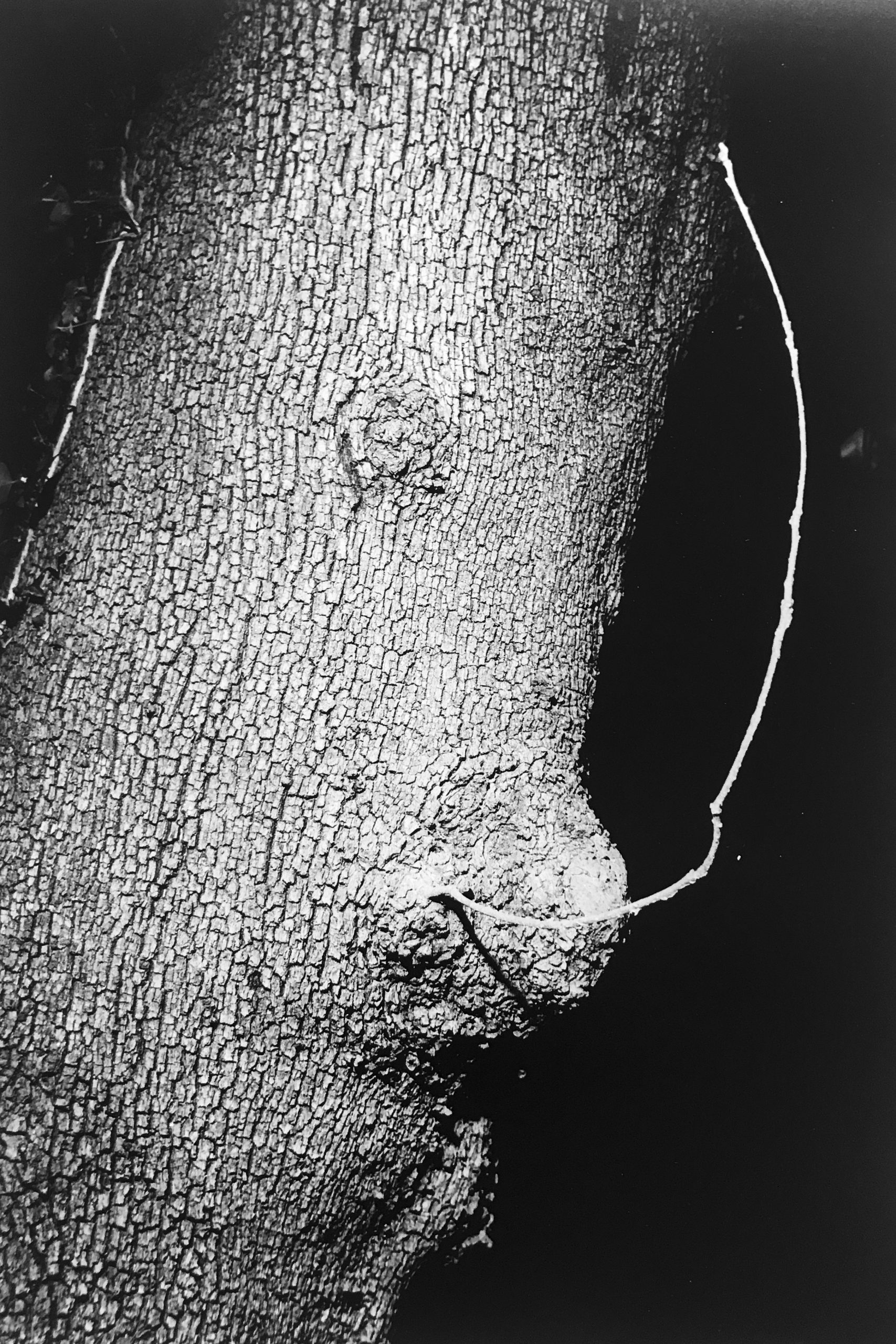
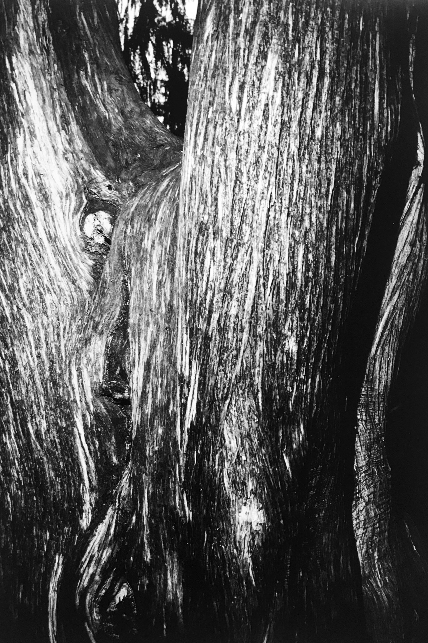
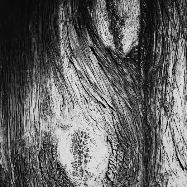
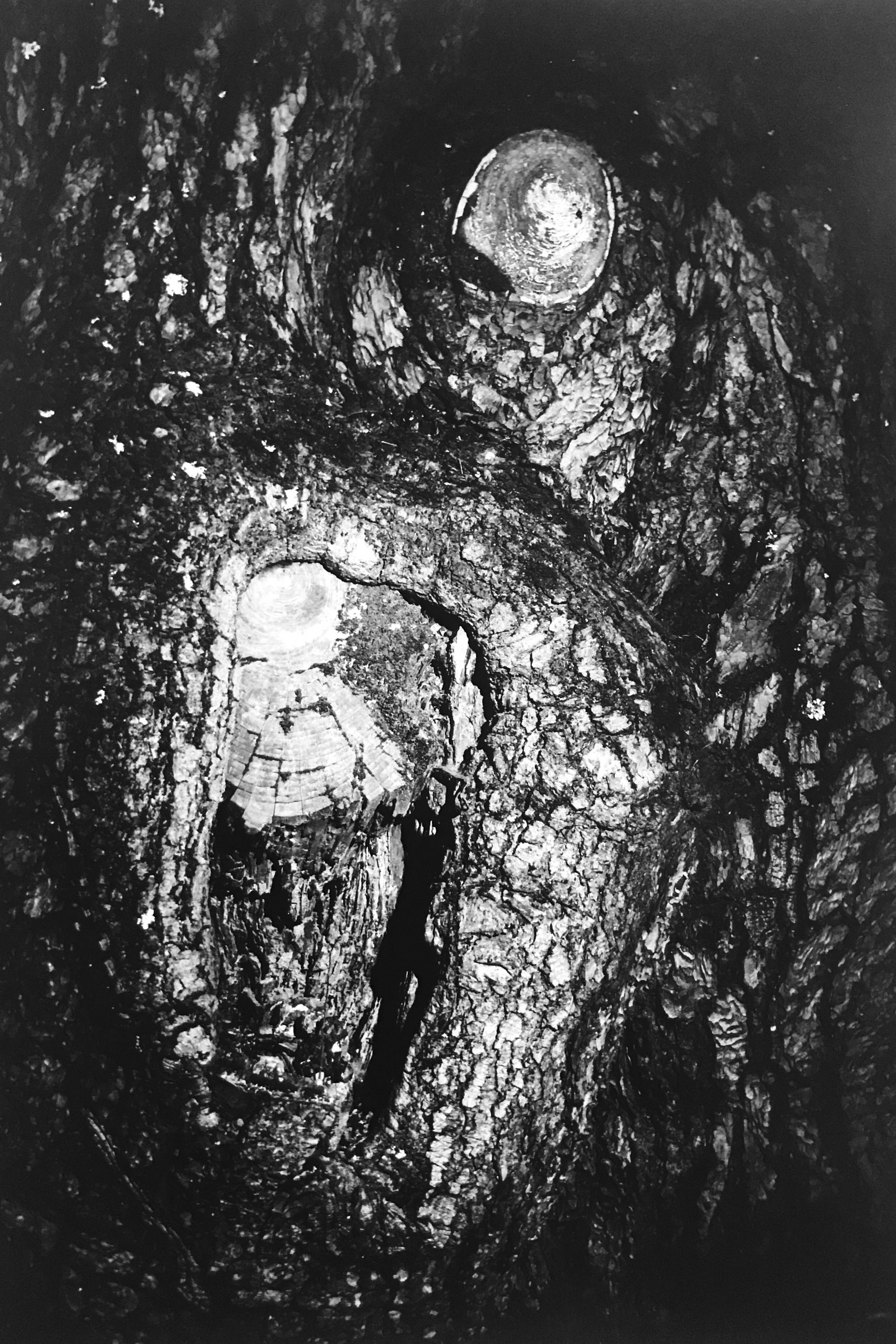
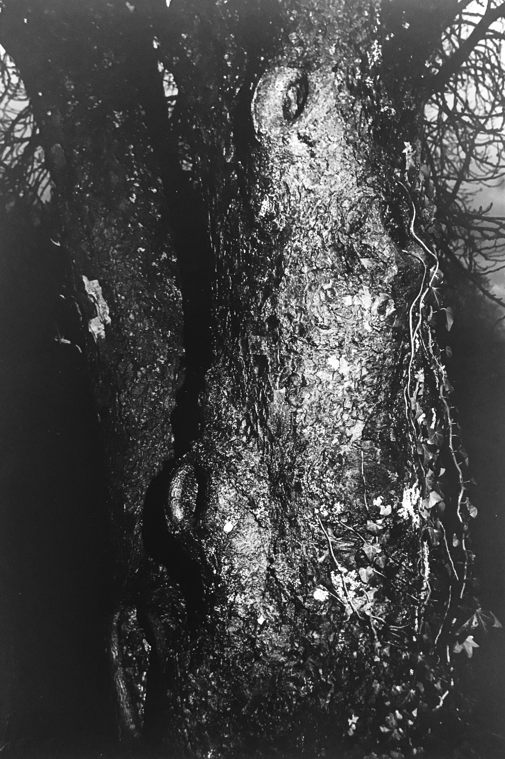
Years ago, Interi founder and creative director, Jean O’Reilly Barlow began to take interest and buy fragments found from the Florence flood out of her own fascination. She purchased them from a colleague who bought them from a wealthy Florentine man. At the time of the flood, he and his helpers took notice of the church artifacts floating through the streets and began to gather and collect as many gilded antiquities as they could. He had a place up the hill that they filled with all of the fragments. This magazzino remained completely closed for about thirty years. About 15 years ago, they allowed only a few select antique dealers and restorers in. Within a matter of five or six years, this man’s collection had entirely depleted, and no one was able to purchase any more.
Alcuni anni fa, la fondatrice e creative director di Interi, Jean O’Reilly Barlow, ha iniziato a riporre il proprio interesse nei frammenti antichi ritrovati durante l’alluvione di Firenze riconoscendone il fascino storico-artistico. Li ha acquistati da un collega che li aveva a sua volta comprati da un ricco signore fiorentino che, all’epoca dell’alluvione, insieme ai suoi aiutanti aveva notato gli artefatti ecclesiastici che galleggiavano per le strade e aveva iniziato a raccogliere e collezionare tutti gli antichi frammenti dorati che poteva reperire. Riempì di reperti storici un’antica villa di sua proprietà sui colli fiorentini che rimase completamente chiusa al pubblico per circa trent’anni. Circa 15 anni fa, venne concesso l’ingresso solo a pochi antiquari e restauratori selezionati. Nel giro di cinque o sei anni, la collezione del ricco signore andò esaurendosi e nessuno fu più in grado di acquistare tali reperti.
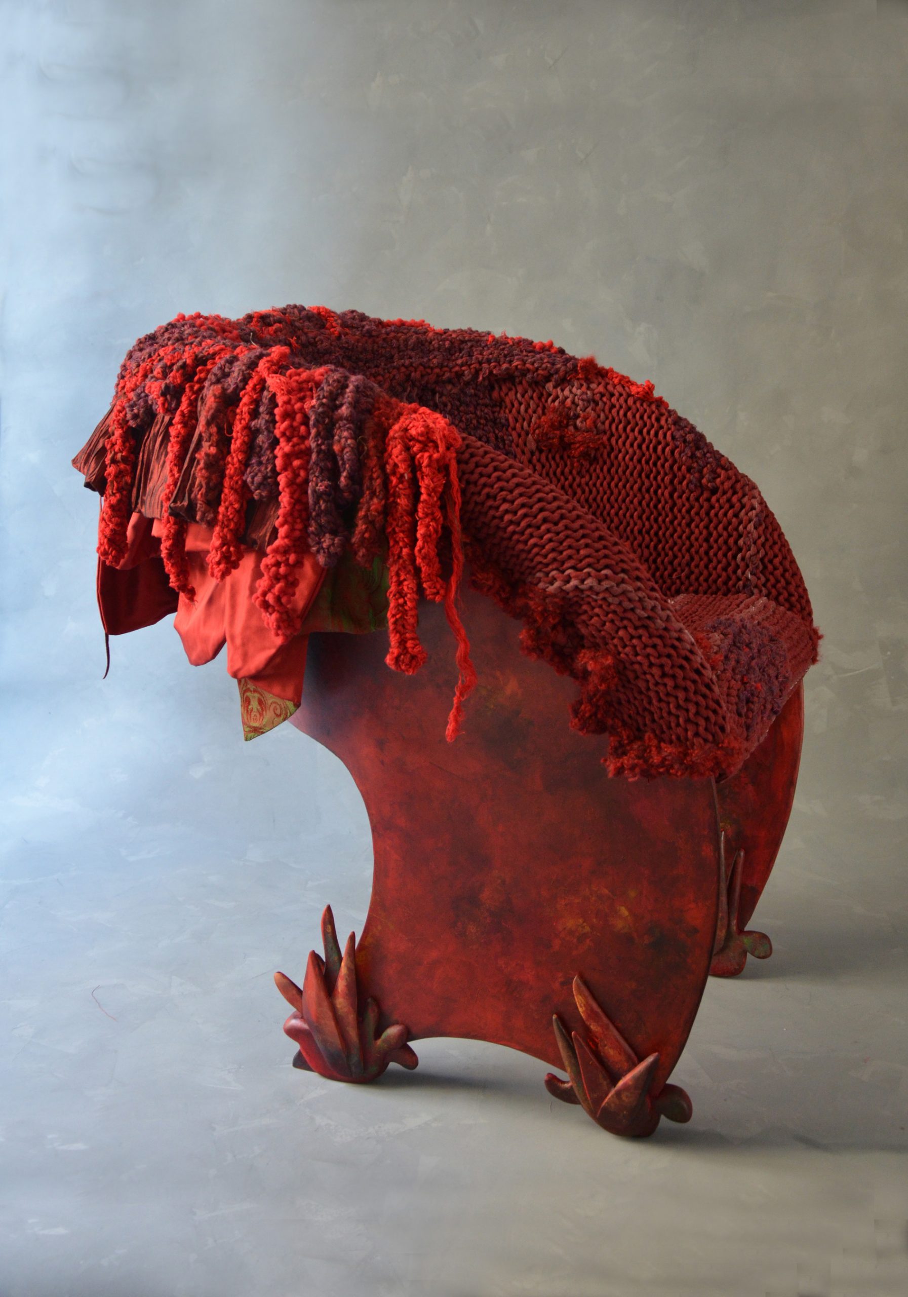
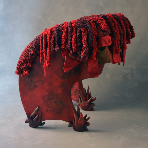
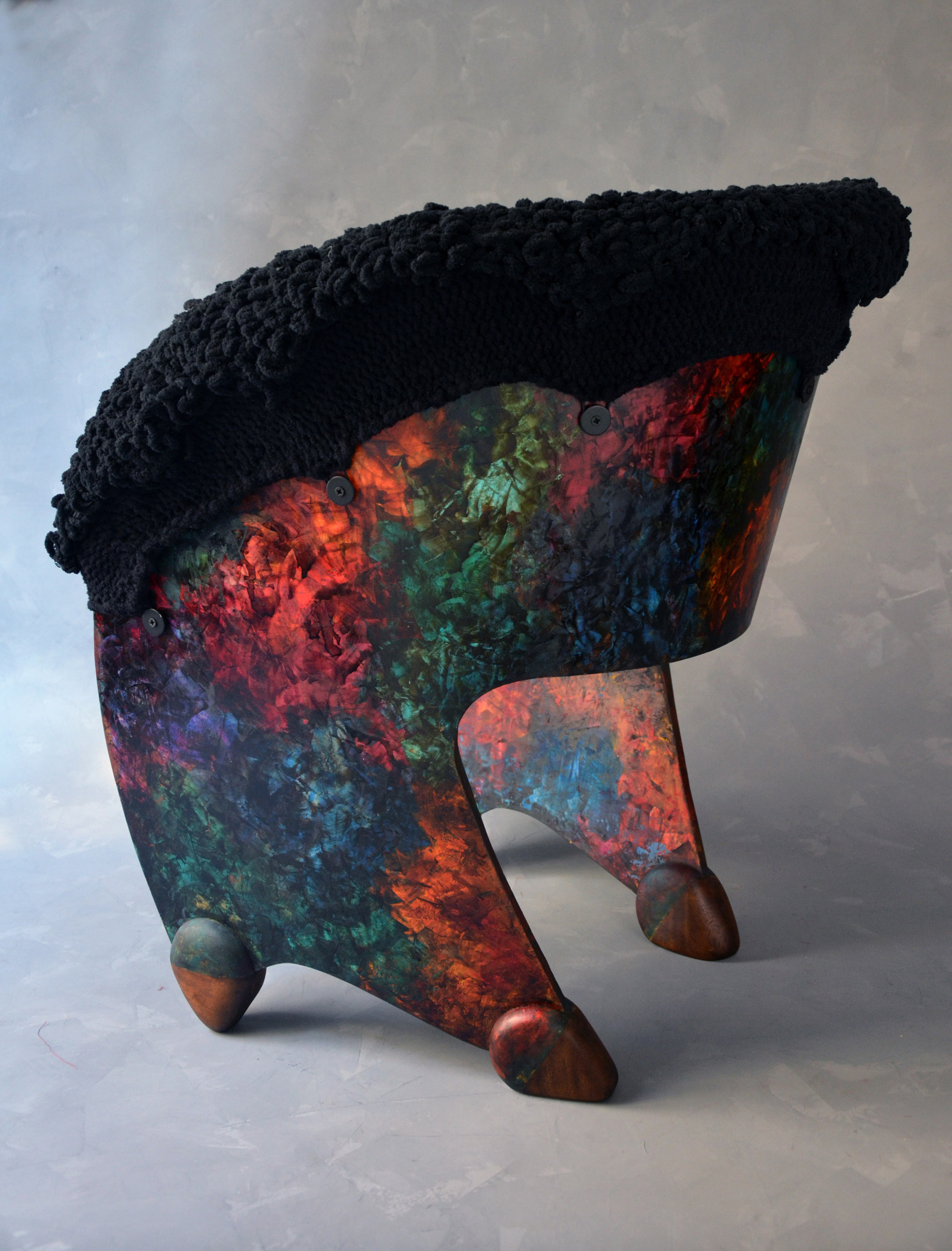
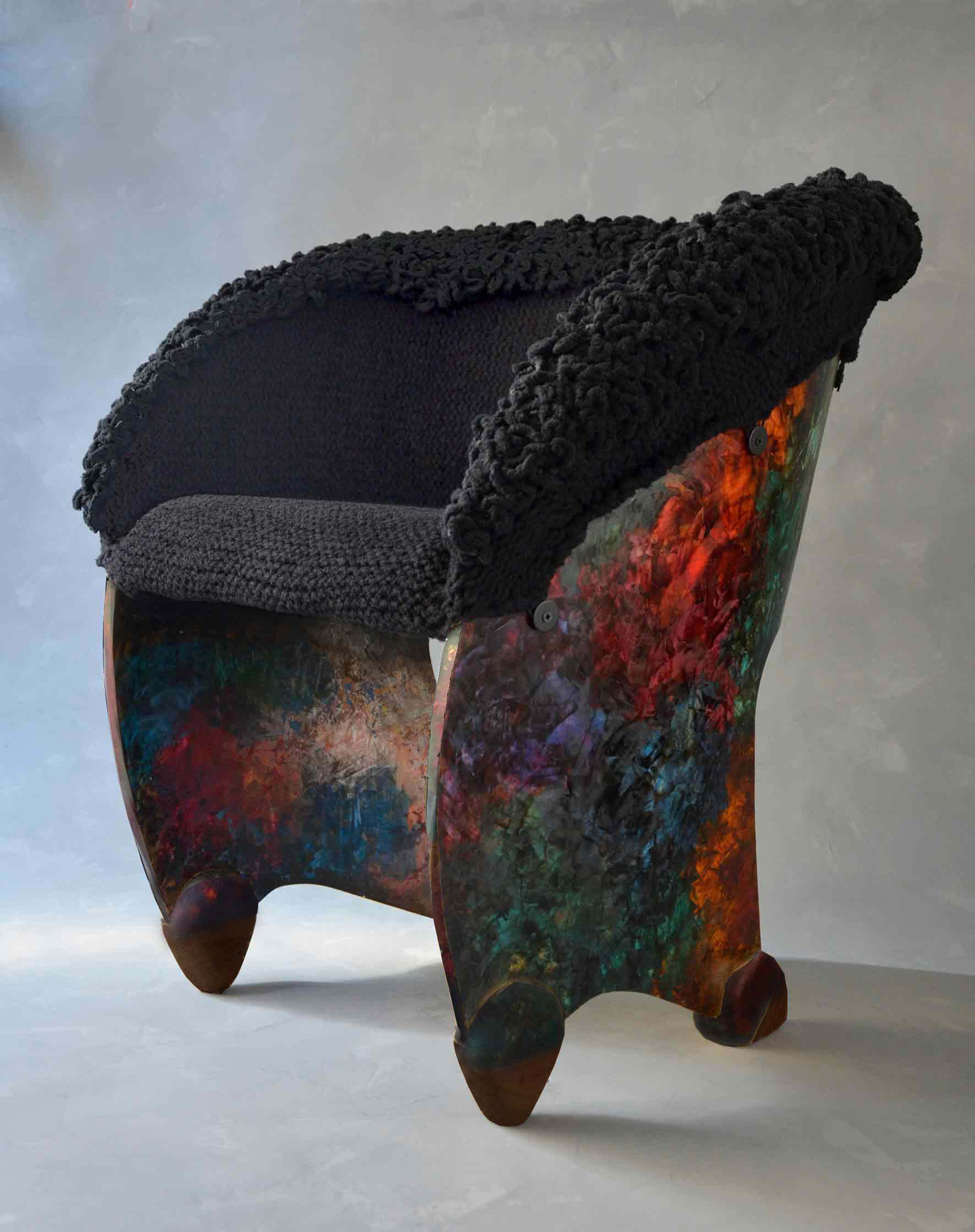
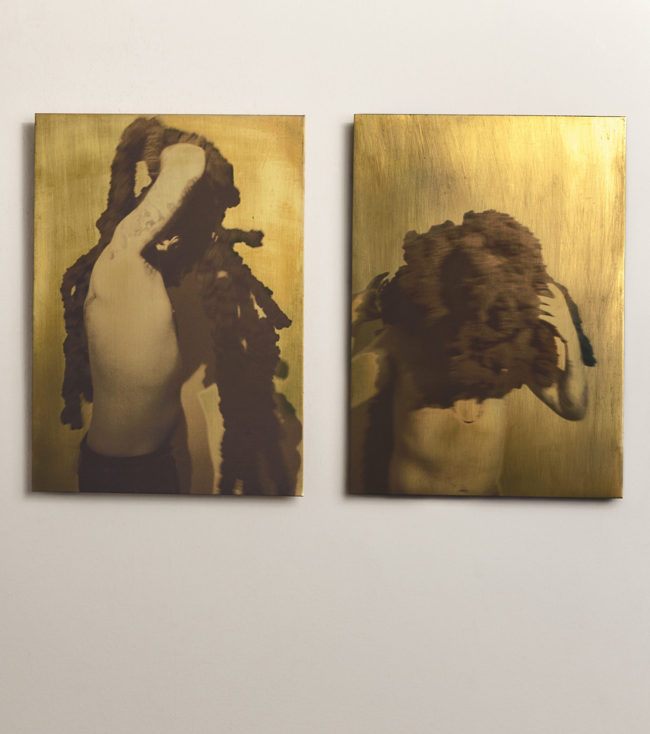
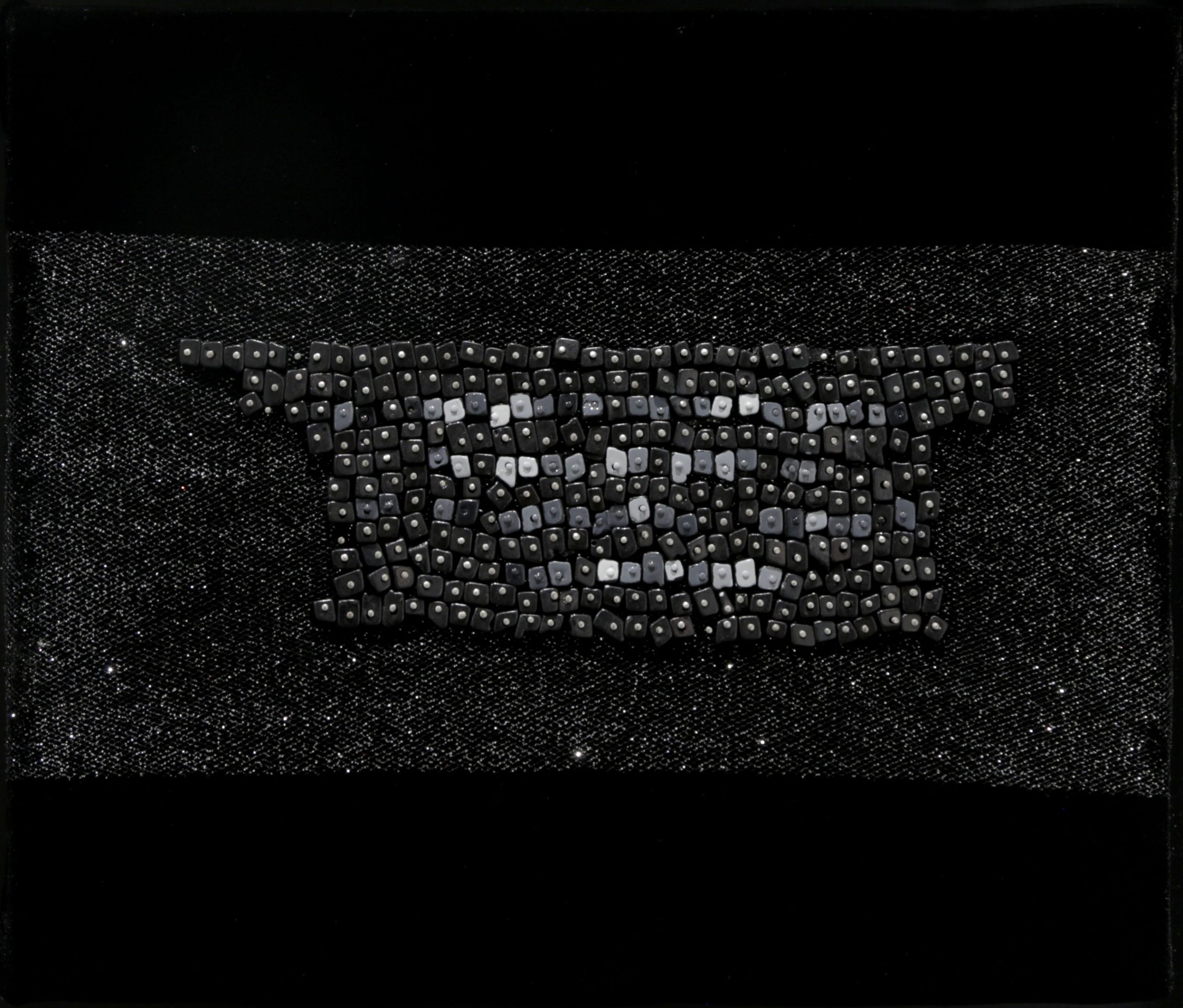
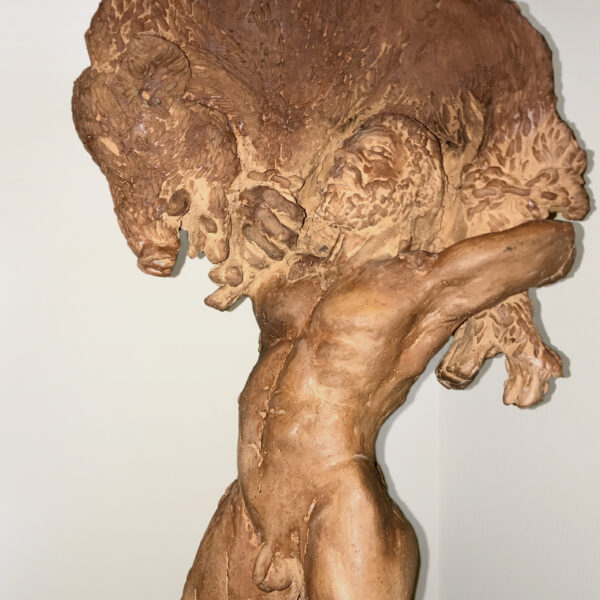
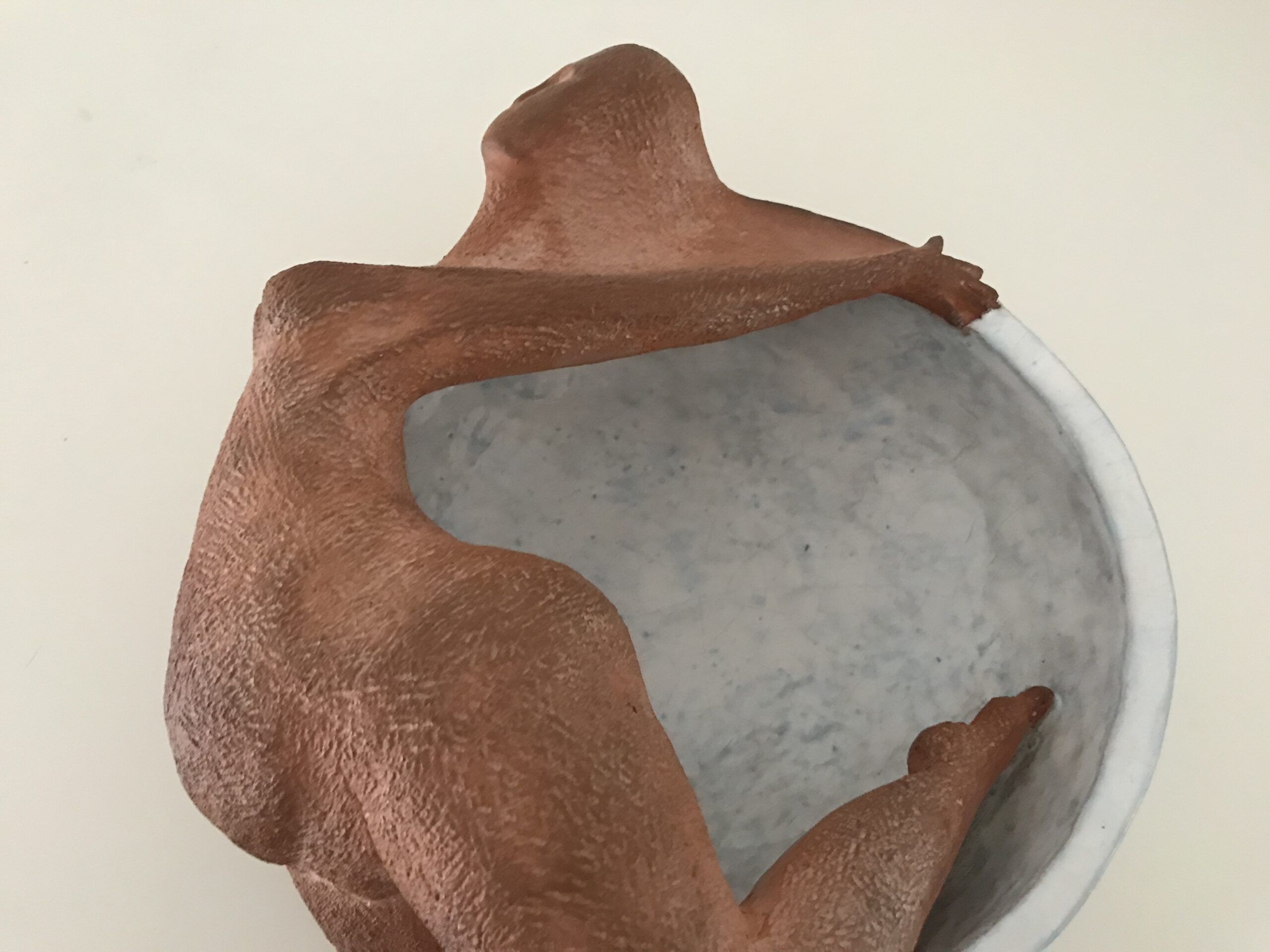
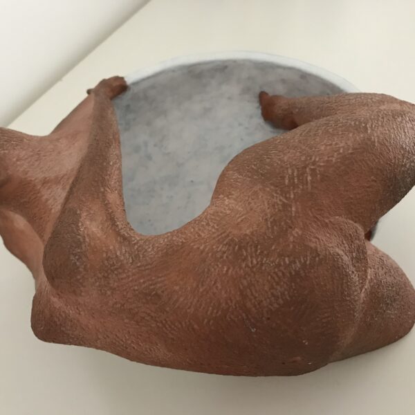
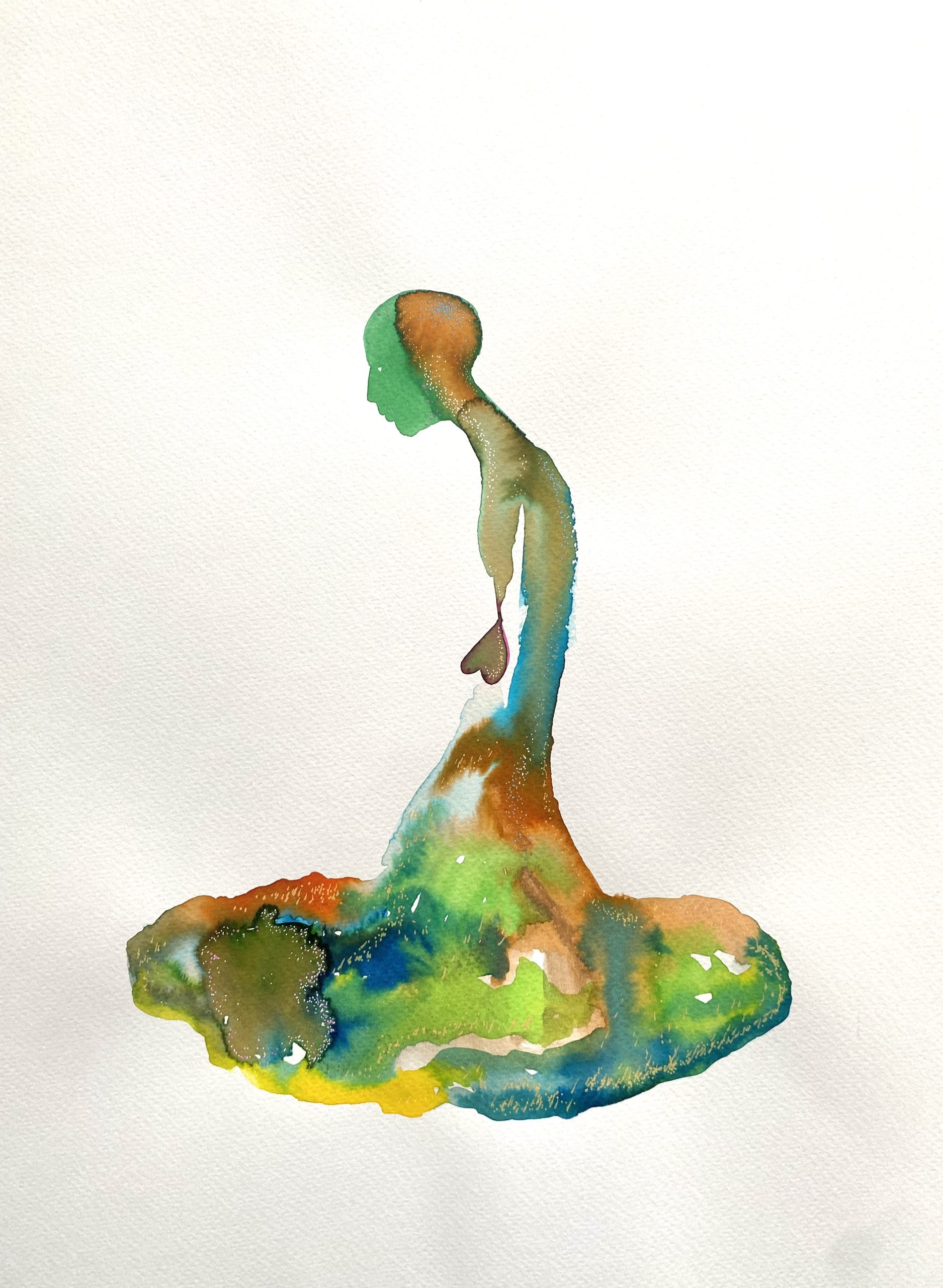
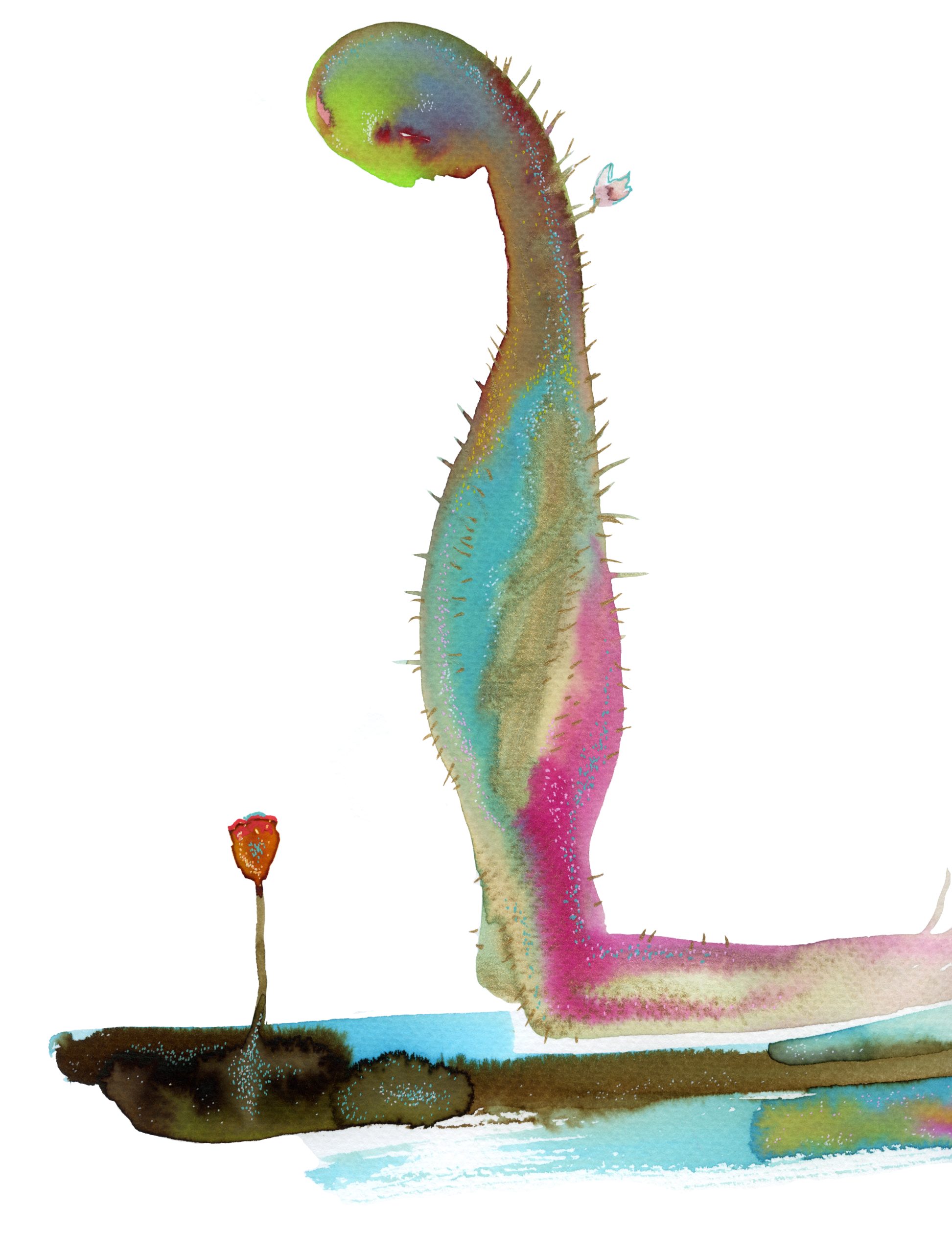
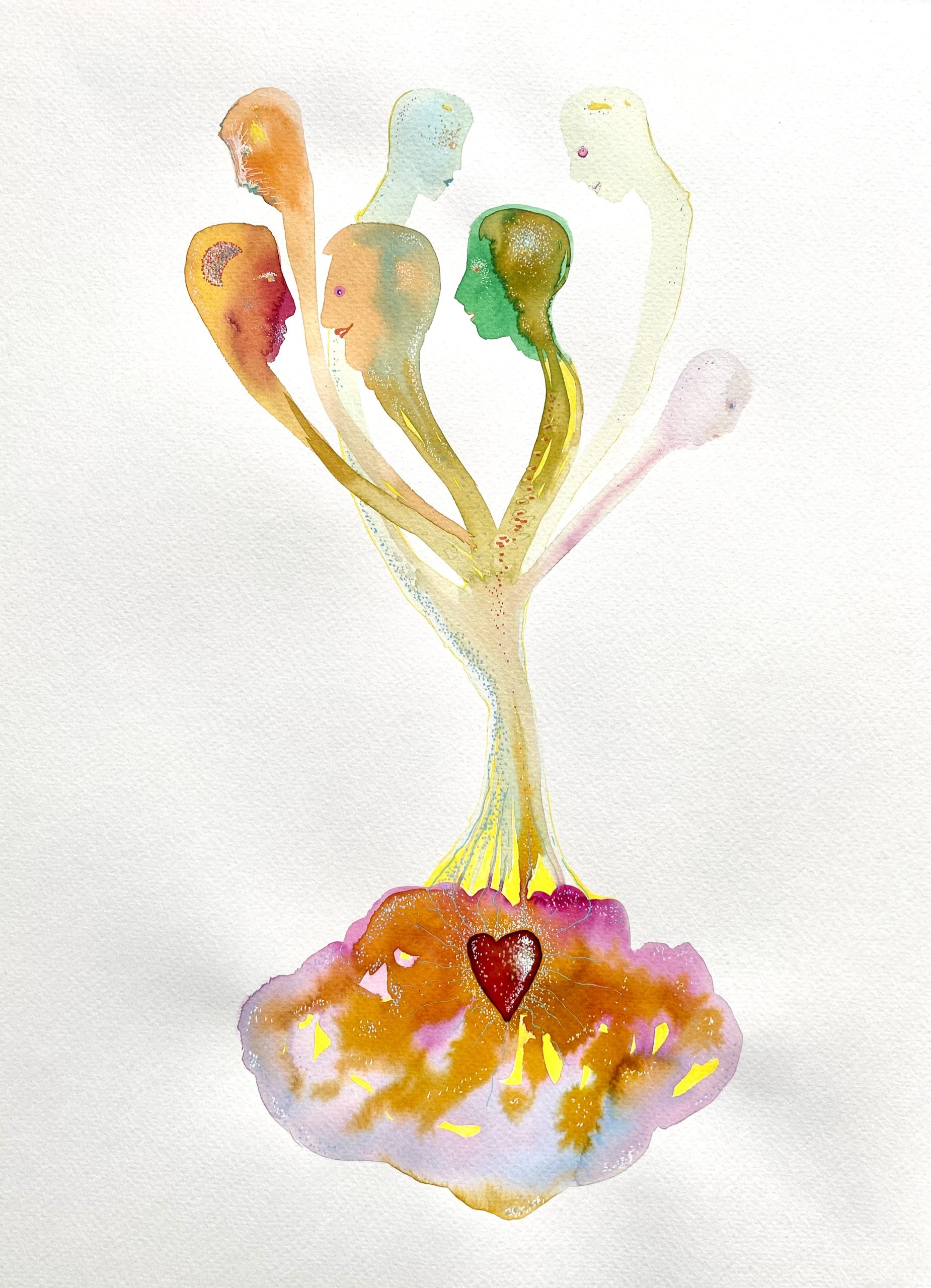
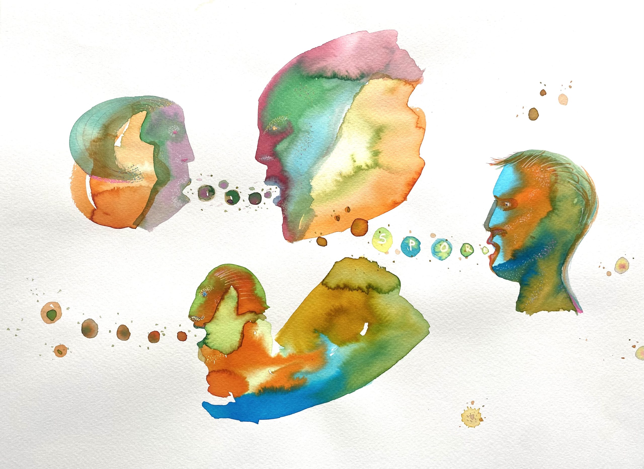
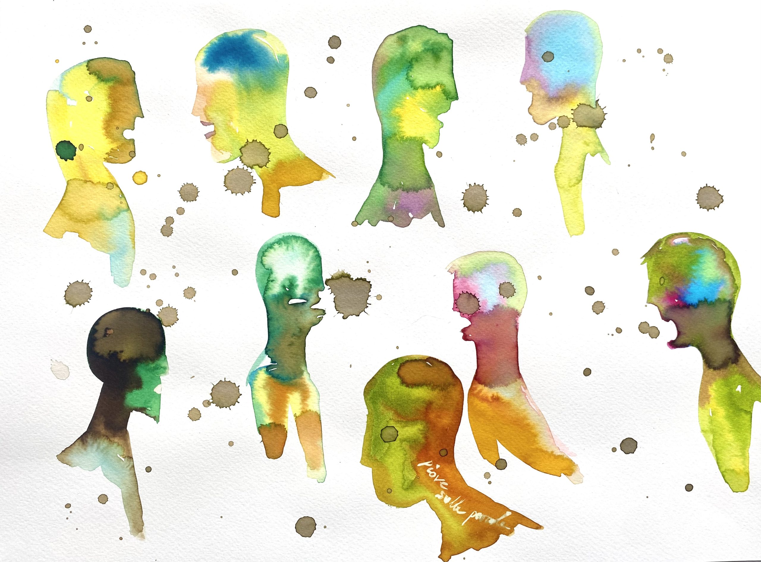
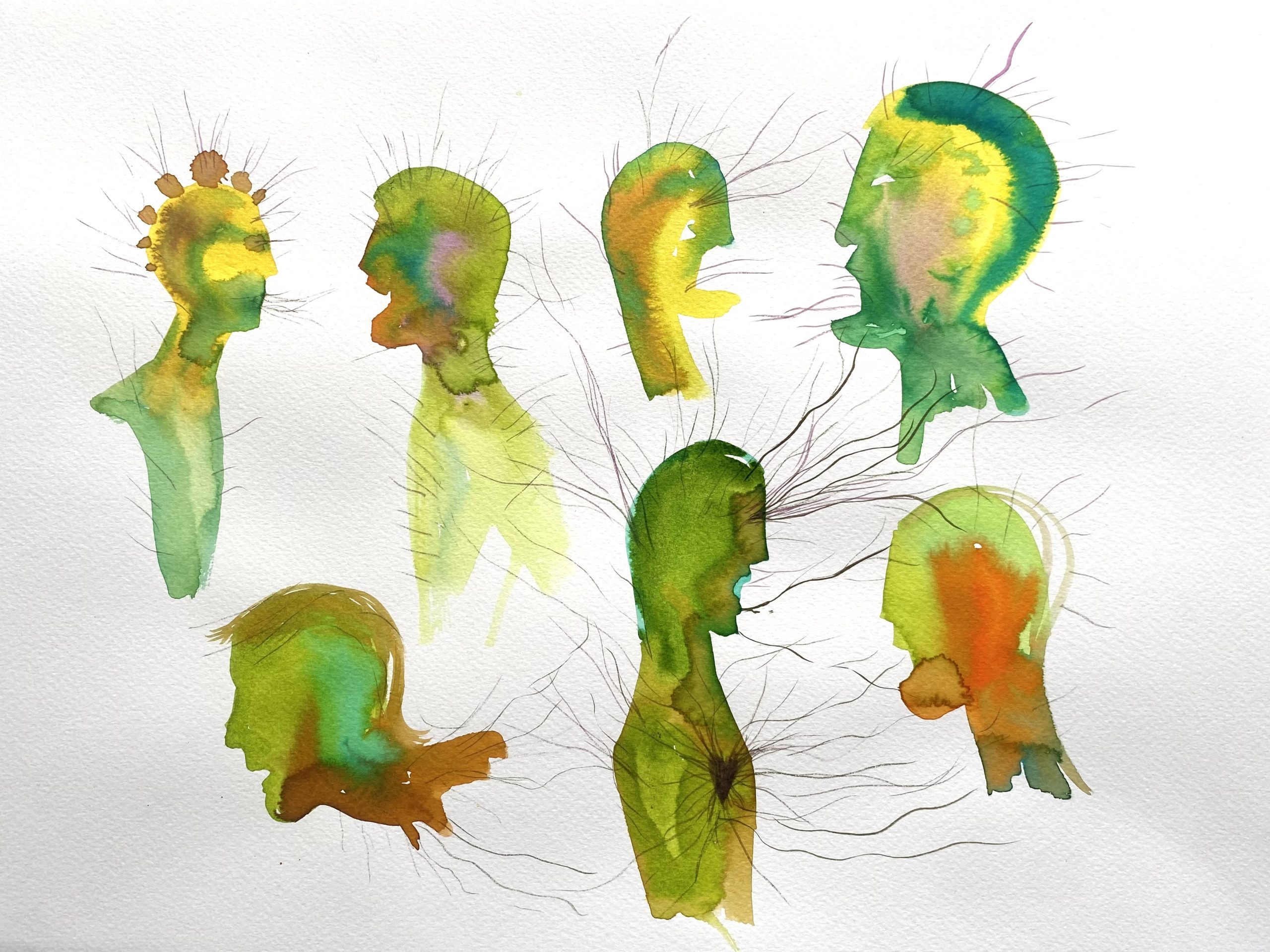
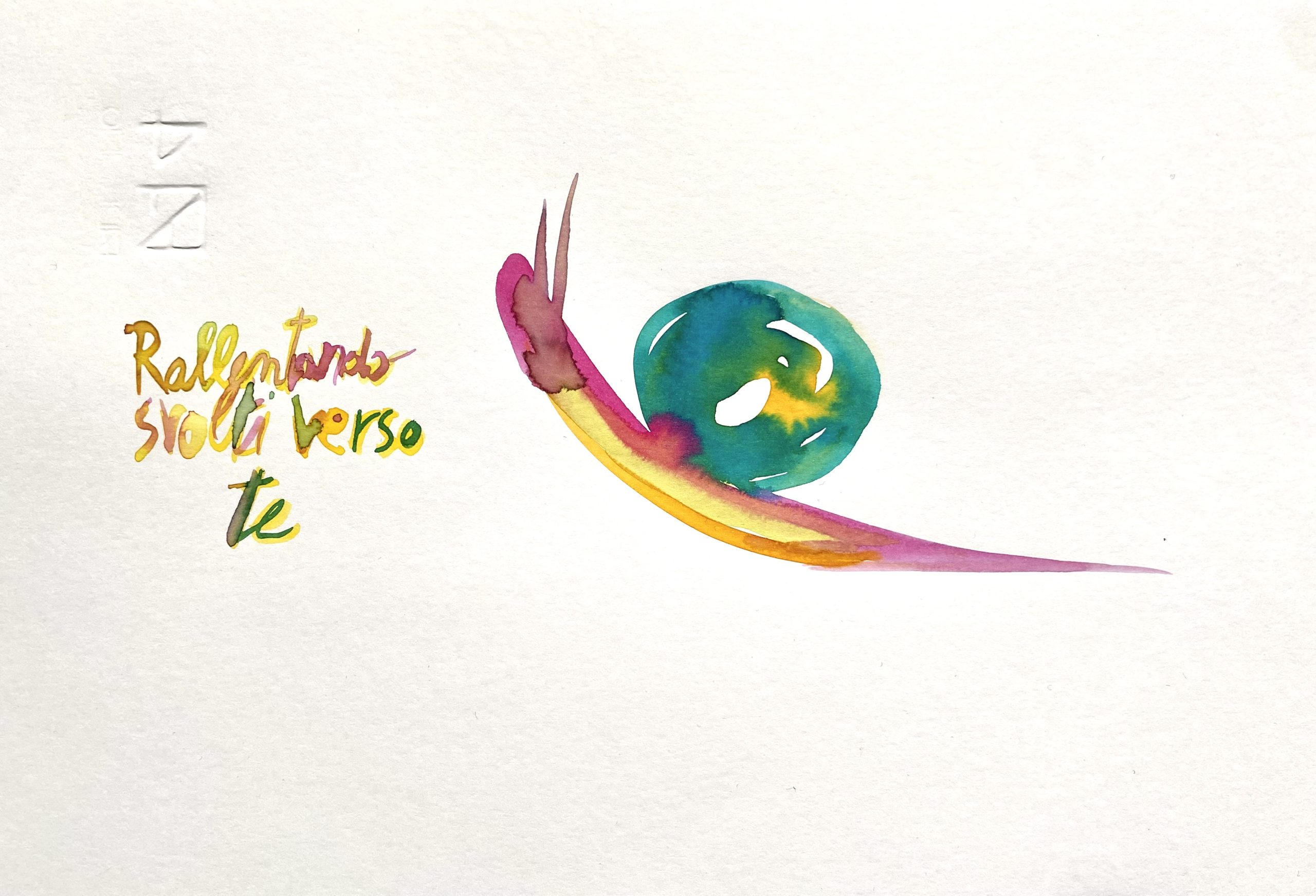
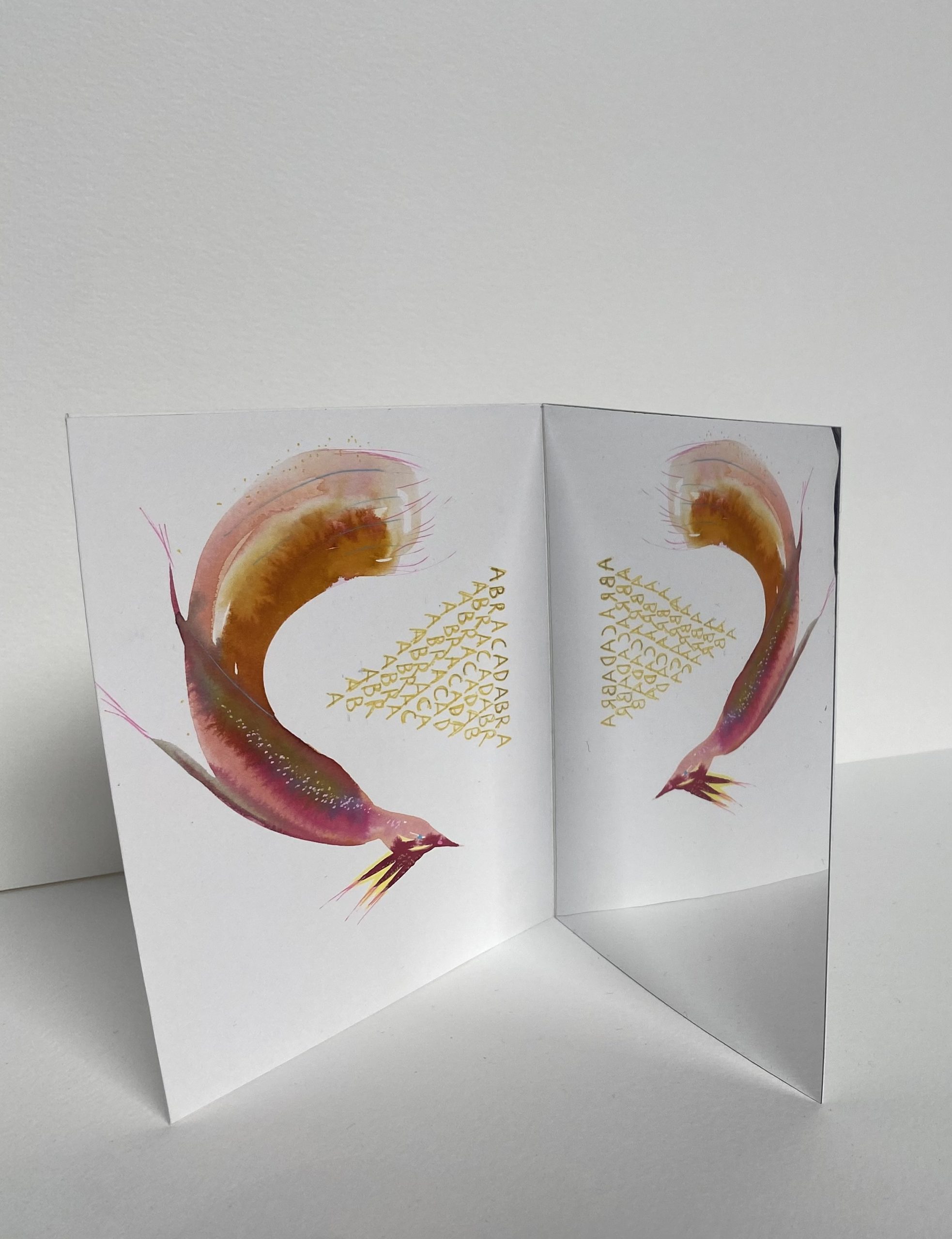
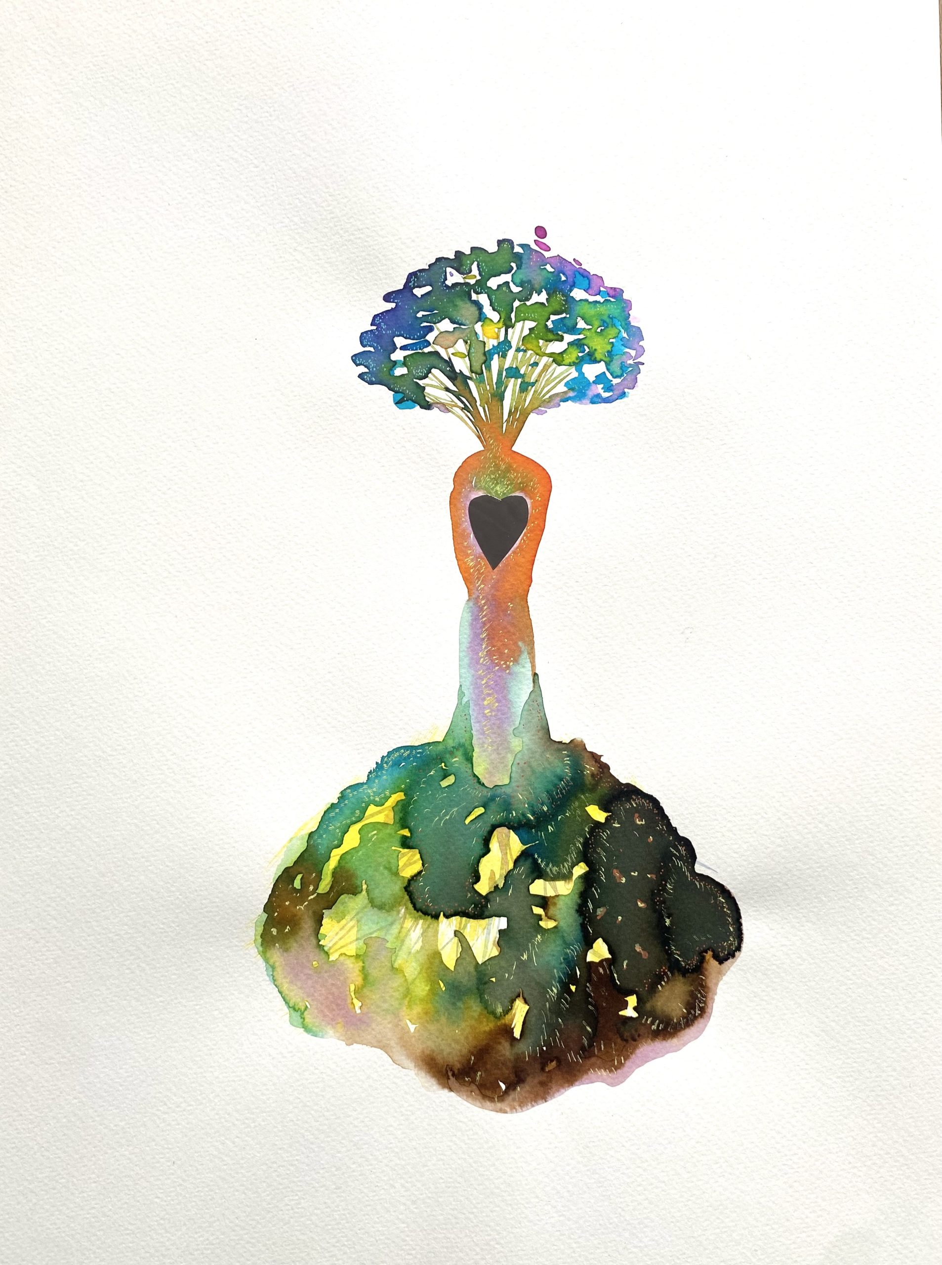
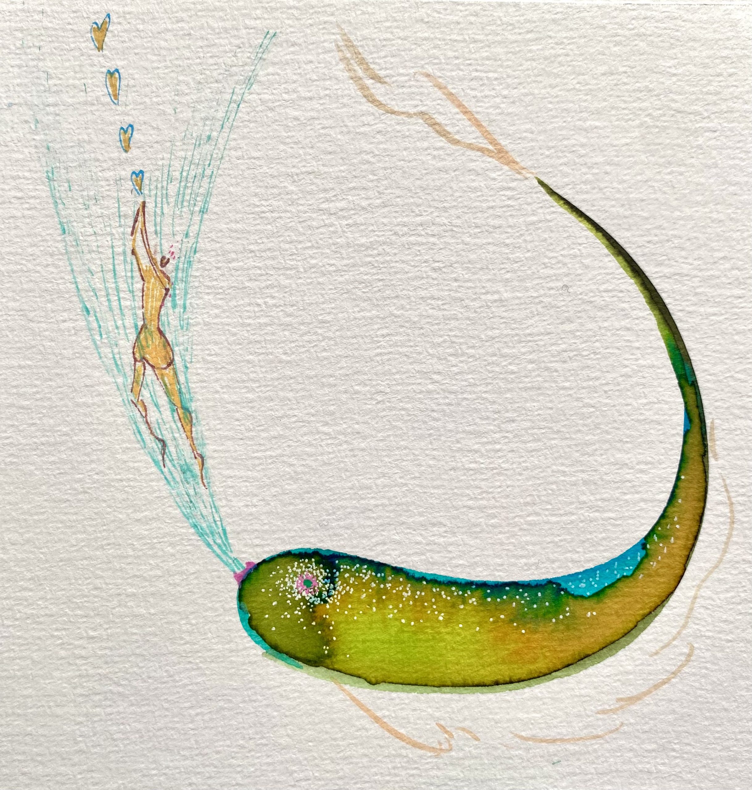
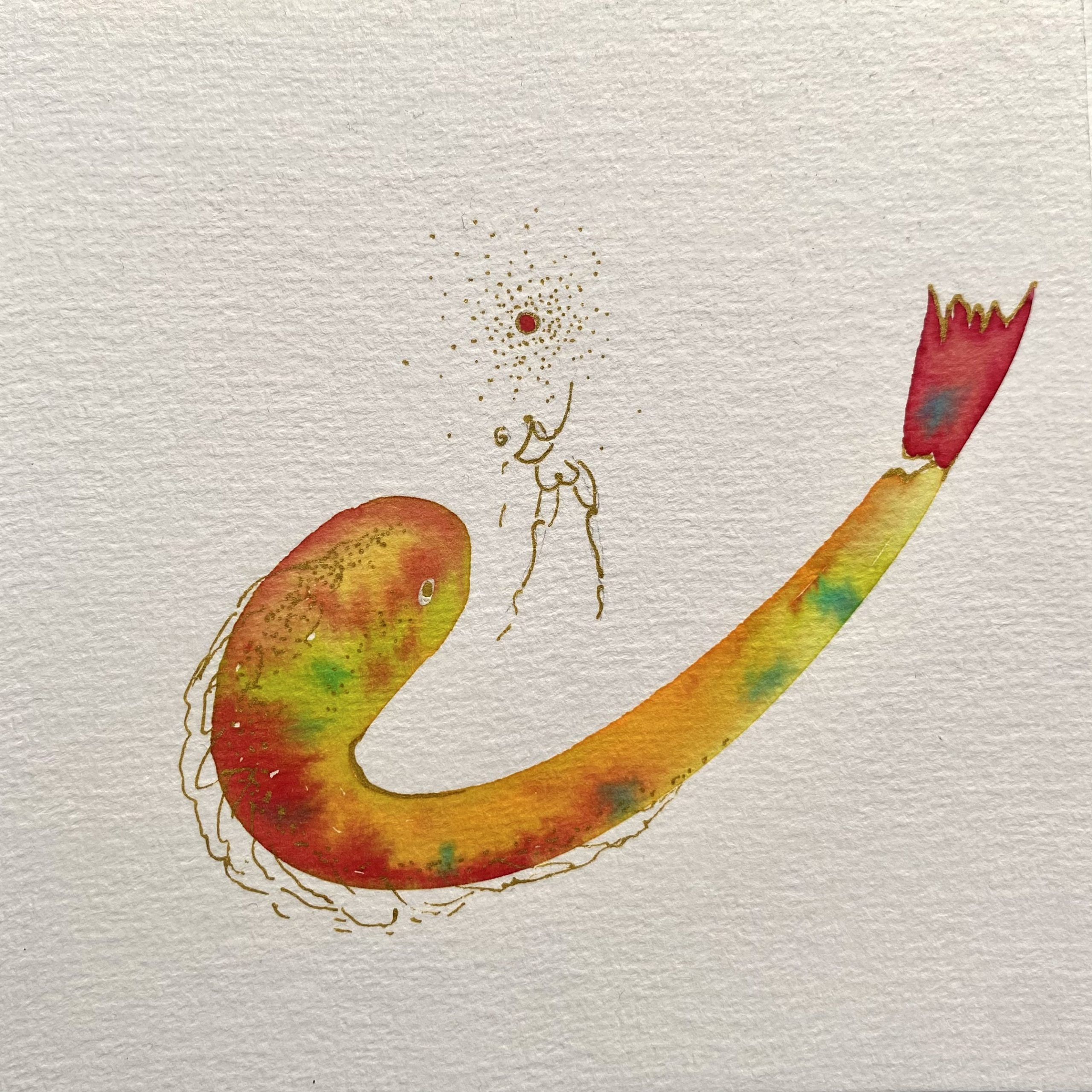
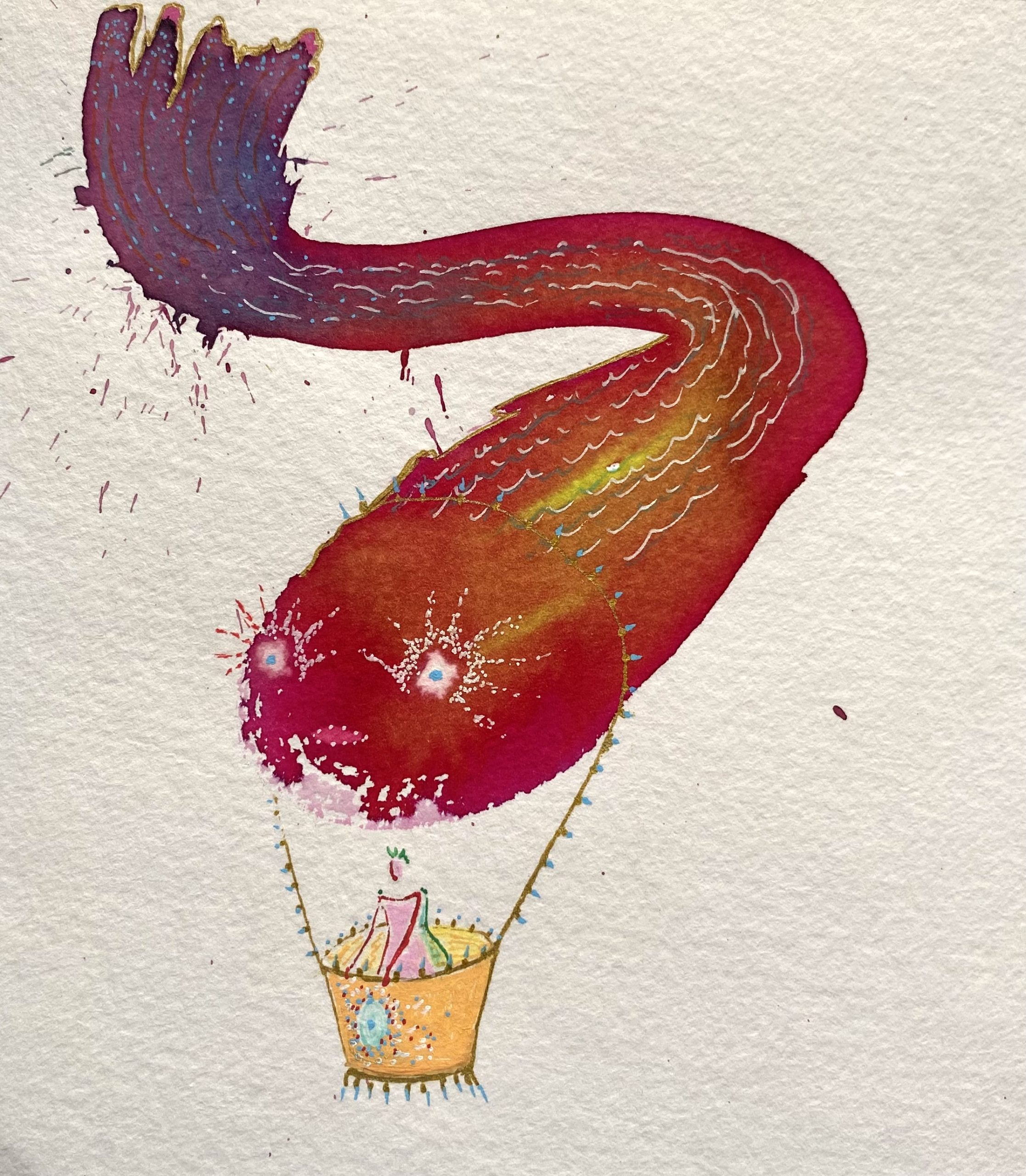
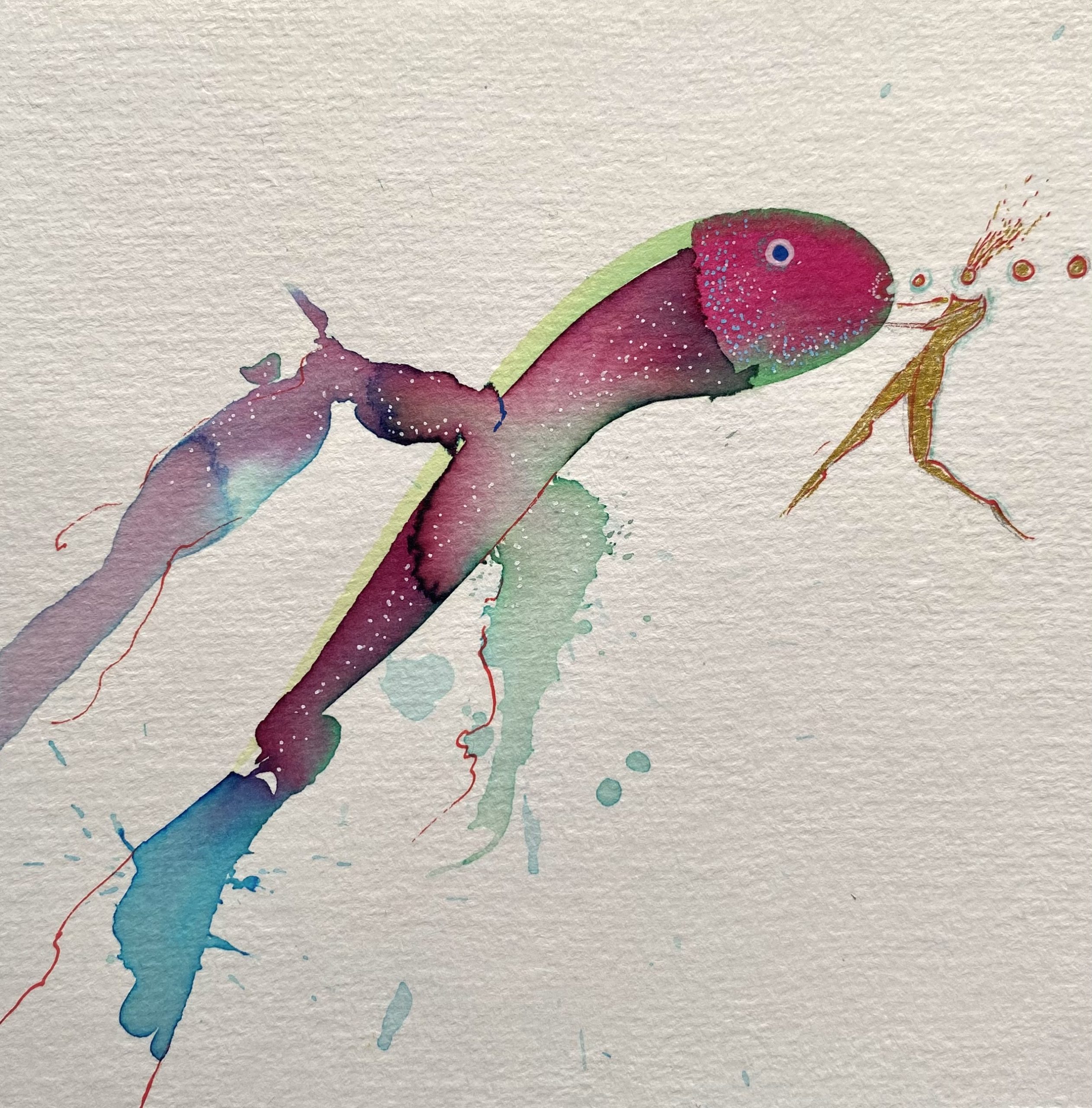
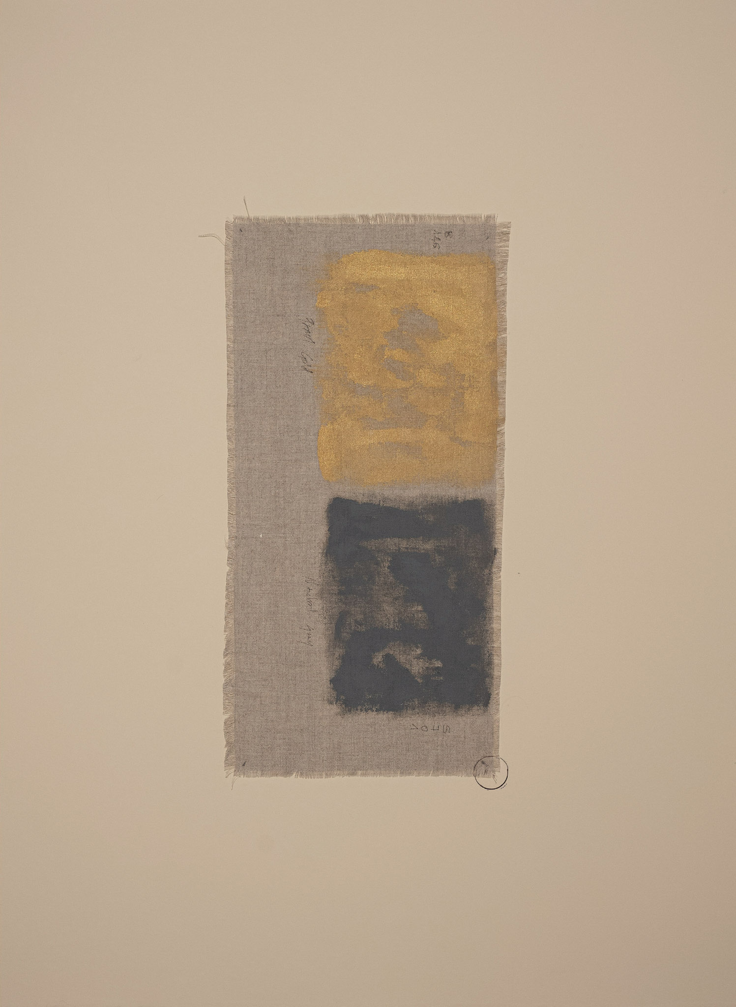
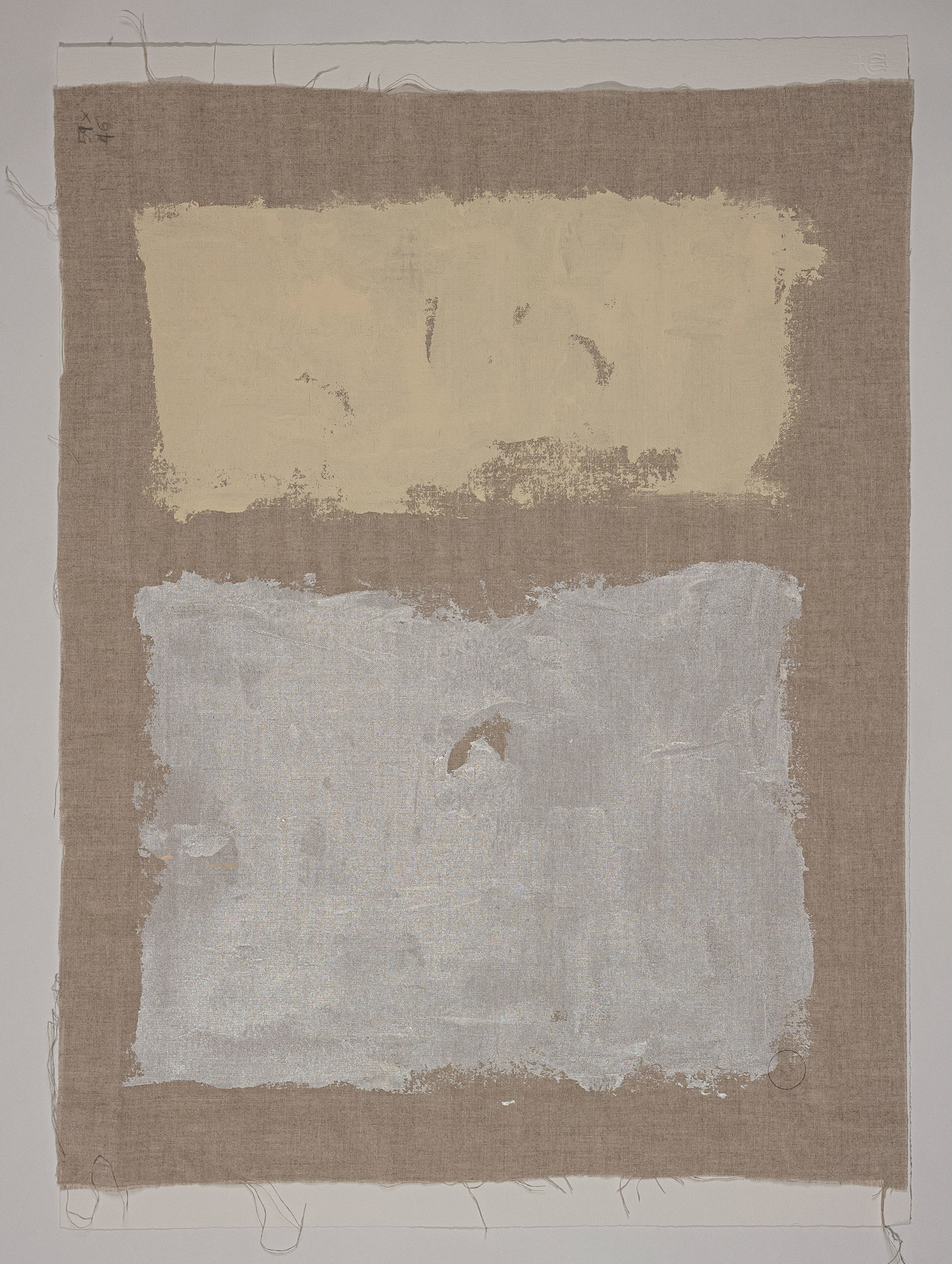
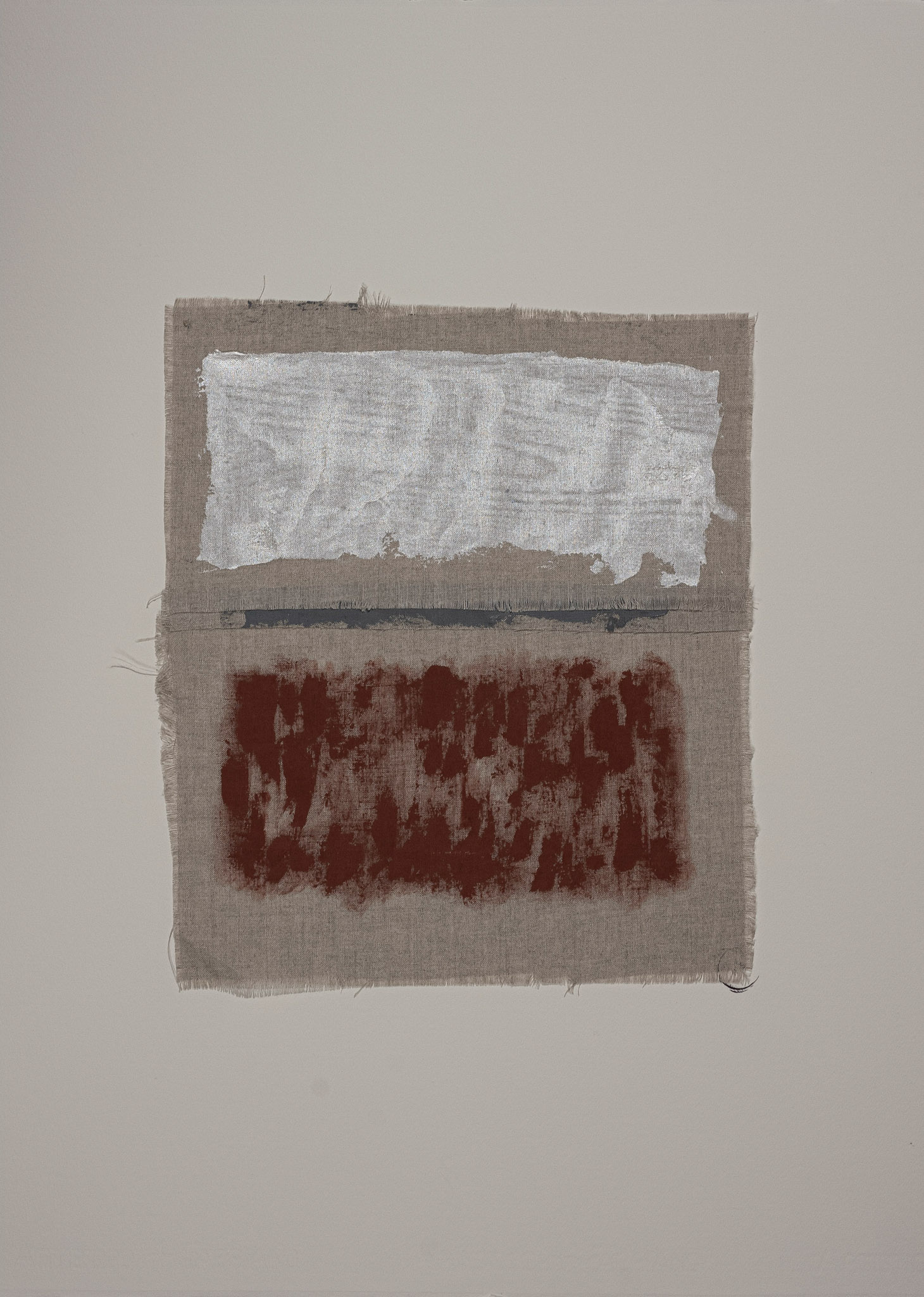
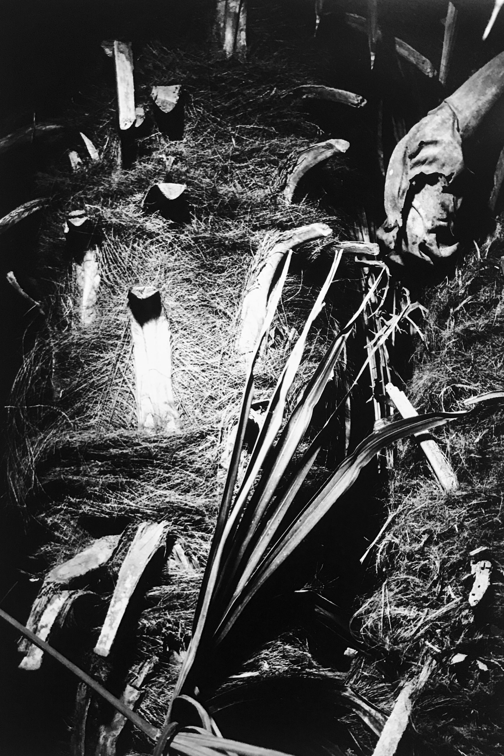
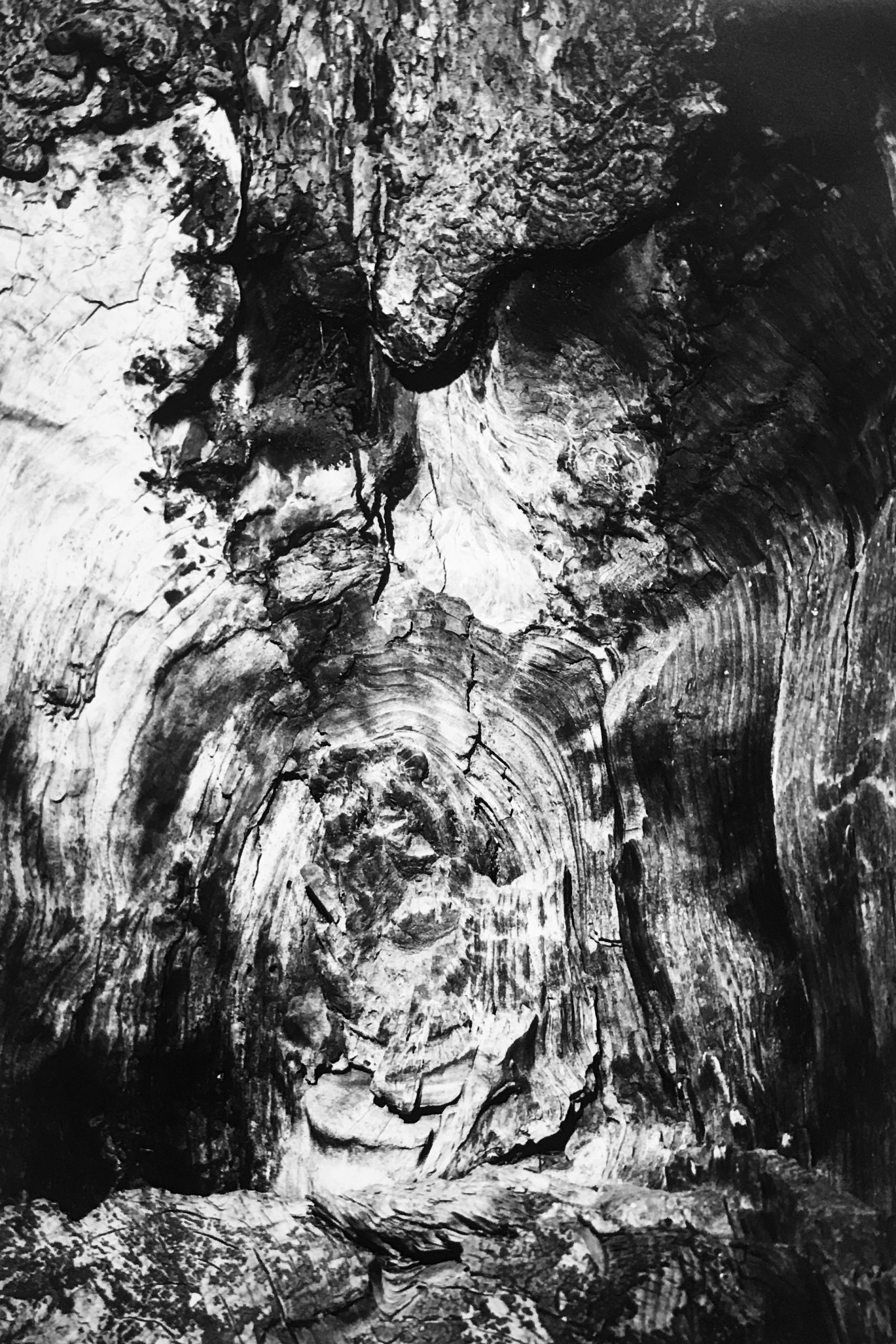
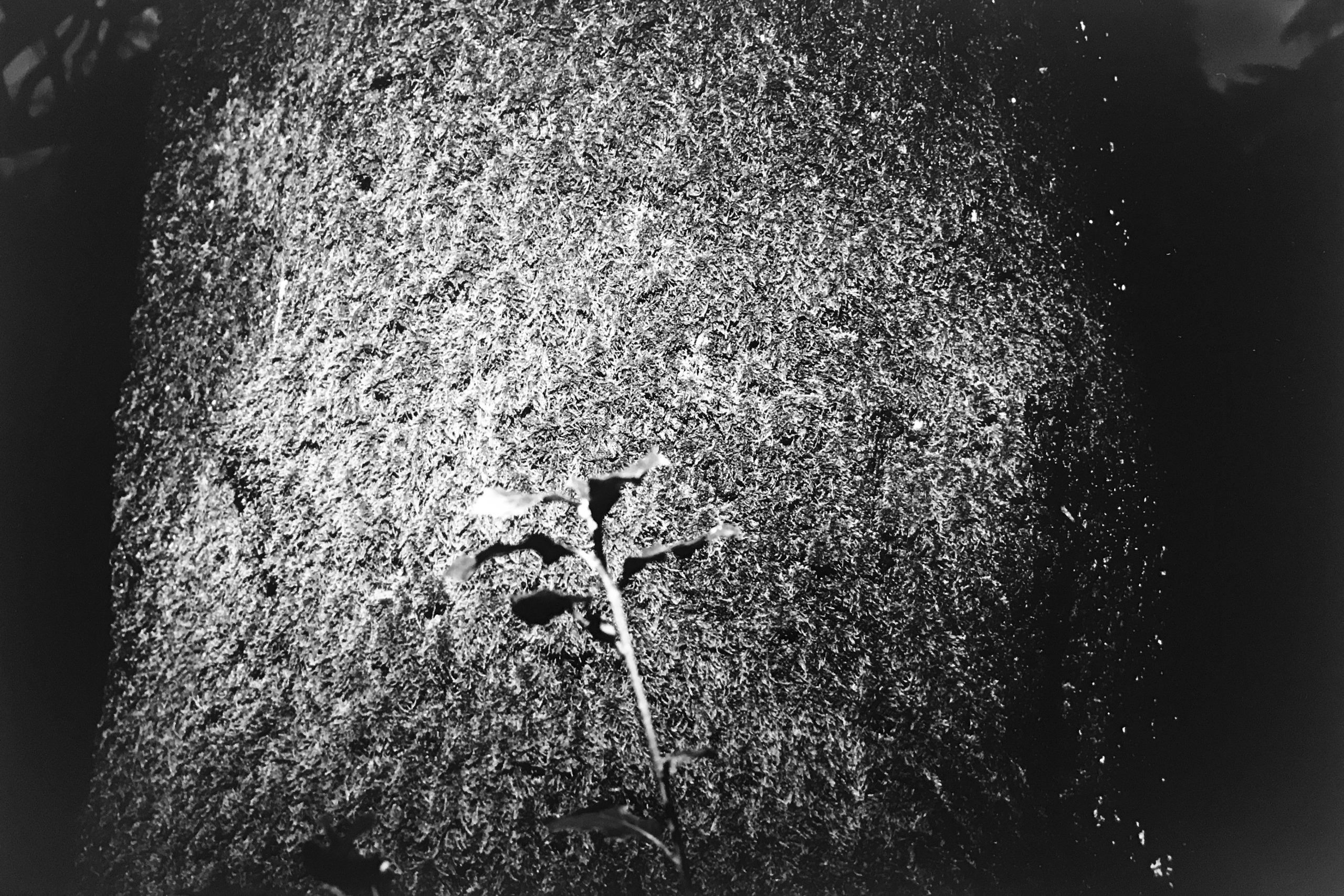
After purchasing the pieces, Barlow had an idea to preserve and transform the artifacts into art. Once works of art that adorned churches throughout Florence, these fragments had been significantly distressed from the mud and water. There is still the original paint and silt left on the pieces to uphold the integrity, craftmanship, and history of sculptural fragments. The collection is proof that there is more beauty to uncover – bringing forth a new era and context of “modern mud angels.”
“Usually, a fragment has gone past restoration but, because of its age and intricate carvings, it is still a work of art. I became interested in the fragments when I saw more than the discarded artifact, but a piece that could be made beautiful again,” says Barlow.
Dopo aver acquistato i reperti, Barlow ebbe l’idea di conservarli e trasformarli in opere d’arte. Dopo aver adornato le chiese fiorentine, i frammenti risultavano danneggiati dal fango e dall’acqua. La vernice originale e i sedimenti del fango ancora presenti su di essi testimoniano l’integrità, la maestria e la storia dei frammenti scultorei. La collezione è la prova che c’è ancora bellezza da scoprire, dando vita a una nuova epoca e a una nuova dimensione che potrebbe definirsi come quella degli “angeli del fango moderni.”
“In genere i frammenti che impiego sono stati scartati durante i restauri, tuttavia, la loro antichità e i loro complessi intagli ne mantengono l’essenza dell’opera d’arte. Il mio interesse nei frammenti è nato quando ho iniziato a riconoscere in essi non più dei semplici reperti messi in disparte ma delle opere destinate a splendere nuovamente” racconta Jean Barlow.
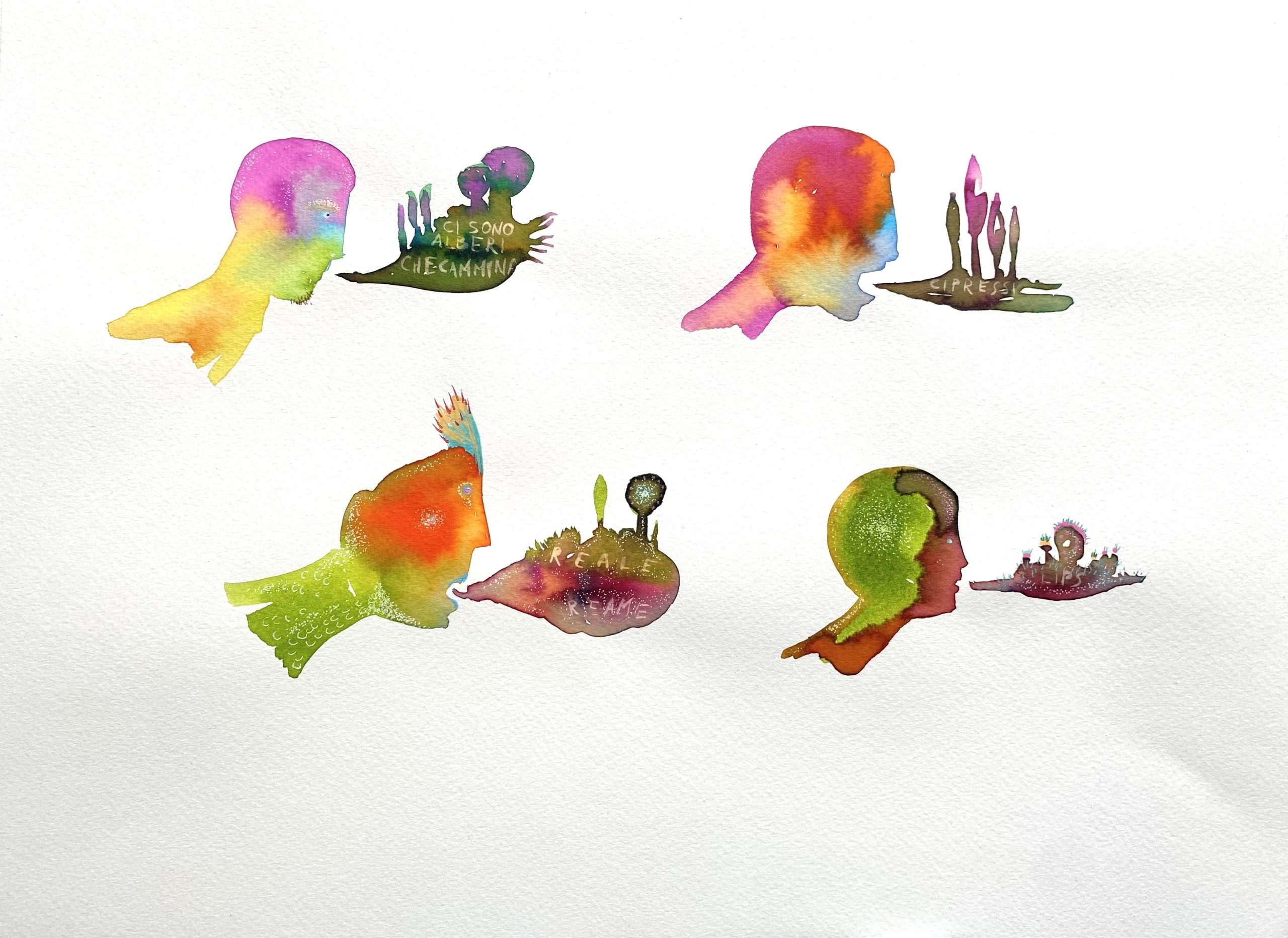
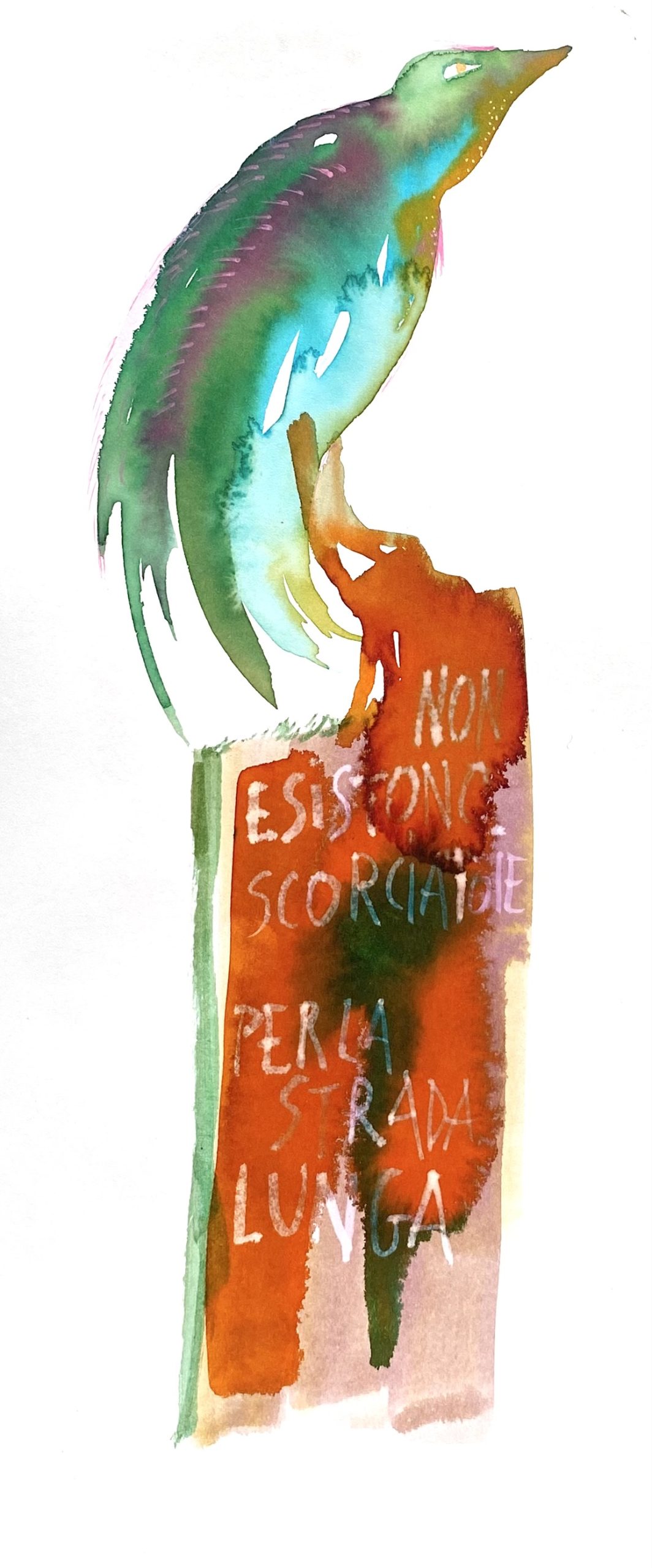
Each piece has been reimagined with fossil agate coral, shells, calcite crystals, tourmaline, and other rare minerals from all around the world – creating a piece that looks as though it evolved together over time. Through contemporary interpretations and artistic methods, the fragments have been given new life, just like the other masterpieces saved from the flood.
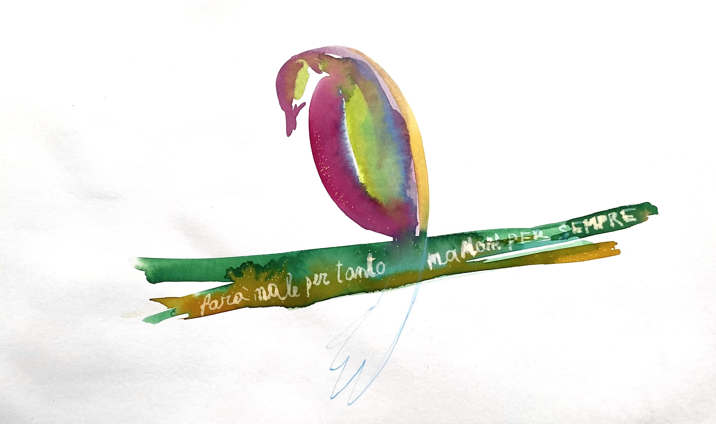
“While many of our fragment artifacts are distressed due to age, these Florence fragments stand apart. They symbolize a history that has been carried through the streets of Italy, to the storehouse, then my studio, and now to the galleries and the modern home,” says Barlow. Each one has been recreated and reveals a new interpretation. What was submerged and stripped of its color and meaning still retains its history and beauty. What was weathered and worn is now reimagined and reborn. What was lost is now found.
Ogni frammento viene riconcepito e decorato con coralli fossili di agata, conchiglie, cristalli di calcite, tormalina e altri rari minerali provenienti da tutto il mondo, creando un capolavoro unico che sembra essersi evoluto insieme nel tempo. Grazie alle reinterpretazioni e alle tecniche artistiche contemporanee i frammenti hanno conosciuto una nuova vita proprio come gli altri capolavori portati in salvo dopo l’alluvione.
“Mentre molte delle nostre opere vengono realizzate con frammenti deteriorati a causa del tempo, i frammenti di Firenze sono diversi: la loro storia è passata per le strade inondate dal fango, per la villa del ricco signore, per il mio studio, per poi risplendere nuovamente nelle gallerie e nelle case moderne” spiega Jean Barlow. Ognuno di essi è stato ricreato e viene presentato con una nuova interpretazione. Dopo essere stato sommerso e spogliato dei propri colori e della propria essenza, riporta alla luce la propria storia e la propria bellezza. Dopo essere stato eroso e segnato dalla catastrofe viene riconcepito e riscoperto per una nuova rinascita.Ciò che era andato perduto, ora è stato ritrovato.


![[:en]Andrea Mancini[:it] Andrea Mancini[:]](https://corridoiofiorentino.it/wp-content/uploads/2020/10/macio.jpg)


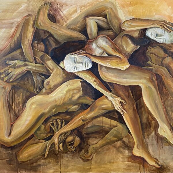
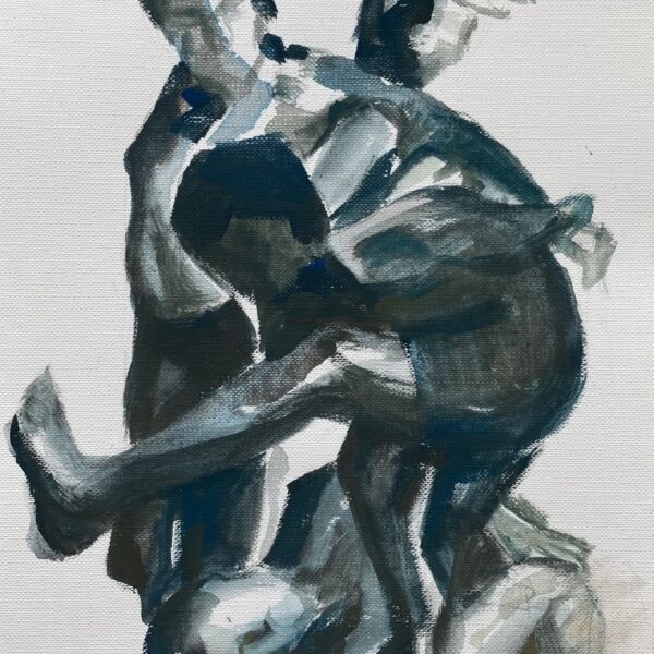
![[:en]“DISVELARSI” Paintings by Michele Berlot[:it]“DISVELA?SI” Paintings by Michele Berlot[:]](https://corridoiofiorentino.it/wp-content/uploads/2021/10/nella-svolta-dei-tempi_100x100_acrilico-e-olio-su-tela_2020-2048x2036.jpg)


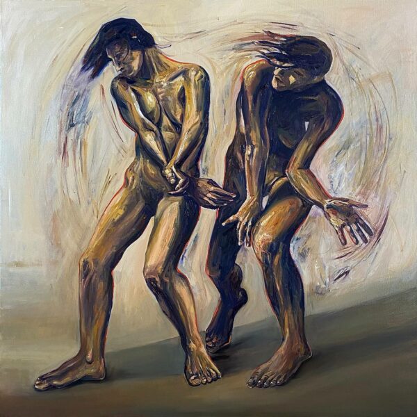
![[:en]Quaranta Giorni and Cuarenta Noches by Carolina Correa[:it]Quaranta Giorni and Cuarenta Noches ritratti di Carolina Correa[:]](https://corridoiofiorentino.it/wp-content/uploads/2021/11/domenico-vitulano.jpg)